| Image |
Comment |
| 01/13/2007 11:51:04 AM |
POMENE SUNSETby carpalComment: The golden branches frame the sunset nicely. The soft focus makes it feel like a pleasant memory. Line the line of trees on the horizon is straight, the line of the water is tilted left - it feels off to me - but maybe it looks more off if you staighten the water and have the trees off. I guess it is no big deal. Wish the sun were on the bottom thirds line with more sky to the left and above. |
 Photographer found comment helpful. Photographer found comment helpful. |
| 01/13/2007 11:46:17 AM |
Dressageby piaffe529Comment: the soft focus and glow work well here - empasizing the elegance dressage. Good composition - the horse and rider on thirds lines, the stong white rail grounding them in back and the simple green foliage behind. The photo IS dressage - elegant and controlled. |
| Photographer found comment helpful. |
| 01/13/2007 11:37:11 AM |
Where the World's Day Starts and Finishes First - Auckland, New Zealandby julesskiComment: I like the simlplicity of the shot - it is all about horizontal lines of city and cloud. The orange/peach color of the sky is very peaceful. I wish there were some more detail - either more tonal range or some one spot for my eyes to focus on. My eyes tend to swoop in and out on the photo on the horizontal lines, with nothing to stop and rest on. |
| Photographer found comment helpful. |
| 01/13/2007 11:33:46 AM |
Harlequin Dollby frestepiComment: Nice motion capture - and I like the face peering out of the shadows behind. Nutcracker performance? To have the ground at the bottom give good reference. I wish there were more room at the top. The composition feels a little unbalanced and squished as a result. |
| 01/12/2007 10:05:35 AM |
A Single Treeby freakin_hilariousComment: Beautiful composition - I like the reflection and the detail in the bushes and tree. The composition works well with the tree on the thrids line. I'd brighten things up a bit - there is some nice color in the shadows. You can keep the details in the sky by using shadow/highlights and a bit of judicious burning.
I like this better:

dunno what you think. |
| Photographer found comment helpful. |
| 01/12/2007 09:54:50 AM |
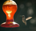
mmm...sweet nectarby AzCKellyComment: I like the glare of light on the feeder - it combines with the angle of the bird's backlit wingto create a feeling of surprise and action. This is not a sharp as I'd like, and for some random reason (the dof? the lighting? the fact that we cannot see the other wing?) the bird seems like it was pasted in to the picture. |
| 01/12/2007 09:52:22 AM |
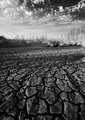
Bayou Droughtby cpurserComment: Nice texture, nice range of tone. Maybe a little too dark at the bottom, but that's no big deal. The clouds are luminous and the line of brush makes a nice resting point for your eyes after the dramatic crack leading the viewer in. Wish there was more detail in the brush - but you've got such a wide angle that makes it difficult and the photo is more about the vast view than the details anyway. |
| Photographer found comment helpful. |
| 01/12/2007 09:49:14 AM |
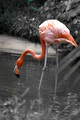
Pink Flamingoby JPetraliaXComment: I like the selective color - it helps to focus the viewer on the flamingo even thought the position of the bird isn't so compelling (with its back to us) There is some odd green left in the bushes/grass inthe back and yellow in the water wich is distracting. Rotating counter clockwise would look better. |
| 01/12/2007 09:47:00 AM |
Lighthouse at Sunsetby bassboneComment: NIce sunset glow of light - so real you can smell the salt air. I particularly like the light on the rocks in the foreground. I like the deep blue of the sky - but there seems to be a good bit of noise in the thin clouds at the very top of the frame - probably from boosting the saturation. I wish the red on the lighthouse wasn't so neon bright. The horizon is not quite straight - when I line it up with the edge of the window it is only slightly off, but for some reason it seems more tilted - perhaps the distortion from the lens is adding to the illutsion? |
| Photographer found comment helpful. |
| 01/12/2007 09:41:13 AM |
cRoSsInG LiNEsby LOWLANDSComment: Good fun! Poppa snail, momma snail, and baby snail! Good use of DOF, leading lines and composition. Nice tones, but I wish there had been a little bit more range in the darkest parts. |
| Photographer found comment helpful. |
Home -
Challenges -
Community -
League -
Photos -
Cameras -
Lenses -
Learn -
Help -
Terms of Use -
Privacy -
Top ^
DPChallenge, and website content and design, Copyright © 2001-2026 Challenging Technologies, LLC.
All digital photo copyrights belong to the photographers and may not be used without permission.
Current Server Time: 07/15/2026 07:11:53 PM EDT.