| Image |
Comment |
| 05/04/2007 01:31:09 AM |
Cloudieby rayg544Comment: While I like cats, I loathe cat photos...
I gave this one a 7. I'm glad to see it did well. You composed this well, and managed some great colors. |
 Photographer found comment helpful. Photographer found comment helpful. |
| 05/04/2007 01:29:45 AM |
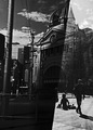
Approaching Middle Ageby RanklesComment: Two people have called this a B&W photo. I think some of y'all need to adjust your monitors...or I do. There is plenty of color here. It is a desaturated shot, but the color hasn't been totally removed. |
| Photographer found comment helpful. |
| 05/04/2007 01:11:50 AM |
Caitby EfergohComment: Thank you, Toyan. I appreciate, that. |
| 05/04/2007 01:10:30 AM |
|
| Photographer found comment helpful. |
| 05/04/2007 01:09:52 AM |
The Lonely Tangoby TOYComment: Great light. Excellent tones. I'm struggling with the gesture in the 3rd frame. It just doesn't come off as natural or comfortable. Her right arm just looks like it is at an awkward angle. I'm not sure how I feel about her looking at the lens in the 3rd shot, but it does help the 3rd fram, but I just don't know about the overall. |
| 05/02/2007 12:07:48 PM |
Caitby EfergohComment: Thanks for the comments folks. Some suggested using a bounce card to put light on her face. I considered that when I shot the image, but decided against it. I wanted her face to be more in the shadow than out. I didn't want this photo to be about a specific woman, but more about women in general. If my finances improve, I'll join up as a member, and post the whole series for your review. |
| 05/02/2007 11:23:38 AM |
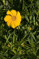
Sunset Bloomby AzCKellyComment: My apologies for not commenting during the voting stage.
To be perfectly honest and blunt. Flower photos don't do much for me. It has to be really special in order to gain my attention if it is a flower photo. This just isn't one of them. But I'll give it longer consideration in order to give you feedback...
The colors seems overdone, but bland at the same time, if that makes any sense at all...it doesn't to me. The yellows in the flower seem to override the detail itself. The rest of the image just seems cluttered with no purpose. I think the angle of the shot might have something to do with this.
Like I said, flowers just aren't my cup of tea, but everyone deserves some feedback if they take the time to put up the shot...I apologize for voting and not commenting. |
| Photographer found comment helpful. |
| 04/30/2007 01:21:35 AM |
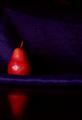
red pearby the99Comment: it is so simple...looks great.
Reminds me of a painting.
"10" |
| Photographer found comment helpful. |
| 04/29/2007 04:34:29 PM |
|
| Photographer found comment helpful. |
| 04/29/2007 04:32:37 PM |
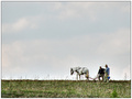
My Ancestorsby GiorgioComment: I wish there were more dramatic colors in the sky, but it is still a great image. "9" |
| Photographer found comment helpful. |
Home -
Challenges -
Community -
League -
Photos -
Cameras -
Lenses -
Learn -
Help -
Terms of Use -
Privacy -
Top ^
DPChallenge, and website content and design, Copyright © 2001-2026 Challenging Technologies, LLC.
All digital photo copyrights belong to the photographers and may not be used without permission.
Current Server Time: 04/02/2026 04:25:59 PM EDT.