| Image |
Comment |
| 05/15/2007 04:40:22 AM |
|
 Photographer found comment helpful. Photographer found comment helpful. |
| 05/15/2007 04:39:24 AM |
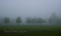
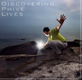
Dead Poets Legionby bmartuchComment: thinky and arty.
Wrong aspect ratio for an album cover, but I'll give it a 9 just the same. Reminds of me 60s/70s hippy music... |
| Photographer found comment helpful. |
| 05/15/2007 04:37:59 AM |
Deathmetal Played Loud by PedroComment: omigawd!
I should give you a 1 just on principle alone. I can't believe you gave me a hair metal flashback.
The colors are great, the font is classic. The whole thing was very well executed, and frankly makes me miss my mullet.
10+ |
| Photographer found comment helpful. |
| 05/15/2007 04:35:34 AM |
|
| Photographer found comment helpful. |
| 05/15/2007 04:34:48 AM |
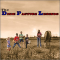
Dixie Pasture Legendsby jasonlpriceComment: The colored clothes don't really jive with the sepia tones. If it were all sepia, or was a selective color B&W, I'd like it a bit more. Conceptually, I like it, but the colors just don't site well with me. Not so bad that it will earn low vote, but not what I would call 10 material, either. 6 |
| Photographer found comment helpful. |
| 05/15/2007 04:32:19 AM |
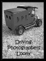
Driving Photographers Loonyby libertyComment: Is that concrete? At first I thought it was carpet. I think I would like it more if it were on dirt. I prefer a higher contrast, too. It just seems to be missing something to make it "pop." But, I do like it just as it sits, it is just asking for more, that is all. 7. |
| Photographer found comment helpful. |
| 05/15/2007 04:30:09 AM |
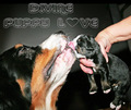
Devine Puppy Loveby SheryllComment: m'eh...
The hand on the pup looks very awkward, the light is harsh. the puppy looks as though it is being fed to the larger dog. I'm sorry, I'm just not in love with it. 4 |
| Photographer found comment helpful. |
| 05/15/2007 04:28:13 AM |
Dip in the Pond of Longevityby tateComment: Great light. The shirt color makes the subject really pop off the image, even if it is in conflict with the rest of the image's colors.
9 |
| Photographer found comment helpful. |
| 05/15/2007 04:25:02 AM |
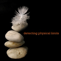
Detecting Physical Limitsby bubeltrubelComment: I'm sure there is a concept here, but it is escaping me. I'm trying to tie the image with the text, but it isn't working. Good exposure, sharp focus. Technically correct, but I just don't "get it."
6 |
| 05/15/2007 04:22:20 AM |
Danish Poultry Leagueby chesireComment: Lovely cool colors, very smooth. The crop is a bit tight for me, and I'm not digging the font, It clashes with the soothing colors. |
| Photographer found comment helpful. |
Home -
Challenges -
Community -
League -
Photos -
Cameras -
Lenses -
Learn -
Help -
Terms of Use -
Privacy -
Top ^
DPChallenge, and website content and design, Copyright © 2001-2026 Challenging Technologies, LLC.
All digital photo copyrights belong to the photographers and may not be used without permission.
Current Server Time: 04/02/2026 01:13:01 PM EDT.