|
|
|
Showing 381 - 390 of ~4058 |
| Image |
Comment |
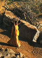
| 01/19/2009 06:32:35 PM | Indian Construction Workerby nancydrew81Comment: This is Kari Ann, greetings from the Critique Club:
composition: she's placed nicely in frame, with the rocks framing her quite nicely on both sides
color: love the color of her dress, and stands out against the sand
contrast: a little more contrast could have been added to the shadows of the rocks and to further separate her from the dirt/sand
focus: from what i can tell, its a little over sharpened in a few spots (i.e. the branches), but on her face its fine. good job though for this being a candid
depth of field: not much, maybe the contrast would have helped further it deeper.
lighting: The harsh lighting add to the barren feel to the image, nicely captured.
other: this image has a lot to say. It may have been a little too abstract for the voters though, as I agree with a commenter before i, this looks like dirt, not sand. But, in that defense, dirt is a type of sand, just dirtier. Anyways, i applaud you for capturing such a good image on the fly, especially the composition, its really good. i hope to see your portfolio grow, you seem to have an eye for special moments like this. If you have any other questions, feel free to PM me anytime, i'll be glad to reply.
-Kari Ann |  Photographer found comment helpful. Photographer found comment helpful. |
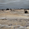
| 01/19/2009 06:19:21 PM | Snowy sandsby ajschelComment: This is Kari Ann, greetings from the Critique Club:
composition: the high horizon is nice, but the image lacks other composition.
color: the redundant color scheme throughout the entire photo give it a sense of lonliness, and as if your lost in the middle of nowhere.
contrast: nice, the bushes are set apart from the landscape very well, giving it more interest
focus: a good choice of general aperture for common focus throughout the entire shot
depth of field: as stated above, very well controlled and its enough, but not too much
lighting: normally not a fan of flat lighting such as this, i think it really adds to the bleakness of the shot.
other: interesting take on the challenge, i really enjoyed how much detail was to be found. the slight dusting of snow on the sand was a new sight for me, and i appreciate you sending this image for us to all see. Keep up the interesting work, i'll be looking forward to it.
If you have any other questions, feel free to PM me.
-Kari Ann | | Photographer found comment helpful. |
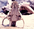
| 01/19/2009 01:04:01 PM | Harsh Environmentby PaulComment: This is Kari Ann, greetings from the Critique Club:
composition: the skull is placed very well in the frame, right along the intersection of the rule of thirds, making my eye go there first, then take in the background.
color: the absence of color throughout the frame works so well for the theme. almost like I am in the desert with sand up my nose.
contrast: great contrast, its so stark, yet, adds so much to the overall theme.
focus: spot on! i love detail, and here i can almost reach out and touch that skull and feel its dry death.
depth of field: again, great use of a shallow DOF.
lighting: making the lighting a lot harsher than it was, was a brilliant idea. The whole scene just evokes desert, from the sand to the skulls to the lighting, its all there and its all being felt.
other: I love this shot. Some may say that this is more about a skull than sand, but, in my eyes, the challenges are not about just using the theme as the main subject, but to use the theme helping another subject. I wish this would have scored higher, as Its a beautiful shot. Keep up the awesome work, i look forward to critiquing more of it. If you have any more questions, feel free to PM me.
-Kari Ann | | Photographer found comment helpful. |
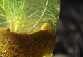
| 01/19/2009 12:57:07 PM | Life in Sandby thekfactorComment: This is Kari Ann, greetings from the Critique Club:
composition: the vase/bowl is positioned nicely in the frame
color: love the soft colors, very calm and natural. i dont, however, like the black in the background, i prefer the white as in your other shot.
contrast: nicely controlled, nothing overpowers.
focus: those little bubbles are in great focus, along with the rock (or whatever the yellow thing is).
depth of field: again, the black is very distracting. the white would have been much more subtle.
lighting: gorgeous lighting, its enchanting.
other: I think your lower scores from this were from the background, the confusing subject matter, and the lack of complete focus on the sand. However, upon a little more time looking this image over, I have grown to really enjoy it. Its almost like peeking into another world. I continue to enjoy looking and evaluating your images, keep up the good work! As always, if you have any other questions feel free to PM me.
-Kari Ann | | Photographer found comment helpful. |
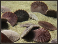
| 01/19/2009 12:50:58 PM | Sand Dollarsby DigiFotoBuddyComment: This is Kari Ann, greetings from the Critique Club:
composition: The lower right sand dollar is a little too close to the edge of the frame, moving a little could have helped that. But, the rest of the dollars are positioned really well in frame.
color: nice, neutral and soft colors, reminds me of the beach.
contrast: very nice contrast, just enough to make them stand out against the sand.
focus: I don't know if the bit of blur was intentional or not. If it was, I quite like the effect it gives, like being underwater. But some people loathe blur like this, so maybe that's were a few of the lower votes came from.
depth of field: great use of depth of field, with only one sand dollar in focus, i see its beautiful details.
lighting: very nice, i love lighting underwater, its so magical.You captured it well.
other: i like this image, but there is just something 'off' about it. i don't know if its just the effect of the glass between the water and the lens, but it looks so surreal. also, the obstruction in the lower left side of the image is distracting. I hope to see more work from you, and you have improved over the course of your stay here at DPC, so don't give up! If you have any more questions, feel free to PM me whenever you like.
-Kari Ann | | Photographer found comment helpful. |
| 01/19/2009 12:42:05 PM | Alone and Brokenby wingyisleedsComment: This is Kari Ann, greetings from the Critique Club:
composition: nicely composed, considering such an odd subject.
color: Colors are nice and earthy. i like the greens in the wood, they add a lot.
contrast: nice contrast, really nicely controlled.
focus: love the detail you captured in the wood and sand, the footprints are also a nice touch in focus.
depth of field: good choice using f4, makes the wood posts detail even more pronounced.
lighting: After reading through the comments, I agree with them. The sky is just too bright, and could have been better either at sunrise or sunset.
other: overall, this is an 'OK' photo. I like the subject, and the title relating, but it just doesn't have enough 'WAPOW!' to send me over the hills for it. I think this is where your score was effected. Also, that sky was probably a big factor in the lower votes, and a little distraction is the pole out in the water, perhaps you could clone that out as well. But you defiantly have an eye for unusual yet interesting things, and you compose them beautifully. I hope you achieve your 6+ score goal soon, you're so close! Keep it up! If you have any other questions, feel free to PM me.
-Kari Ann | | Photographer found comment helpful. |
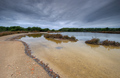
| 01/19/2009 12:32:25 PM | The shore limitby GabrielSComment: This is Kari Ann, greetings from the Critique Club:
composition: The shore line creates a very nice leading line for the photo. also, the horizon is in a good spot, as each of the bushes lead your eye to the center of the image. But, with that, there isn't a subject in the center, so it kinda loses that impact.
color: nice colors, but all a little bland. non have a concrete 'pop' effect. that may have been what you were going for though, so i'll leave it at that.
contrast: good contrast, but the sky could have really been pushed to the limit here, making it much more dramatic.
focus: good focus, nice use of a small aperture for overall sharpness
depth of field: again, good choice of f14.
lighting: nice overcast lighting
other: to me, this could have been much more dramatic, especially that you used HDR. But, some like to keep it simple, and i think this is what you were going for. i think that's what may have hurt your score, it just didn't have enough pop or WOW effect. I think this is a nice image, so to each his/her own, i suppose. Keep shooting, I'm looking forward to watching your profile grow! If you have any questions, feel free to PM me any time.
-Kari Ann Message edited by author 2009-01-19 12:34:02. |
| 01/19/2009 12:22:09 PM | Human Comfortby bspurgeonComment: This is Kari Ann, greetings from the Critique Club:
composition: the puppy fits perfectly in the frame, and his eyes fall right in the rules of thirds, drawing me into his gaze. nicely done
color: sepia is a perfect choice for the mood, very soft and comforting
contrast: maybe a little less contrast between his face and the arm of the chair would have been nice, but at the same time, i like it, so im at a draw in that department, haha.
focus: spot on, his eye is in perfect focus
depth of field: awesome. glad you used a wide aperture so those eyes can really pop
lighting: gorgeous lighting, great find.
other: i love this photo. The lighting and mood of it just evoke comfort and lazy Saturdays. I hope you are proud of this shot, you should be. And that ear propped up? Is just about the cutest thing...ever. Congrats on the top 10 finish! Hope this comment was useful to you. If you have anymore questions, feel free to PM me anytime.
-Kari Ann | | Photographer found comment helpful. |
| 01/18/2009 07:05:22 PM | In Her Toesby OmanOtterComment: This is Kari Ann, greetings from the Critique Club:
composition: the women is placed very well in the frame, she sits along a great intersection in the Rule of Thirds, taking my eyes right to her upon opening. Also, the beach adds a good leading line.
color: As stated before, the blues are a little overpowering. Maybe if she were wearing another color besides the same blue of her outfit, she would have popped out more, and the blues could have been laid off a bit.
contrast: good contrast overall, everything it set off nicely.
focus: nice focus on the subject, can plainly tell the women is the main focus.
depth of field: A deeper depth of field should have been used. In this case, the sand is out of focus, and thats the main theme of the challenge.
lighting: I like the lighting. Perhaps next time you can wait a little longer till sunset or near sunset, that way the blues will be a broader range, and the lighting will be more diversified, not so flat.
other: for me, this is an average photo yearning to be above average. I think with a few little tweaks in timing, clothing, and aperture could have really set this out from the pack. So with that being said, i hope you'll take the advice of others and keep up the shooting! You've got the eyes for sure to see photographic potential. i hope this critique helped you. if you have any other questions, feel free to PM me.
-Kari Ann |
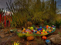
| 01/18/2009 06:56:51 PM | Sand... the Nature of Glassby AndyMac24Comment: This is Kari Ann, greetings from the Critique Club:
composition: the basket of glass objects is placed very well in the frame, along with the higher horizon.
color: Those colors just burst off of the page, working very well against the more subdued colors of the surroundings.
contrast: very nicely controlled even due to all the things going on in the image.
focus: sharp, and very well controlled, meaning its not over sharpened
depth of field: glad you didn't choose a wider aperture so that everything can remain in focus
lighting: good lighting, and good idea to use HDR, really makes this image stand out.
other: At first glance i had no idea what your picture was about or what it was supposed to represent, but with further analysis, its grown on me. Great job at choosing something different from everyone else, its nice and refreshing. Also, I see there is a little bit of artifacting around the edges of the grasses in the upper left corner. This was probably caused by compression in image size in post processing, or perhaps the HDR of that particular spot was hard. Anyways, it doesn't detract, but just a little note to be aware of in the future. i hope this critique was useful to you. If you have any other questions or concerns, feel free to PM me any time.
-Kari Ann | | Photographer found comment helpful. |
|
Showing 381 - 390 of ~4058 |
Home -
Challenges -
Community -
League -
Photos -
Cameras -
Lenses -
Learn -
Help -
Terms of Use -
Privacy -
Top ^
DPChallenge, and website content and design, Copyright © 2001-2026 Challenging Technologies, LLC.
All digital photo copyrights belong to the photographers and may not be used without permission.
Current Server Time: 06/16/2026 09:41:28 PM EDT.
|