|
|
|
Showing 351 - 360 of ~4058 |
| Image |
Comment |
| 01/25/2009 05:18:32 PM | Smileby landon1013Comment: This is Kari Ann, greetings from the Critique Club:
composition: the subject is placed nicely in the frame, her shoulder leads the eye right up to her face and eyes
color: a little flat and orange, this could have been caused by the white balance. that or the lighting in the room was a bit flat
contrast: nicely controlled contrast. nothing overpowers the women, thus making her the main subject and the first thing our eyes go to
focus: focus is good, clearly on the subject of the image
depth of field: an increased or shallower depth of field would have made this better to blur the background person more.
lighting: pretty flat, either due to weird lighting or strong flash.
other: overall, its a good portrait of a very pretty girl with a strong smile. But, the lighting, artifacting (see yospiff's comment) and distracting background all degraded the beauty of the image. i think with a little more practice, you can really set your portraits apart from the pact, and get your score higher. keep trying, and i look forward to seeing you improve. If you ahve any more questions, feel free to PM me.
-Kari Ann |  Photographer found comment helpful. Photographer found comment helpful. |
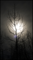
| 01/25/2009 03:32:57 PM | I will bloom againby BJokerudComment: This is Kari Ann, greetings from the Critique Club:
composition: the trees surrounding the main tree are a good leader for the eyes, but maybe having the moon in more of the top upper half of the photo would have helped. to get this achieved, i think a wider angle would have worked better.
color: lovely toning in sepia/black&white. it adds a surreal feel to the image
contrast: good contrast, enough to keep the trees intact, but not loosing the beautiful sky as a backdrop
focus: focus is very nicely achieved, i know how hard it is to focus at night, even manually. good work
depth of field: everything in frame is sharp, crisp, and easily recognized.
lighting: spooky find in lighting, the moon almost resembles the sun. the choice of a longer exposure allowed those little stars to come through the frame, very nice.
other: overall, a very nicely composed and thought out shot. i think what killed your score was the flare from the moon, but as you mentioned in the comments, you'll try harder next time to figure out what causes that and how to fix it if it does occur. I hope you continue to enjoy DPC and enter in the challenges. Your work already is improving and im looking forward to watching it grow. If you have any other questions, feel free to PM me.
-Kari Ann | | Photographer found comment helpful. |
| 01/24/2009 02:00:25 AM | Scotch Tape Warby incubusComment: interesting use of tape! haha, nicely done with the expression as well, very ,"woa man, what the crap happened with the tape" | | Photographer found comment helpful. |
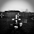
| 01/24/2009 01:59:18 AM | Till Death Do Us Apartby hlinnetComment: This is Kari Ann, greetings from the Critique Club:
composition: the center composition of the gravestone and the two girls equally spaced from it make this a very standard composed image. nothing wrong with it, but some don't fancy it. i however, think this portrays the space between life and death, amongst other things.
color:sepia is a great choice for such a moody image.
contrast: the contrast is a little harsh in the bottom portion of the image, but i find the rest of the image pretty well controlled in this area.
focus: good focus on the main subject of the grave, and i like how the girls were in focus as well, but they're merely moved.
depth of field: i feel the house adds interest and more depth to the photo, not a distraction.
lighting: moody lighting, and great sky, very stark and barren
other: i think this should have score much higher than it did. the only reasons i think people may have underestimated this photo is for the darker subject theme, and the harsh contrast. but, as for me, this portrays so many things: the children grieving for their lost loved one, the space in time between life and death, the space between young and old, dead and living, spirit and body, ect. you captured such a great thought provoking image. my hats off to you. if you have any other questions, feel free to PM me anytime.
-Kari Ann |
| 01/24/2009 12:51:07 AM | Day 23 - Jasonby shalrathComment: what a sweet little boy, as with the other ones, i love the colors you achieved, very light and sweet. | | Photographer found comment helpful. |
| 01/24/2009 12:34:13 AM | The Walk of Lifeby Rainbow-Coloured-SoulComment: This is Kari Ann, greetings from the Critique Club:
composition: the leading lines of the bridge, the pathway, and all the vertical lines really draw your eye to the stranger in the composition, with that being said, i love the addition of the man, he is an essential part of the picture, and adds interest
color: sepia tone is managed perfectly. no overdoing it here.
contrast: the deep contrast really works well, offsetting the subject and adding emphasis to the leading lines
focus: the background being a tad blurry dosent bother me, but for some it may. i feel it helps focus the eye more on the man.
depth of field:again, this is a personal taste, but i like the shallower depth of field, some may find it distracting though.
lighting: beautiful lighting, well done.
other: i love this photo, its so solemn yet portrays the message of hope. i agree with other commenters though, the white on the top of the photo could have been cropped out to help emphasize the lines to the man. but its nothing major, just a small improvement to an already great photo. congrats on your new personal best as well, this is definitely worthy of it. If you have any other questions, feel free to PM me anytime.
-Kari Ann | | Photographer found comment helpful. |
| 01/24/2009 12:14:23 AM | | | Photographer found comment helpful. |
| 01/24/2009 12:14:03 AM | | | Photographer found comment helpful. |
| 01/24/2009 12:13:26 AM | Day 20 - Sallyby shalrathComment: something about this photo made me just love it the moment i saw it. the joy on the girls face, the atmosphere, the motion of twirling the girl is experiencing, and myself is experiencing just looking at the photo. great joy, great movement, great captures. love it. | | Photographer found comment helpful. |
| 01/24/2009 12:12:11 AM | Day 19 - Lilyby shalrathComment: she is so pretty! i love the combination of different fun colors you used, from the light greens to the light pinks, to the pale blues, all work together into making an interesting yet cute photo. great job. | | Photographer found comment helpful. |
|
Showing 351 - 360 of ~4058 |
Home -
Challenges -
Community -
League -
Photos -
Cameras -
Lenses -
Learn -
Help -
Terms of Use -
Privacy -
Top ^
DPChallenge, and website content and design, Copyright © 2001-2026 Challenging Technologies, LLC.
All digital photo copyrights belong to the photographers and may not be used without permission.
Current Server Time: 06/15/2026 04:08:28 AM EDT.
|