|
|
|
Showing 331 - 340 of ~4058 |
| Image |
Comment |
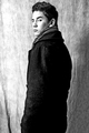
| 02/02/2009 11:12:20 PM | Piercingby taylorpageComment: This is Kari Ann, greetings from the Critique Club:
composition: The crop emphasizes the subjects height, and it almost emits the look of him being 24 feet tall. I think this is a great thing in an Ansel Adams Challenge, he tried to capture the heighth and beauty of all the things around him. Well thought out in that contrast.
color: Of course, the Ansel Adams challenge is supposed to be in Black and White, you controlled the tones very well.
contrast: Perhaps a little less contrast on the back of the coat would make the image more soft. But, i think, as well, that the harsh contrast provides emphasis to the title and the entire tone of the image.
focus: Good focus, sharp.
depth of field: i like the background in focus, the textures are reminiscent of those in nature, thus referring back to the theme of the challenge, which is Ansel, and, in a sense, Ansel and nature were one.
lighting: Very dramatic lighting, I keep wanting to say that the bright light to the left is a little distracting, but at the same time, i feel it adds such a definite high light to the image that i feel it would be bland without it.
other: overall, i really enjoy this image. The tones are rich and the full range is present. I can see why some may have voted this photograph down for the lack of a picture of some surreal and otherworldly landscape image, but I also cannot see why they cannot have voted it up for its mere beauty of capturing the dramatic lighting and mood of the image. To each his own, i suppose. You should be very pleased with how this image turned out. And, with this being a self portrait, it adds to a list of self portraits that continue to inspire me to do more. I hope this comment was helpful to you. If you have any questions, feel free to PM me.
-Kari Ann |
| 02/01/2009 07:18:16 PM | wonderingby GiorgioComment: awesome editing and the expression captured is so raw and true |  Photographer found comment helpful. Photographer found comment helpful. |
| 02/01/2009 02:52:58 PM | Playfulby choltmeierComment: This is Kari Ann, greetings from the Critique Club:
composition: very good composition. she is placed well in the frame and my eyes go directly to hers.
color: the reds compliment each other very well here, which is a hard feat. Usually the same color on color dosent look good, but the polkadotted shirt really adds to the contrast between the two. great job.
contrast: good contrast, perhaps a little more contrast in her eyes would have made them pop a little more, but thats just me
focus: I agree with you and others, a little less shallow DOF would have put her mouth and eyes in focus, making the image even more fun. But, It dosent bother me that much, honestly.
depth of field: already talked about.
lighting: I think the lighting is well controlled. I dont think its too bright at all, to me it looks perfect.
other: I saw this image during voting and thought, "What a cute shot! Its going to place pretty high" It looks like it got a real nice score in the end, so congrats to that. The only thing I can think of that the voters may have voted you down on was the DOF. But, live and learn. You should be very happy with this adorable shot anyways. Keep up the great work, and If you have any other questions, feel free to Pm me.
-Kari Ann | | Photographer found comment helpful. |
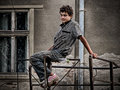
| 02/01/2009 02:46:27 PM | Master Millardby wingwhamComment: This is Kari Ann, greetings from the Critique Club:
composition: Centered composition works well here, putting the subject in the center of the frame gives the viewer a full shot of his face and the subtle background objects help complete the photo
color: Black and white seems to be a good choice here, I dont know though, perhaps a little color would have given the photo a little more depth to what he does or what he is about
contrast: a bit more contrast in his eyes could have made them pop more, but overall very well done
focus: good focus on the subject. Everything in his face is nice and sharp
depth of field: I'm torn here. I wish the background were blurrier, but at the same time i like what it adds to the subjects environment.
lighting: as you stated, its a bit harsh, but i think it adds to the feel of his personality, very rough but powerfull.
other: This is an average shot. Nothing really extraordinary to make it stand out against all the others. I do like the composition and the theme, but it may have been stretching it for some voters not knowing what a "Master" is or what this guy may really be about. I think his expression may have thrown them off too, it looks too startled. Perhaps a shot of him doing his work (actually doing it) would have been better. I hope to see your portfolio get more work in it as time progresses, you have a unique eye and it'll be interesting to see what you can come up with. If you have any other questions, feel free to Pm me anytime.
-Kari ann | | Photographer found comment helpful. |
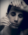
| 02/01/2009 02:37:03 AM | Rough Dayby incubusComment: awesome, i love the emotion that comes out in the image. it was great fun watching your work this month, and i'll be keeping an eye out for more of it! | | Photographer found comment helpful. |
| 01/27/2009 08:09:43 PM | Alana-and-Brooke-2.jpgby jomariComment: i really like this shot in black and white, really brings out the magical light you captured in their faces. really nice | | Photographer found comment helpful. |
| 01/27/2009 08:09:08 PM | blurby JessiComment: eh, too much blur for me. but its your photo, so do as you want! | | Photographer found comment helpful. |
| 01/26/2009 12:27:36 AM | Arielby stupidcatComment: not a fan of the hand by the face, but i like the soft smile she's giving. also, her eyes are again well lit | | Photographer found comment helpful. |
| 01/26/2009 12:26:58 AM | The Veilby stupidcatComment: my favorite of your new bunch, interesting and thought provoking for sure! i love it | | Photographer found comment helpful. |
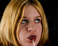
| 01/26/2009 12:26:26 AM | Kojak's Lollipopby stupidcatComment: another nice one, the chin bothers me somewhat, but theres nothign you can do, as you said. i really like her eyes in this, very nicely done! | | Photographer found comment helpful. |
|
Showing 331 - 340 of ~4058 |
Home -
Challenges -
Community -
League -
Photos -
Cameras -
Lenses -
Learn -
Help -
Terms of Use -
Privacy -
Top ^
DPChallenge, and website content and design, Copyright © 2001-2026 Challenging Technologies, LLC.
All digital photo copyrights belong to the photographers and may not be used without permission.
Current Server Time: 06/15/2026 04:08:39 AM EDT.
|