|
|
|
Showing 321 - 330 of ~4058 |
| Image |
Comment |
| 03/15/2009 02:17:17 PM | |  Photographer found comment helpful. Photographer found comment helpful. |
| 03/06/2009 12:24:24 AM | sm JB B&W.JPGby avalanche1030Comment: nice, I think a further darker of the background would help make him pop in the picture more, but other then that, i think its well done!
| | Photographer found comment helpful. |
| 02/28/2009 07:52:22 PM | | | Photographer found comment helpful. |
| 02/06/2009 01:13:27 AM | | | Photographer found comment helpful. |
| 02/06/2009 01:05:43 AM | | | Photographer found comment helpful. |
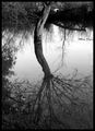
| 02/05/2009 10:42:44 PM | Arboreal Reflectionby inamoComment: This is Kari Ann, greetings from the Critique Club:
composition: interesting composition, i like how you can see the trunk, but the rest of the iamge has to be viewed by reflection
color: black adn white conversion is very nice, good tones
contrast: again, the tones are very well controlled, and the full spectrum is there to make it visually appealing
focus: good focus, and even the reflection is still pretty well discernible
depth of field:pretty safe aperture, but works well
lighting: nice evening lighting im assuming. makes the tones in the water really stand out against the dark banks of the water
other: a pretty picture, but not much else going for it. the composition could have been helped by getting rid of the bank in the lower left corner, but this may have been the safest composition you could be accessed to. only downfall is the overall 'wow' of the image, it lacks 'wow'. I really hope this critique was helpful to you. If you ever have any other questions regarding, please feel free to PM me whenever.
-Kari Ann | | Photographer found comment helpful. |
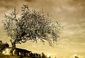
| 02/05/2009 10:30:47 PM | Tomb On One Tree Hillby MsAmbrosiaComment: This is Kari Ann, greetings from the Critique Club:
composition: composition is good, the tree fills up the upper part of the frame nicely, but there is little in the lower half to keep the interest. perhaps a little zooming out would have filled this better
color:the colour filter you applied works ok, but a little toning down of the intensity would have been more appropriate.
contrast: good contrast, love the sky and the shadows on the barn
focus: great focus, the tree is nice and sharp, without loosing the detail of the sky
depth of field: a generally safe aperture used here, but it works to the photos advantage of keeping everything sharp
lighting: great find in the lighting. the tree is lit beautifully, and the sky has just enough light to keep it interesting and still have depth.
other: the only downfall i can possibly see to your image is the overpowering filter you applied, and the absence of anything in the lower half the the frame. ?Otherwise, a very nice image. i hope this critique was useful and constructive for you. If you have any other questions, feel free to PM me.
-Kari Ann |
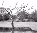
| 02/05/2009 10:21:45 PM | Dead Wood & Waterby PaulComment: This is Kari Ann, greetings from the Critique Club:
composition: good composition wise, the tree falls nicely in the rule of thirds.
color: gives the image a bit of an IR feel being in black and white
contrast: more contrast between the background and the tree in the foreground would have worked better IMO (and as others have stated)
focus: (see below)
depth of field: either a different angle or a more dramatic approach to the image would justify the use of the f4.0, here the background is too distracting to the eye, and the slight blur makes it even more annoying.
lighting: lighting is ok, but a bit on the flat side, maybe a more pronounced sky would have helped break up the white sky
other: I left the focus empty for a reason, mostly because I feel that the image has no real focus. The trees in the background severely compete with the main tree, and even though the main tree is in focus, its lost in a sea of slightly OOF trees. i have viewed your portfolio many a time, and feel this is not one of your more focused shots. Try revisiting this spot and seeing what else you can come up with, because i know this spot has potential, it just needs a little push for it to get there. i hope this was more constructive than mean, because thats what im trying to do, help others to help myself. If you have any more questions at all, you are more than welcome to PM me anytime.
-Kari Ann | | Photographer found comment helpful. |
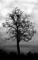
| 02/05/2009 10:10:10 PM | Forlornby witt34Comment: This is Kari Ann, greetings from the Critique Club:
composition: here is an example of where centered composition works extremely well and to the advantage of the photo. The tree is so dominant that i can stare at the intricate details of the branches for hours. very well done
color: black and white is a great choice for this shot, it adds such drama
contrast: High contrast works wonders here, allowing the tree to really be separate against the ominous clouds.
focus: spot on, very sharp throughout the entire frame and exceptionally well on the tree
depth of field: cant say much here, but i can say that the choice of 5.6 was obviously a good one.
lighting: great lighting here, perfect weather for the location and the mood of the image
other: great job on such a powerful image. It brings the viewer in, and makes them sit there and look for a minute or so. Great find, and great finish in such a array of good images. Also, congrats on the new personal best! If you have any more questions, feel free to PM me anytime.
-Kari Ann | | Photographer found comment helpful. |
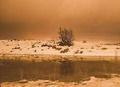
| 02/05/2009 10:04:56 PM | Alone at nightby diverssComment: This is Kari Ann, greetings from the Critique Club:
composition: a different composition could have helped this image drastically. The subject (tree) is too centered in the frame, and without any interesting surrounding elements (spare the water) helping pull the viewer in, this composition is too boring
color: The colors are strange and a little too one-toned for most tastes, including my own.
contrast: more contrast could have really helped this image as well. everything seems too flat and monotonous.
focus: focus is a little on the soft side, but reasonable for such a long shutter speed
depth of field: perhaps a f-stop of 8.0-16 would have been more effective here, producing a sharper image, and more depth of field
lighting: unique night lighting, the lights in the background, however, only serve as a distraction to me. but if they were kept for a reason, then disregard.
other: tweaking with the tones, the color and the composition could really have helped this image out a lot. This photo has no 'pop' factor for the viewer, and thus resulting in the below average ending. I do hope, however, that this has given you a chance to learn from a few misshaps, and grow stronger as a photographer. I also hope you enjoy your newfound time here at DPC, and look very much forward to the growth of your portfolio in the months to come. If you have any further questions, feel free to PM me.
-Kari Ann |
|
Showing 321 - 330 of ~4058 |
Home -
Challenges -
Community -
League -
Photos -
Cameras -
Lenses -
Learn -
Help -
Terms of Use -
Privacy -
Top ^
DPChallenge, and website content and design, Copyright © 2001-2026 Challenging Technologies, LLC.
All digital photo copyrights belong to the photographers and may not be used without permission.
Current Server Time: 06/16/2026 11:49:40 AM EDT.
|