| Image |
Comment |
| 10/03/2008 12:21:35 PM |
Forsakenby bucketComment: I think you gave the half-portrait pictures a nice nwe touch: I like that her head tilted to the side slightly. |
 Photographer found comment helpful. Photographer found comment helpful. |
| 10/03/2008 12:16:36 PM |
old oneby shoggyComment: I wish you had cloned out the lantern and the air condition below the window. Nice textures in the stones. |
| 10/03/2008 12:13:46 PM |
a muse meant parkby posthumousComment: Bumping you up (from a 4 - my initial reaction for being too messy) to a 7. For the artistry, almost impressionism. |
| Photographer found comment helpful. |
| 10/03/2008 12:06:05 PM |
Anticipationby AngadeonComment: while having a good balanced composition, there is nothing real exciting going on in this picture. May be taking a leaf blower and throwing up some leaves could bring some life into it? From a more technical side: increasing contrast (levels/curves) would add much depth. Right now it appears flat and washed out. I'm sure you don't remember the scene like this. You might remeber it full of colors with beautiful strong yellow leaves. Right? |
| Photographer found comment helpful. |
| 10/03/2008 12:00:50 PM |
|
| Photographer found comment helpful. |
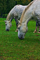
| 10/03/2008 11:59:24 AM |
Dinner time on the farm.by DeniseComment: I believe an other crop could make this picture much more interesting. From my point, the focal point are the heads of the grassing horses. By adding so much space around them, you take this focus away. Did you think about a real tight crop around the heads only? On my monitor the freens are too saturated. |
| Photographer found comment helpful. |
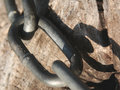
| 10/03/2008 10:09:04 AM |
macro-3.jpgby incubusComment: Oh, so long published and not a comment yet?
I like your composition with the shadow included into the frame.
Here a few suggestions: try working on the contrast with levels and curves; similar to your 2nd entrance. THis pic looks a bit flat.
THe second comment: the focus seems to be right in the middle on the center link. But there is nothing going on where you have the focus. Moving the focus to a point where 2 links meet could increase the interest? |
| Photographer found comment helpful. |
| 10/03/2008 09:02:43 AM |
|
| Photographer found comment helpful. |
| 10/03/2008 08:56:52 AM |
Mr. Elephant Beetleby sherpetComment: Lovely details and colors. Amazing details. And you managed to not blow out the reflections n the bug's head. GReat job! |
| Photographer found comment helpful. |
| 10/03/2008 07:45:55 AM |
An God Said, Let There Be Light.by twotkynsComment: IMO very over-processed. I'm sure other voters might like this processing. If the sky really would be that red, where is the warm red tone on the ground? Wouldn't all of the picture have a strong redding tone? |
Home -
Challenges -
Community -
League -
Photos -
Cameras -
Lenses -
Learn -
Help -
Terms of Use -
Privacy -
Top ^
DPChallenge, and website content and design, Copyright © 2001-2026 Challenging Technologies, LLC.
All digital photo copyrights belong to the photographers and may not be used without permission.
Current Server Time: 06/23/2026 01:01:43 PM EDT.