| Image |
Comment |
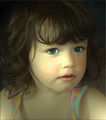
| 03/21/2007 04:10:51 PM |
Moniqueby trainComment: cute picture but the lighting does not work for me. too much light on her right cheek |
 Photographer found comment helpful. Photographer found comment helpful. |
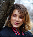
| 03/21/2007 04:08:01 PM |
"Whitney"by tfarrell23Comment: eyes need a bit more light, background too bright. the shadow of the tree trunk takes away the light falling into her eyes. this let's the contrast foreground to background be too big. just my thoughts |
| Photographer found comment helpful. |
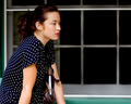
| 03/21/2007 04:04:45 PM |
In Thoughtby moviemanComment: nice use of the negative space to the right supporting her view into nowhere |
| Photographer found comment helpful. |
| 03/21/2007 04:02:42 PM |
|
| 03/21/2007 04:01:56 PM |
|
| Photographer found comment helpful. |
| 03/21/2007 04:00:39 PM |
|
| Photographer found comment helpful. |
| 03/21/2007 04:00:08 PM |
Tear for a Friendby StrikeslipComment: IMO the white of the eye is a bit overprocessed and too white. Clarity and sparkle of the pupils are great |
| Photographer found comment helpful. |
| 03/21/2007 03:53:48 PM |
|
| Photographer found comment helpful. |
| 03/21/2007 03:52:19 PM |
Sarahby jasonlpriceComment: IMO the pupils are standing out a bit too much. Are they really that dominant? |
| Photographer found comment helpful. |
| 03/21/2007 03:50:38 PM |
Alejandraby AranchaComment: I like the tight crop. lots of work getting the eyes so clear and crisp |
| Photographer found comment helpful. |
Home -
Challenges -
Community -
League -
Photos -
Cameras -
Lenses -
Learn -
Help -
Terms of Use -
Privacy -
Top ^
DPChallenge, and website content and design, Copyright © 2001-2026 Challenging Technologies, LLC.
All digital photo copyrights belong to the photographers and may not be used without permission.
Current Server Time: 06/22/2026 04:32:39 PM EDT.