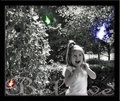
DPChallenge: A Digital Photography Contest You are not logged in. (log in or register
 
Browse Settings
Currently viewing:
Registered UserHeiSch

Show comments:

Per page:

Order:

Comments:


Comments Made by HeiSch
Pages:   ... [201] [202] [203] [204] [205] [206] [207] ... [312]
Showing 2031 - 2040 of ~3119
Image Comment
love at first site.
08/03/2007 08:24:16 AM
love at first site.
by ShannonLee

Comment:
Impossible to plan. the face, the lines of heads that lead right into the eye-to-eye contact. This is one of the strongest pictures so far.
Photographer found comment helpful.
Dancer
08/03/2007 08:18:36 AM
Dancer
by Germaine

Comment:
My first impression: this is exactly how I remember flamenco nights in Spain. all fluid motion, nothing frozen. Thanks for bringing back these memories.
Photographer found comment helpful.
from under the canopy
08/03/2007 08:02:57 AM
from under the canopy
by krnodil

Comment:
Honey, I shrunk the kids.... but this one is much better!
Photographer found comment helpful.
blur day 1
08/02/2007 08:00:22 AM
blur day 1
by Elvis_L

Comment:
Elvis,
you know what I like most about this picture? That you can still see the environment around the car. In a lot of the panning pictures you'll only see blurred lines in the background. You have this technique pretty well under your belt. Just out of curiousity: you remember what color the car really was?
Photographer found comment helpful.
S i m p l i c i t y
08/01/2007 08:03:08 AM
S i m p l i c i t y
by JeffDay

Comment:
Congratulations to the top 40 finish, great picture. down to composition basics. You know I love that.
Heini
Photographer found comment helpful.
Believe
07/31/2007 01:03:39 PM
Believe
by CalamitysMaster00

Comment:
Hello Sarah,
well you asked for some comments, so here they come.
First of all, I love the idea of making your own poster for the little girl with fairies.
Composition
Portrait will work much better than landscape. the entire left side, the bush, is not adding anything to your picture. You recognized this probably and then added 2 more fairies to somehow fill this empty space (?). This only thing you really accomplished was that you force the viewer away from what's important: the relation of the girl to the fairy. By only having one fairy in your picture you are focusing the viewer much more on what you want to show.
It is beautiful how you positioned the faily - right into the view of the girl. Fantastic job of her envisioning the fairy, btw.
I would place the writing completely out of the picture as well. Move it to the bottom. You don't want anything even close to the girl and the fairy. Move it out of the picture onto the frame or if you want it in the picure at the bottom but with a much small font.
I also would either crop her closer to the elbow or showing her body completely. That's your preference. Personally I'd go for the closer crop.
Try to figure out your camera how you could create a more shallow DOF. Tis will blur the background and helps focusing on the girl and the fairy.
Pay more attention to the background. one side of her face is dark, the other too bright. This unbalances the viewer and makes it harder to focus on her face. The darker you select the background, the more the girl will stand out, especially with the sun light highlighting her.
Work with levels, curves and contrast to make her pop out of the background even further.

Technical
You could have move the girl into the shade, avoiding the blown out areas of white on ther head, the left arm and parts of her shirt. But I lke your choice better, the blown out areas create a nice dream like look and feel.
Now probably the hardest part for you to swallow (after reading your profile ). You should use something to stabilize your hands when you take pictures. For snapshots to create memories, handheld pics are fine. But here you talk about a poster for your model. This means you will most probably print it in a bigger format. Here it needs to be crisp and sharp. What I learned from this site: if it has eyes - make them sharp. If you still don't like tripods, lean your camera against a tree, a rock, something that does not move. Don't get you hand between the rock/tree. Stabilize with both hands - and yes it will look funny how you look through the viewfinder - and then gently push the trigger. The result will be much crisper. If you decide at the end of your processing that you want the pic softer, you can always apply gaussian blur. The difference is: a blury picture because the camera moves and controlled blur after taking a good sharp shot.
Then there are some details you could work on. And here i"m trying to find the right way myself: sharpening the eyes, slightly dodging the eye-whites and teeth. There are excellent tutorials on this site how to do this.
My last comment: I like your idea of desaturating parts of your photo. What if you desaturate the background, leave the fairy in full color and only slightly desaturate the girl. I would not leave her in full color, but I would not desaturate her completely. This could show the link/connection between the girl and the fairy.
Please don't take this long list of suggestions the wrong way. Just trying to keep a little girl believe in fairies for alittle longer :)
Photographer found comment helpful.
yarn
07/30/2007 07:51:57 AM
yarn
by alexgarcia

Comment:
Congratulations Alex to this beautiful picture. Iparticularly loved you composition (gave you a 9 :) )
Photographer found comment helpful.
Beauty in Decay
07/27/2007 01:02:52 PM
Beauty in Decay
by bergiekat

Comment:
good taste in the seletive desat. nicely done. My first thought was that the photo need straightening until I noticed that this might be impossible to do. A much tighter crop (eliminate the bottom part just above the door) could help focusing on your subject - the window.
Just the opposite on the crop - too tight on the upper corner of the window. The crop would bring the format more into the typical 3:4 ratio.
The tree trunk then becomes a matter of preference. It could set some bounderies for the open space on the left or it could be seen as distracting. Either way you're right or your wrong.
A little more work on curves and contrast would bring out the texture of the weathered bricks. May be you could think of saturating them just enough to guess their color? Just a hint of saturation. I guess they're red - so it would be very nice contrast to the blue window. Just some ideas...
I also guess you decided to use the wide range of your lens?
If you have the chance and go back, try the tele range of your lens and move further away. This will reduce the distortion of the lines of the building.
My final thought: clone out the power line :)

Message edited by author 2007-07-27 13:25:40.
Photographer found comment helpful.
heart to ground.
07/27/2007 12:13:10 PM
heart to ground.
by ShannonLee

Comment:
Now that's a BIG poop bag. And it's ful. Sorry too blurry to identify content. :)
Photographer found comment helpful.
Adios
07/27/2007 12:07:29 PM
Adios
by Germaine

Comment:
I see more of those recently in Jersey.
WHy would you say you blew the mothion blur. You can even almost read the license plate. That's a good shot.
Photographer found comment helpful.
Pages:   ... [201] [202] [203] [204] [205] [206] [207] ... [312]
Showing 2031 - 2040 of ~3119


Home - Challenges - Community - League - Photos - Cameras - Lenses - Learn - Help - Terms of Use - Privacy - Top ^
DPChallenge, and website content and design, Copyright © 2001-2025 Challenging Technologies, LLC.
All digital photo copyrights belong to the photographers and may not be used without permission.
Current Server Time: 12/22/2025 06:26:44 PM EST.