|
|
|
Showing 1111 - 1120 of ~2210 |
| Image |
Comment |
| 07/21/2004 12:49:01 AM | - Miracle! -by ImagineerComment: Hi Jon! I wondered during the voting if this was yours. I'm getting good at spotting certain members' work.
Congrats on placing so well! GOLDEN!
|  Photographer found comment helpful. Photographer found comment helpful. |
| 07/19/2004 02:46:59 AM | Love, Balance, and Harmonyby TranquilComment: C'mon! This is becoming impossible to vote on without bias. This is a good shot that I've seen several times in different variations. How about some originality? |
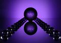
| 07/17/2004 06:29:26 PM | Infinityby RUEDISCHMUTZComment: Greetings from the Critique Club!
This is a difficult kind of photo for me to critique. Comments that come to mind are, "Interesting", "I wonder how this was done?", and "Cool lighting."
For an in-depth critique I need to be more specific and more honest about my appreciation for the image and my viewing experience. The word that comes to mind when I think hard on this photo is 'relevence'. Unlike an abstract composition which is created by framing an existing subject in an unexpected and unusual way, this is a purely set-up abstraction. The enjoyment factor rests entirely on whether or not the viewer finds it a compelling arrangement of form, line, and color. Put another way, an abstract created by framing a small segment of the side of a weathered exterior (by way of example) has some interesting subject matter built in. The viewer may still not appreciate the composition but his ability to recognize that the abstraction was created from the textures, shapes, and colors of a larger object adds something to the viewing experience. He may not know exactly what the larger object is or indeed, how much larger it is then the section he has been allowed to see but theirin lies some of the enjoyment of an abstraction.
A set-up abstraction (in a photograph--I have different feelings regarding abstract painting) doesn't leave the viewer with any questions other than, "how was this done?" and 'what thought process led to this creation?'. Those questions are interesting in a technical sense but not as inherently sastifying (to this viewer) as the more universal experience created by viewing something familiar shown as a small part of a whole. Keep in mind, I don't mean to imply that this is the only way to create an abstract with existing subject matter. My point is more about the use of a subject that is familiar to create an abstraction. While marbles are a familiar object, these have been clearly arranged to create a design. The approach has not been to find the design existing already within the marbles but to arrange them in such a way as to create a completely new design, unfamiliar to the viewer.
This may seem like a lengthy explanation but I have a point. With the photo presented here, one either likes the design, doesn't like it, or is indifferent. Being a work of pure abstraction and imagination, there isn't much else to think about. It doesn't spark a sense of familiarity or meaning to the viewer. I have to admit to falling into the 'indifferent' category. I enjoy the color but I'm just not moved enough by the design elements to have more than a passing interest in the photo. It seems a bit busy to me. I like the look of the main sphere. I think I would have enjoyed this quite a bit if was just a single glass sphere suspended in the ambient purple background. The image does not support the title. I don't experience a sense of infinity from viewing this as there is clearly a beginning and an end. One could argue that a sphere represents infinity, in which case, this would support my feeling that it should just be one sphere in the composition.
So much for the asthetic experience. On a technical level, the lighting works well and seems to be what you were aiming for. The sphere of lavender light echoes the spheres of the marbles. I would suggest a seamless background to remove the line that bisects the frame. Message edited by author 2004-07-17 18:34:39. |
| 07/17/2004 05:49:58 PM | Reading under Purple Light.by biggood53Comment: Greetings from the Critique Club!
While I think the Tiffany lamp has potential as good subject matter I don't care for the way it fights for dominance with the woman's face. The title throws me off a bit. It suggest that I will experience purple light spilling on to the pages of a book. The reality is, the light looks quite warm and golden and we only see a woman's face peering down. She is wearing reading glasses but she could also be sewing, doing a crossword puzzle, or balancing her checkbook as someone else quipped. This suggest to me that the cropping is a bit odd which leads me back to my initial comment regarding the struggle for dominance of subject matter.
My instinct is to suggest a more generous crop so that the viewer can see her activity. Alternatively, you could try a different POV which shows the light spilling onto the pages of her book as she reads. This composition indicates a bit of indecisiveness in choosing a clear focal point. Is it the woman or the lamp? The soft focus on the women helps a bit but her features are still quite visible and add quite a large area of interest that compete with the equally interesting lamp shade. It makes it difficult for the eye to relax. Since this is quite clearly meant to be a relaxing image the dynamics need to be toned down quite a bit.
I do like the placement and cropping of the lamp and the harmony of the jewel tones and the warm, golden light. If the lamp stayed excactly where it is in the composition but the woman was sitting quite a bit further away, perhaps curled up on a sofa, I think it would make for a more balanced composition and a very cozy, pleasing image. Of course, I don't know if this is possible, not knowing what the room is like. This is just how I envision this image working. It could perhaps be done by placing the woman on a cozy piece of furniture under similar lighting but without showing another lamp, and placing the Tiffany lamp several feet away from her on some kind support (a dining room table, a plant stand). Of course you couldn't call it "reading under purple light". The point would be to showcase the lovely lamp shade while keeping it in a warm and human environment. | | Photographer found comment helpful. |
| 07/17/2004 05:25:59 PM | Embarrassmentby KonadorComment: Greetings from the Critique Club!
Ha! My very next photo on the cue after reading your email regarding my first critique!
I liked the humour of this photo but it wasn't a perfect viewing experience for me. I've looked at it pretty carefully and I can only conclude that I find the cropping a bit tight. I think the intent was to get a good capture of their expressions but I would like to see a bit more of the ridiculous costumes and maybe some context, like a smirking glance from a passerby. While I'll agree this is quite obviously an embarrasing situation, their embarrasment would be more keenly felt by the viewer if their humilation was being witnessed by someone other then himself.
I like the color combination quite a bit. I'm not crazy about what appears to be a desaturated background. I think the blurring would have been sufficient to separate the subjects. As it is, the delineation is so sharp they seem almost super-imposed on the background.
I liked the originality of the subject and the street photography quality of the effort. | | Photographer found comment helpful. |
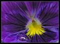
| 07/17/2004 05:11:34 PM | Pansyby nathaliedooComment: Greetings from the Critique Club!
I downloaded this to my Critique Club folder so I could view it in PS and crop out the border which I found really overwhelming and unattractive, point I made rather too bluntly during the voting.
I really enjoy the vibrant contrast between the purple and yellow which, as I'm sure you're aware, are complementary colors. While it is possible that centering the yellow would make a more dynamic composition, I'm not convinced of this. I rather enjoy the off-center placement.
I agree with the other commenters that the water droplet adds a distracting note to an otherwise very simple, dynamic scheme of color and radiating lines. This is just a nit but I feel this could have been cropped to eliminate the blurry patch of grey-blue at the bottom right corner which detracts from the simplicity of the purple and yellow.
This is the kind of composition that would look fabulous blown-up extra-large. |
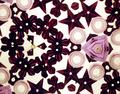
| 07/17/2004 03:08:34 PM | Kaleidoscopeby flip89Comment: Greetings from the Critique Club!
I found myself wanting to like this image more than I did. I like the colors quite a bit. The flower and star sequins are particularly pretty. I think it is the randomness of the composition that detracts from my enjoyment of the subject matter. The pale round beads don't add much interest yet there are quite a few of them in the frame. The lavender object at the right of the frame, while very pretty, isn't a strong focal point.
Therein the problem lies. There doesn't appear to be a main focal point for the eye to rest on long enough to create a satisfying viewing experience. If I were viewing this through a kaleidascope the changeable nature of the toy would create the pleasing viewing experience I'm after. As a still life, this is just too busy for me. You don't mention how many shots you took before settling on this one. It is possible that without enough attempts, the very randomness of the nature of kaleidoscopes would have yielded a more pleasing arrangement then this one. It is certainly worth experimenting with again if you are motivated to do so.
I am impressed at the quality of the image considering you took it from a kaleidascope. That can't have been easy. | | Photographer found comment helpful. |
| 07/14/2004 09:05:37 PM | Design Districtby GinaRothfelsComment: Whoo, the color hurts my eyes. Framing the shot this way creates a tangible connection to the words on the sign. Very good. | | Photographer found comment helpful. |
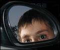
| 07/14/2004 09:02:00 PM | ... Closer Than They Appearby GeneralEComment: Not very original. The focus is a little soft. The extreme pinpoint highlights in his eyes have a creepy effect. This isn't a great use of the surrounding areas of the frame. | | Photographer found comment helpful. |
| 07/14/2004 05:01:26 PM | Sweet readingby xoaoComment: Where have I seen this before? This trick is getting tired for me. It's a good shot so I have to give it at least a five but can this be the last one of these? Please? | | Photographer found comment helpful. |
|
Showing 1111 - 1120 of ~2210 |
Home -
Challenges -
Community -
League -
Photos -
Cameras -
Lenses -
Learn -
Help -
Terms of Use -
Privacy -
Top ^
DPChallenge, and website content and design, Copyright © 2001-2026 Challenging Technologies, LLC.
All digital photo copyrights belong to the photographers and may not be used without permission.
Current Server Time: 07/24/2026 10:16:34 AM EDT.
|