| Image |
Comment |
| 06/16/2007 08:08:11 AM |
Wine anyone?by of-snowComment: This has such vibrant colours but I think you missed it in the lighting. It is too grey.IMO It looks like you used window lighting but did you cast a shadow over your shot? |
 Photographer found comment helpful. Photographer found comment helpful. |
| 06/16/2007 07:55:59 AM |
Girls will be Boys and Boys will be Girlsby alexzenComment: I love the colours in this shot. The only thing is the poster in the background is distracting me from the subject. I found myself trying to find out what the poster is. Otherwise a good shot. |
| Photographer found comment helpful. |
| 06/16/2007 07:53:09 AM |
Got Butterby karmatComment: I like the idea. It looks a little too grey for me. This has much more potential if you had boosted the great colours you have in this pic. Good luck. |
| Photographer found comment helpful. |
| 05/24/2007 09:18:48 PM |
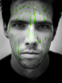
Is It In You?by langdonComment: I want to like this but the rest of him and his expression doesn't seem to me that he has exerted any energy at all to be sweating! |
| Photographer found comment helpful. |
| 05/24/2007 09:09:56 PM |
USA Flagby digitalpinsComment: Would have been nice if the crop was even. Or if the angle of the shot was dead centre. |
| 05/24/2007 09:08:30 PM |
For My Teacherby shalrathComment: I like the perspective. Her two middle fingers are too blown out..not enough detail there. The rest of the pic is good! |
| Photographer found comment helpful. |
| 05/24/2007 09:05:18 PM |
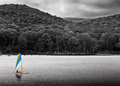
Catamaranby graphicfunkComment: Great tones on the background! The position and the size of the catamaran get lost in the picture even though it is highlited |
| Photographer found comment helpful. |
| 05/24/2007 09:02:59 PM |
The town clockby RUEDISCHMUTZComment: Nice building. Maybe a different perspective might have done better here. I think there are too many power? lines cutting across the image. |
| 05/23/2007 12:52:49 PM |
g r e e nby librodoComment: Absolutely Stunning!! This has Librodo written all over it. If it is not Librodo, Congrats on mastering the excellence of his work. |
| Photographer found comment helpful. |
| 05/23/2007 07:35:34 AM |
|
| Photographer found comment helpful. |
Home -
Challenges -
Community -
League -
Photos -
Cameras -
Lenses -
Learn -
Help -
Terms of Use -
Privacy -
Top ^
DPChallenge, and website content and design, Copyright © 2001-2026 Challenging Technologies, LLC.
All digital photo copyrights belong to the photographers and may not be used without permission.
Current Server Time: 06/22/2026 12:07:34 AM EDT.