| Image |
Comment |
| 07/24/2003 07:13:53 PM |
|
 Photographer found comment helpful. Photographer found comment helpful. |
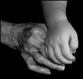
| 07/24/2003 07:12:05 PM |
Reaching for the lightby ladpupmoeComment: Love this picture, the exposure and lighting is superb. It's does appear to be leaning to the right slightly though, except for the right of the image, and the tonality is different on the right. |
| Photographer found comment helpful. |
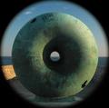
| 07/24/2003 08:28:11 AM |
Round²by mbardeenComment: Matt - Fortunately for us I didn't get down to the sea-front during the week else I was going to enter the same, could've stuffed it for both of us. Well done. |
| Photographer found comment helpful. |
| 07/22/2003 06:27:55 AM |
|
| Photographer found comment helpful. |
| 07/22/2003 06:26:38 AM |
|
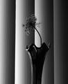
| 07/17/2003 02:48:47 AM |
Body Artby mbardeenComment: Well lit and composed, but as an entry in a "nude" challenge it disappoints. |
| Photographer found comment helpful. |
| 07/16/2003 04:05:05 PM |
Shy by mariomelComment: Great lighing and composition. One of the few cases where a frame is used well - it give the picture a further dimension, the model is being viewed either from above or the front. |
| Photographer found comment helpful. |
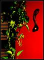
| 07/16/2003 03:59:40 PM |
Maestroby albright1Comment: A very striking image. Personally I find the background too bright on the left - it's caused the left wrist and forearm to be over-exposed. There also appears to be spots on the lens or background in the lower third of the left side. |
| Photographer found comment helpful. |
| 07/16/2003 03:55:12 PM |
Raptureby KarenBComment: Very good use of light and colour (or lack of it). In my top 3 for this challenge. Personally I wouldn't have used the frame and the background is too stark and looks unnatural. |
| Photographer found comment helpful. |
| 07/16/2003 03:52:04 PM |
Reflecting on Anna by dan_pendletonComment: In my top 3 for this challenge. Very good use of colour and very well composed (rule of thirds is hade to be broken). Personally I would have attempted to blend the images slightly, the hard edge on the right of the image distracts slightly (but I'm being very picky at this point!) |
| Photographer found comment helpful. |
Home -
Challenges -
Community -
League -
Photos -
Cameras -
Lenses -
Learn -
Help -
Terms of Use -
Privacy -
Top ^
DPChallenge, and website content and design, Copyright © 2001-2026 Challenging Technologies, LLC.
All digital photo copyrights belong to the photographers and may not be used without permission.
Current Server Time: 07/16/2026 03:43:16 AM EDT.