| Image |
Comment |
| 01/05/2009 08:29:32 AM |
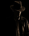
Young Indiana Jonesby stupidcatComment: Composition: I like his positioning in the frame. But, I like mysterious negative space :)
Lighting/Exposure: I am particularly fond of the kicker light you have there in the back. Though his hat seems to be in perfect focus, his face/shirt seem a little oof.
Pose: This pose is perfect for what you are attempting to convey.
Suggestions for Improvements: Try closing that shutter down to f4 or f5.6 to avoid the oof areas when your camera focuses on the closest object that is lit OR force it to focus where you want it to. I would like to see a rim light, like the one on his hair/hat, on his shoulder/torso as well.
I have your type of camera and used it for over a year and a half. If you have any questions, I would be happy to help. Overall this is an excellent low-key photograph. I see improvement. Keep em comin :) |
 Photographer found comment helpful. Photographer found comment helpful. |
| 01/04/2009 03:19:34 PM |
Stopped Motionby MatthewComment: This image is just stunning!! A perfect lighting situation, complimentary colours across the board... New fave! |
| Photographer found comment helpful. |
| 01/04/2009 11:21:05 AM |
Day 3: Haleyby socalsteveComment: Composition: Her positioning in the frame is lovely.
Lighting/Exposure: I love the warm light on her that feels like a sunset. I am not sure why you chose f1.8? Unless it's a really close up photo, it causes too much to be out of focus for a portrait.
Pose: I really like the way you have her posed here. However, she looks a little stiff holding it :)
Suggestions for Improvements: Higher f-stop. Even at 3.5 you are still going to get that beautiful bokeh in the bg. When posing a child, explain to them what you want them to do, then let them rest for a moment (break down the pose) and have them go back into it naturally. With a kid this age, she will remember what position you had her in :)
That little girl is just adorable. Her smile is so winning :) |
| 01/04/2009 11:15:34 AM |
Hello Woodyby incubusComment: Composition: I like the way you placed your face in the frame. Like you are coming out of the edge. I don't care for the loss of your fingertips :)
Lighting/Exposure: Nice light and shadows everywhere but the side of your face near the camera. I'd like to see a bit more light/detail there.
Pose: Again, you have the whole pose thing down pretty well. You convey a thought well.
Suggestions for Improvements: A little more light from the camera side and a small movement of your hand nearer your face. That's it though.
I just love shots that include a little wooden man. Those guys are so darn easy to pose! :) |
| Photographer found comment helpful. |
| 01/04/2009 11:11:31 AM |
hard days nightby photokariangelComment: Composition: I love that you just fell asleep in the tub. I also see that you are making good use of that gorillapod :) hehe
Lighting/Exposure: As always, your light is wonderful.
Pose: I love your arms. Looks very uncomfortable :) hehe
Suggestions for Improvements: Maybe sprawl your legs out to match the arms... but that's it.
This is very different for you. I have never seen you convey quite this sense of turmoil. Your photos are usually very pensive and emotive. This one is much more risque. I like it!! :) |
| Photographer found comment helpful. |
| 01/04/2009 11:08:35 AM |
sydney_day3.jpgby stupidcatComment: Composition: I really like the angle on this.
Lighting/Exposure: You achieved a beautiful soft light by moving that lamp way back :) I also really like the cool lighting, makes it seem like night-time light.
Pose: N/A
Suggestions for Improvements: Actually, none. I rather enjoy the blue/green cast you have going here. I'd like to see this one in B&W as well :) It's very moody.
This daughter is as beautiful as the last! You certainly are lucky to have such cuties :) |
| Photographer found comment helpful. |
| 01/04/2009 10:59:47 AM |
ariel_day2.jpgby stupidcatComment: Composition: I feel the crop on this is a bit tight. A bit more headroom, I think.
Lighting/Exposure: A tad on the bright side. Especially the hair. BUT, I much prefer this non-flash version as you have some interesting light and shadow going on.
Pose: I love her pose here. Her eyes are cut back towards the camera perfectly and her arms say, "GO AWAY!!"
Suggestions for Improvements: From someone that uses constant lighting as well and not flash, remember WYSIWYG. That light there in the back is very harsh on her hair. I would suggest moving both lights back a bit and the one in the rear a bit higher. Also, moving her another foot away from the BG so that it goes blurry. That lens is going to be its sharpest at around f4. When doing a studio portrait, with someone other than a little kid ;), try taking your ISO to 100, putting your camera on a tripod, and adjusting everything else around the metering. You also have remote capture software that came with your camera.
You are lucky to have such a willing model. Again, your daughter is very pretty and certainly knows her moods :) |
| Photographer found comment helpful. |
| 01/04/2009 10:42:43 AM |
Marshall & Syd 2.JPGby avalanche1030Comment: Composition: Much better than the last one. I do prefer the dog and man to be closer. Also with this composition, you have achieved a visual bringing together of the two friends just by moving them a tad closer together.
Lighting/Exposure: Again, bright mid-day light is not a good idea. However, if you ever find yourself in this position again, try these settings: ISO 400, Aperture F5.6, Shutter 1/60s or so.
Pose: I like that the man's shoulders and elbows are at different heights. That helps bring in interest.
Suggestions for Improvements: A little bit of USM in Photoshop might help this. Your focus is a tad soft.
That is simply one of the cutest dogs I have ever seen. You can tell that it is very close with its person. Overall, you did a much better job on this one than the last one. I realize you took them at the same time, but it was wise of you to try different things :) |
| Photographer found comment helpful. |
| 01/02/2009 08:51:49 PM |
morning lightby photokariangelComment: Can I just say that everything about this is appealing? :) The light, the focus, the colour. All are sublime. |
| Photographer found comment helpful. |
| 01/02/2009 11:56:54 AM |
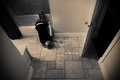
Day 2: Bad Omenby socalsteveComment: Composition: Your placement really draws me in. I am not sure I would want to be the one opening that door! LOL!
Lighting/Exposure: I think you nailed the light for this type of shot. Very nice job catching the blade in the flash as well. I would like to see the door in a bit more focus. Maybe at f8.
Pose: Menacing. Fits this photo very well.
Suggestions for Improvements: The only suggestion is to try a deeper DOF. Your cam is obviously on a tripod, a slower shutter wouldn't have mattered much :)
I can't believe you managed to catch your reflection in a piece of glass. Very nicely done. I wouldn't want to be the one walking through that door! :) |
| Photographer found comment helpful. |
Home -
Challenges -
Community -
League -
Photos -
Cameras -
Lenses -
Learn -
Help -
Terms of Use -
Privacy -
Top ^
DPChallenge, and website content and design, Copyright © 2001-2026 Challenging Technologies, LLC.
All digital photo copyrights belong to the photographers and may not be used without permission.
Current Server Time: 07/16/2026 03:49:27 PM EDT.