| Image |
Comment |
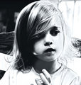
| 01/07/2009 10:44:34 AM |
her handby JutildaComment: Composition: I like the way you managed to keep a sense of purpose and keep her hand in the frame. Great choice for a square crop.
Lighting/Exposure: I like the contrast in this shot. It makes me look much harder.
Pose: N/A candid.
Suggestions for Improvements: None.
I like the duotone. Gives it a lovely old feel. Great to have you in this SC!! :) |
 Photographer found comment helpful. Photographer found comment helpful. |
| 01/07/2009 10:41:59 AM |
Sunkissedby JutildaComment: Composition: Wonderful. I love her placement in the frame.
Lighting/Exposure: Perfect. Backlighting and shadows both work well together here.
Pose: SO cute! I am guessing this is a candid shot, it is lovely.
Suggestions for Improvements: NONE. Keep it just the way it is.
I am so glad you got a new camera when yours broke! What would the DPC community do without lovely new shots like this to look at? :) She is just beautiful and your treatment in post is spectacular. Overall softness but a very sharp set of eyes. I really like this! |
| Photographer found comment helpful. |
| 01/07/2009 10:38:53 AM |
watching my stepby onesaintComment: Composition: Leading lines are wonderful, lovely sense of motion.
Lighting/Exposure: A tad harsh, but nothing that distracts from the loveliness of that baby girl.
Pose: N/A candid.
Suggestions for Improvements: I have no idea what to suggest because I am not familiar LOL!!
She is a true beauty. I look forward to seeing more of what this lens can do with a portrait. |
| Photographer found comment helpful. |
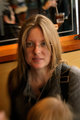
| 01/07/2009 10:32:44 AM |
heatherby onesaintComment: Composition: I would like to see the head in front cropped out.
Lighting/Exposure: Your light is nice here. I am guessing window/available light.
Pose: N/A as it is a candid.
Suggestions for Improvements: Just the cropping of that head :)
These are pretty cool... on to the next one :) |
| Photographer found comment helpful. |
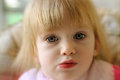
| 01/07/2009 10:31:06 AM |
trapped in the high chair again.by onesaintComment: Composition: I love the closeup. She is looking right into my soul.
Lighting/Exposure: Beautiful and soft. I'd like to see a bit more light on the right side.
Pose: Her expression is so cute here!
Suggestions for Improvements: I'm a bit stuck here as I don't really know about that lens and I have no settings/setup to go by :)
I like lensbaby shots, as a whole. I am interested to see what you do with it. :) |
| Photographer found comment helpful. |
| 01/07/2009 10:15:15 AM |
Tasteby incubusComment: Composition: Nice positioning of all the elements in the frame.
Lighting/Exposure: I like that I can read the labels on the bottles... keeps them from being distracting blobs in the foreground. I lament the loss of detail in the hair.
Pose: Perfect expression.
Suggestions for Improvements: Some more lighting on the hair so it doesn't blend quite so much. That's all I can see though.
I just love some of the expressions on your face in this SC. Keep it up, these are great! |
| Photographer found comment helpful. |
| 01/07/2009 10:11:33 AM |
#3by breadfan35Comment: Composition: I like the way he is in our faces here. Connection is key :)
Lighting/Exposure: Very nicely lit and perfect f-stop choice.
Pose: I'm not fond of straight into the camera shots. Shoulders are slumpy.
Suggestions for Improvements: Tilt or turn the head a little. Raise the right or left shoulder a bit to avoid the slumpies.
Overall, this is lovely. I really adore the catchlight in the eyes. Nicely done. |
| Photographer found comment helpful. |
| 01/06/2009 06:51:33 PM |
|
| Photographer found comment helpful. |
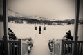
| 01/06/2009 05:41:03 PM |
another low road descendingby photokariangelComment: Composition: I find more to look at each time I look at it. It is crooked but straight, cold but warm, and happy but sad. Wonderful leading lines too!
Lighting/Exposure: Wonderfully soft looking snow, the soft shadows on the porch, the light on the distant mountains. All spectacular. Nice use of f4 here.
Pose: You look cold! :)
Suggestions for Improvements: Ummmmmmm... none, actually.
Another wonderful SP from you, Kari! Simply lovely. |
| Photographer found comment helpful. |
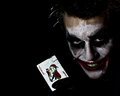
| 01/06/2009 10:06:06 AM |
The Jokerby stupidcatComment: Composition: I like the placement of the elements within the frame.
Lighting/Exposure: Light is good. Focus seems a tad off on the face. It seems that the focal point was on the card and it managed to get the card and the nose :)
Pose: I rather like the pose.
Suggestions for Improvements: A clean card ;) I think that at f4, had you focused on the nose instead of the card, it would have all fallen into the focal plane quite well.
I love your creativity. Looking forward to more :) |
| Photographer found comment helpful. |
Home -
Challenges -
Community -
League -
Photos -
Cameras -
Lenses -
Learn -
Help -
Terms of Use -
Privacy -
Top ^
DPChallenge, and website content and design, Copyright © 2001-2026 Challenging Technologies, LLC.
All digital photo copyrights belong to the photographers and may not be used without permission.
Current Server Time: 07/16/2026 09:32:32 AM EDT.