| Image |
Comment |
| 01/10/2009 10:54:07 AM |
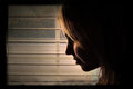
Selfby JessiComment: Composition: I like the way your arms frame your face.
Lighting/Exposure: Lighting is very nice. I look forward to seeing what you do w/this lens!!
Pose: Standard photographer pose. Nice hand cradling the lens there.
Suggestions for Improvements: I would crop this. To just above your head on the top and to just above your elbow on the bottom. When I do it with my hands, it looks much better. Brings your face into the limelight. :)
This is a very candid self portrait. Those come along rarely. :) Keep it up!! |
 Photographer found comment helpful. Photographer found comment helpful. |
| 01/10/2009 10:49:02 AM |
endlessnessby photokariangelComment: Composition: Wonderful vanishing point!!!!!!!!!
Lighting/Exposure: How on earth do you keep finding new places in your house??!! The light is astonishing.
Pose: Looks like you are descending into the light at the end of the tunnel.
Suggestions for Improvements: None.
This is just awe inspiring, Kari. Very nicely found and photographed!! |
| Photographer found comment helpful. |
| 01/10/2009 10:43:29 AM |
#6by breadfan35Comment: Composition: Fantastic leading lines. I am drawn right to her every time.
Lighting/Exposure: GREAT DOF choice! I rather light the light.
Pose: She looks like she is watching for something or someone. Her expression fits well.
Suggestions for Improvements: A removal of the bright spot in the top left corner. Either with a crop or a burning of the highlights.
I like the cool colouring you have going on here. It's very emotive. Makes it feel a bit sad. |
| Photographer found comment helpful. |
| 01/10/2009 10:33:40 AM |
Waters Edgeby incubusComment: Composition: I like the slightly off center comp here.
Lighting/Exposure: Very nice silhouette. I am wondering what f-stop you used. You seem a bit oof but the background is tack sharp.
Pose: Ideal.
Suggestions for Improvements: I would like to see the feet.
These SPs are very moody and dark. Yet they show so much light and beauty in the world. I quite like the contrast between the two. :) |
| Photographer found comment helpful. |
| 01/10/2009 10:30:36 AM |
Lukeby JutildaComment: Composition: I like the choice of centering here.
Lighting/Exposure: Your light is always so beautiful and soft.
Pose: Perfect. I love that he still has a pencil in his little hand.
Suggestions for Improvements: Cloning or cropping of the white paper in the bottom right corner.
Luke looks like he is having a great time playing with you. :) Love this kid's eyes! |
| Photographer found comment helpful. |
| 01/10/2009 10:28:11 AM |
F A T H E Rby bnileshComment: Composition: He looks just a bit confined.
Lighting/Exposure: I appreciate that you managed to keep the glare out of the glasses. Nice light but I would like to see some separation of the subject and the background.
Pose: Nice head tilt.
Suggestions for Improvements: Leaving a bit of space on one side or the other of the shoulder to give a more free appearance. Some kind of light on the background.
This looks to be a very honest conveying of personality. He has a nice face :) |
| Photographer found comment helpful. |
| 01/10/2009 10:23:41 AM |
carry this pictureby incubusComment: Composition: Nice use of negative space.
Lighting/Exposure: Very soft. Good use of dark/light to create a mood.
Pose: N/A face only.
Suggestions for Improvements: A little less darkness between the face and ear or a taking out of the ear totally.
This is so emotional. Love it! |
| Photographer found comment helpful. |
| 01/10/2009 10:21:13 AM |
a lack of colorby photokariangelComment: Composition: Your placement in the frame is perfect. Great leading lines!!
Lighting/Exposure: I really love the way you have managed a sidelit shot with window light.
Pose: Moody. Very nice separation of your chin and torso.
Suggestions for Improvements: None.
Love your editing steps :) LOL!! Again, a fantastic SP from you! |
| Photographer found comment helpful. |
| 01/10/2009 10:14:57 AM |
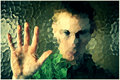
#5by breadfan35Comment: Composition: Very nicely balanced with what we can make out well and what is not so clear.
Lighting/Exposure: Wonderful.
Pose: I really like the hand on the glass. Makes it seem like you are trying to communicate.
Suggestions for Improvements: None.
This is a very cool image. I think it would have done well in the transparency challenge! :) |
| Photographer found comment helpful. |
| 01/09/2009 08:53:36 AM |
Sipby JutildaComment: Composition: Perfect choice for a square crop.
Lighting/Exposure: Wow. That is really beautiful.
Pose: Loving the pose!!!! Title fits so well.
Suggestions for Improvements: None.
I see nothing about this that I dislike. She is a beautiful little girl! |
| Photographer found comment helpful. |
Home -
Challenges -
Community -
League -
Photos -
Cameras -
Lenses -
Learn -
Help -
Terms of Use -
Privacy -
Top ^
DPChallenge, and website content and design, Copyright © 2001-2026 Challenging Technologies, LLC.
All digital photo copyrights belong to the photographers and may not be used without permission.
Current Server Time: 07/16/2026 03:48:12 PM EDT.