| Image |
Comment |
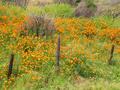
| 04/11/2003 12:19:14 PM |
Wildflowersby bobgaitherComment: Ok, with the goal that you should control absolutely everything you can, I'll ask my question - why did you leave the fence in? If you moved maybe 10 feet to your right, and closer by 2 feet...what about the composition that inclues almost nothing but orange flowers blooming? I think it would be better - though I love this shot just for the colors and warm feel. 8 |
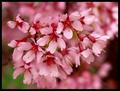
| 04/11/2003 12:16:12 PM |
Pinkby BAMartinComment: Excellent choice of color. I like the focus and the detail is clear. One of the better flower pics this week. (Different color from typical choices too - good). I want to move in on these just a hair - see what's going on even more... but great job. 8 |
 Photographer found comment helpful. Photographer found comment helpful. |
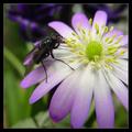
| 04/11/2003 12:13:34 PM |
A Colourful Snackby jimmythefishComment: Thought I left a comment already on this one, but I guess not.
The details are amazing - looking at the hair under the fly and on its legs. The center of the flower is in focus as well - all of which is superb. Nice job throwing the background out of focus - I love this shot. 8 |
| Photographer found comment helpful. |
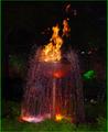
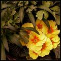
| 04/11/2003 12:11:05 PM |
Fire Fountainby daniComment: Two or three noticeable light distractions in the background.
I am not a big fan of the flash-look here, but I LOVE the colors top and bottom. The center doesn't really have any great interest, but the fountain is pretty unusual.
I would have tried to move a foot higher or closer to cut out the bottom bushes, but not much to do about it now. |
| 04/11/2003 12:06:11 PM |
Cavalinha Boatby britesantosComment: Perfect angle! Why did you cut the tip off? There are two noticeable crop points I don't like - one is the tip of the boat, the other is the bottom tip of the star. The colors are superb - I like how the boat and the sky are both beautiful shades of blue. |
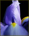
| 04/11/2003 12:01:52 PM |
Temple of Irisby falveyComment: I love the apparent 'door' on the temple and even the walkway. As nice as the color is, I think the yellow on the right is distracting and takes my eyes away from the center. I like the focus but just for kicks - what if they were reversed and the 'path' was clear, while the temple was blurry because it's farther away? |
| Photographer found comment helpful. |
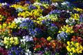
| 04/10/2003 11:21:56 PM |
flowersby jbolingComment: Fantastic amount of colors. How would this look with a slight saturation or contrast boost? It's so colorful - I wish it shined! lol |
| 04/10/2003 11:16:25 PM |
Spring Tonesby jjbeguinComment: This is one of the best 'flower' shots of the week. I like the dark green and the way it's not cropped tightly left and top. I wish the right wasn't cropped off (petals). |
| Photographer found comment helpful. |
| 04/10/2003 11:13:09 PM |
What better colors?by STEINRComment: What better colors... a slightly bluer, less cloudy sky? Good capture, though. I like the feel...the direction seems backwards...weird. 8 |
| Photographer found comment helpful. |
| 04/10/2003 11:11:11 PM |
Little Boy Blueby MaggieGComment: If the choice of outfit for this shot was planned, this shot is fabulous. If it wasn't - great luck! :) Either way, good show. 8 |
Home -
Challenges -
Community -
League -
Photos -
Cameras -
Lenses -
Learn -
Help -
Terms of Use -
Privacy -
Top ^
DPChallenge, and website content and design, Copyright © 2001-2026 Challenging Technologies, LLC.
All digital photo copyrights belong to the photographers and may not be used without permission.
Current Server Time: 06/11/2026 11:13:18 PM EDT.