| Image |
Comment |
| 05/08/2003 01:10:25 AM |
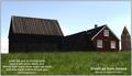
The old house'sby eikidigiComment: I think it's a bit dark and the text is too much. THe building on the right is cool - the ones on the left are a bit too dark to see much detail. |
| 05/08/2003 01:08:38 AM |
|
 Photographer found comment helpful. Photographer found comment helpful. |
| 05/08/2003 01:07:57 AM |
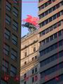
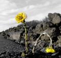
breakthroughby helgihelgiComment: This is a good picture - I'm not sure how good of a postcard it is. It doesn't look appealing - with the one flower bent over and stuff. |
| Photographer found comment helpful. |
| 05/08/2003 01:06:31 AM |
|
| Photographer found comment helpful. |
| 05/08/2003 12:56:57 AM |
.25 cents each / 5 for $1.00by KarenBComment: THE most scenic of the scenery shots. I wish there was some bird or person or lighthouse to catch our attention on - but this is beautiful. 10. |
| Photographer found comment helpful. |
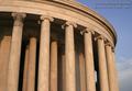
| 05/08/2003 12:42:15 AM |
Jefferson Memorialby magnetic9999Comment: Nice low sunlight. It looks so warm and inviting. I like how the composition fills the majority of the space. I would take this same shot but try to eliminate the trees behind and try a bright blue day - could make this 10 a PERFECT 10! :) |
| Photographer found comment helpful. |
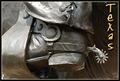
| 05/08/2003 12:40:39 AM |
Texasby DennisFComment: An exellent illustration of what Texas is. Nice accompanying text. Is this part of a statue? I love the crop here. It makes me want to see more. Perfect color - 10. |
| 05/08/2003 12:38:31 AM |
Hi there! Greetings from Frisco!! by Pep VentosaComment: The use of text here clearly enhances, rather than detracts from this shot. The border does well to stay out of the way of a clear, bright and superb shot. Excellent work. I wouldn't change anything - 10. |
| Photographer found comment helpful. |
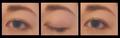
| 05/07/2003 06:57:00 PM |
In the Blink of an Eyeby StevePaxComment: Greetings fromt the Critique Club
Hi Steve!
Composition
I understand your theme well. But what happened in the blink? If we saw more - something more - like an egg dropping from shoulder height to her waist or something - as she blinked. Like "as she's blinking, it's falling." (or some other such nonsense) The crop is very tight.
Color
The colors look just a hair washed out - maybe a bit more brightness and contrast would take that white film look off. I like the colors you do have.
Focus
Looks a bit soft and dreamy. You didn't write what your intent was, so I'll just say it looks soft - if that's what you were going for, congrats. :)
Subject matter
As I said above - I wish there was something to show the timeline of a blink... the eye is good and "blink of an eye" is a great storyline for a triptych!
Overall
I like this shot - I think it has great potential!
Happy shooting and good luck!
|
| Photographer found comment helpful. |
| 05/07/2003 02:46:55 AM |
|
| Photographer found comment helpful. |
Home -
Challenges -
Community -
League -
Photos -
Cameras -
Lenses -
Learn -
Help -
Terms of Use -
Privacy -
Top ^
DPChallenge, and website content and design, Copyright © 2001-2026 Challenging Technologies, LLC.
All digital photo copyrights belong to the photographers and may not be used without permission.
Current Server Time: 06/20/2026 06:00:17 PM EDT.