| Image |
Comment |
| 02/11/2008 03:44:24 PM |
|
 Photographer found comment helpful. Photographer found comment helpful. |
| 02/11/2008 03:43:22 PM |
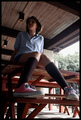
Chucksby ctComment: I'm guessing here that 'Chucks' are the shoes she's wearing ?
They are a nice strong colour to photograph - the only issue is that they get a little lost in the business of the picture. You have a mass of vertical and horizontal lines in this shot, as well as very ligh and very dark areas, all of which lead the eye away from the shoes.
Perhas if you could have gone for a simpler shot, with a less cluttered background ? maybe even get the model to bring her feet up onto the table and rest her chin on her knees so that she is a more compact shape, and the shoes are sideways onto the camera, so we can get to see them in all their glorious pinkness ? :- )
Good luck in the challenge. |
| Photographer found comment helpful. |
| 02/11/2008 03:35:56 PM |
|
| 02/11/2008 03:33:19 PM |
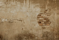
iWall - Giving life to almost each houseby BrokenPelvisComment: I really like what you were after here - I'm just not sure whether it quite works (for me).
I like the shape carved in the plaster, and the mix of a symbol that epitomises stylish minimillism, set into a air of grunge and decay, causing a good dynamic tension. I wonder if you have desaturated this though ?
I think I would have rather seen the plaster whiter (almost stuccoed) and the brick redder . . but that might just be me :- ) |
| Photographer found comment helpful. |
| 02/11/2008 03:29:40 PM |
The gourmet mealby mabesComment: You clearly knew what you wanted to capture here, but have been let down by the technicals. The light temperature is too warm (giving an orange colour)- this means the plate isn't white enough and the food colours don't have enough 'zing' in them. Also the focus is not crisp enough.
that said , at least you get to eat your props afterwards :- ) |
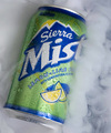
| 02/11/2008 03:26:02 PM |
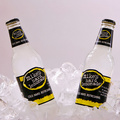
COLD, HARD, REFRESHINGby ace flymanComment: A nice idea - the only issue is that with the bottles both pointing out towards the top corners the visual centre of the picture actually has nothing in it . .
Maybe if you had perched a Lemon on top of the ice right in the middle it would have picked up both on the colour of the lables visually, and the theme of lemonade ? I would also ideally have liked to see the background whiter. On my screen this backdrop is just not crisp and white.
good luck in the challenge. |
| Photographer found comment helpful. |
| 02/11/2008 03:20:38 PM |
Simple but to the pointby SteveBassComment: Ahh what a car . .
These shots can be surprisingly hard to do well, and I think that with a couple of tweaks this could have been much stronger.
The first one is that the focus is not quite perfect - and for thsi sort of simple shot it needs to be absolutely spot on. This may mean a tripod, or may just mean altering ISO to get a high enough speed to steady it.
Secondly, I wonder if it is too central ? I think the reflections of the lights might actually be able to be built into the picture, so that they appear to be almost like clouds with the Lamborghini badge almost being like a hot air balloon floating among them. Perhaps if the badge was brought down closer to the bottom right of the picture, rather than being right in the centre ?
Anyway, best of luck in the challenge. |
| Photographer found comment helpful. |
| 02/11/2008 03:10:26 PM |
|
| Photographer found comment helpful. |
| 02/11/2008 03:09:16 PM |
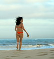
Just follow me....come to Argentine beachesby the99Comment: Nice idea, and I'm sure the Argentinian beaches are very beautiful.
While I like the way the models hair is being blown in the wind, I'm not sure about the grey(ish) skies or the rough seas . . They would be better on, say a windsurfing advert. I'm also not sure what the bottle she is carrying is for or where it comes into the advert.
Good luck in the challenge. |
| Photographer found comment helpful. |
| 02/11/2008 03:01:35 PM |
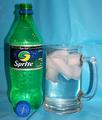
Sprite!by jere2201Comment: Good idea to use a well known product that has a dstinctive colour to help add visual impact. The shot is rather let down by the technicals though.
Pricipally the lighting is a little harsh causing the sort of shadows that you just don't see in adverts - this might have been reduced if you had used a darker (matt) background. On the subject of backgrounds, although you may not have noticed how creased the backdrop was in this shot, cameras do tend to pick out these straiht lines very clearly, so it is well worth ironing the backdrop or using a simply bit of coloured card as a backdrop.
Finally there is the dynamic element of the shot. This is a fizzy, zingy, drink . . but you have it sitting still. Perhaps if you could have had it being poured into a simpler glass or tumbler, so that you injected a bit of movement and who knows maybe even a splash or two as it hits the side of the glass.
I hope this is of some help. Good luck in the challenge . |
| Photographer found comment helpful. |
Home -
Challenges -
Community -
League -
Photos -
Cameras -
Lenses -
Learn -
Help -
Terms of Use -
Privacy -
Top ^
DPChallenge, and website content and design, Copyright © 2001-2026 Challenging Technologies, LLC.
All digital photo copyrights belong to the photographers and may not be used without permission.
Current Server Time: 05/13/2026 08:53:13 AM EDT.