| Image |
Comment |
| 03/18/2008 02:00:12 AM |
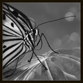
Good Morning, Fine Spring Dayby SandyPComment: May have changed my mind - will this fascination with the difference between colour and BW never end??!!!
The BW really POPS. AND I think if the black border were really huge, say in a wide matting when you print and frame it, it would be excellent. And when you do, you might lighten the area around the shiny black eye. This is a very exciting picture. |
 Photographer found comment helpful. Photographer found comment helpful. |
| 03/17/2008 11:44:24 PM |
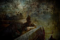
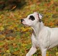
Four legs good, two legs bad...by xianartComment: Deep. Touches a nerve. (I don't believe you did it again: I just finished reading one of Orwell's essays last night - on the deterioration of language usage, 1948 or so). |
| Photographer found comment helpful. |
| 03/17/2008 11:38:44 PM |
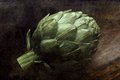
ode to the artichokeby ErinMComment: I really think some of Neruda's odes are his best work. This is one of them. And your photo is an ode in itself. |
| Photographer found comment helpful. |
| 03/16/2008 02:49:12 AM |
|
| Photographer found comment helpful. |
| 03/16/2008 02:37:29 AM |
|
| Photographer found comment helpful. |
| 03/15/2008 03:11:28 PM |
Good Morning, Fine Spring Dayby SandyPComment: Actually a rare instance of me preferring the colour, so understated, which settles the subject so nicely in context, and shows the eye better, but that might be my monitor. Perhaps the black and white brings out more the drama of your DOF, and increases the sense of space, though I think the thick black border over emphasizes the black in the subject which doesn't need it. In any case, a delightful shot, the zoom did good and so did you in the composing. That smile certainly does no harm! Message edited by author 2008-03-15 15:15:29. |
| Photographer found comment helpful. |
| 03/15/2008 12:48:59 PM |
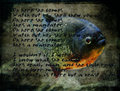
Man Eaterby JutildaComment: Nice matching indeed, but wonderful how you make man-eater really pop out. |
| Photographer found comment helpful. |
| 03/14/2008 03:11:06 AM |
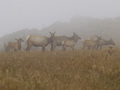
Elk in the mistby anmldocComment: This is beautiful. Not sure beefed up colour/contrast would improve the feel of this. Sorry you're not longer a member or active, because your two viewable photos are excellent, and stand very well on their own. |
| 03/14/2008 03:08:35 AM |
|
| 03/14/2008 02:50:49 AM |
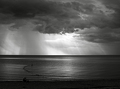
Chiaroscuro Cumuloby OlyuziComment: Yes, this puts many scapes to shame. (Checking out your camera, what a wonder to find this. Like the mystery detail at the bottom). |
| Photographer found comment helpful. |
Home -
Challenges -
Community -
League -
Photos -
Cameras -
Lenses -
Learn -
Help -
Terms of Use -
Privacy -
Top ^
DPChallenge, and website content and design, Copyright © 2001-2026 Challenging Technologies, LLC.
All digital photo copyrights belong to the photographers and may not be used without permission.
Current Server Time: 07/26/2026 02:07:13 PM EDT.