| Image |
Comment |
| 06/08/2008 09:53:30 PM |
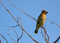
Circlingby PrismComment: Very pleasing composition, and just enough shape - bit of a challenge with that lens - but then again when I use my zoom on these guys I can't find them! |
 Photographer found comment helpful. Photographer found comment helpful. |
| 06/08/2008 09:49:03 PM |
Waitingby PrismComment: Been looking at your re-edit, and have to say it was a good idea. You must have been quite a distance to get this shy one. Serious bird with the mask and all. Nice pose, light and colour. |
| Photographer found comment helpful. |
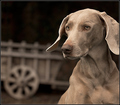
| 06/08/2008 12:50:56 PM |
Was that a rabbit?!by bspurgeonComment: This is really good to look at for awhile. I know these dogs feature in many great pictures, but I find the lighting and colour and pose and definition and composition all sitting in a very nice place here. |
| Photographer found comment helpful. |
| 06/07/2008 05:00:40 PM |
|
| Photographer found comment helpful. |
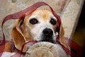
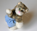
| 06/07/2008 04:58:39 PM |
Fuzzy Wrapby colorcarnivalComment: What I like about this is that you see right away the dog's right eye and the dance of ribbon over her head (coordinating with the falling lines of her right ear). (You could make a neat abstract by cropping just left of her nose and up aways from the bottom - with her permission of course). |
| Photographer found comment helpful. |
| 06/07/2008 01:25:17 AM |
|
| Photographer found comment helpful. |
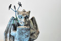
| 06/07/2008 01:14:12 AM |
Scary Storyby awpollardComment: I don't feel that magnetman is fully featured in this. I keep thinking about the gargoyle typist/keyboardist/writer! |
| Photographer found comment helpful. |
| 06/07/2008 01:12:13 AM |
|
| Photographer found comment helpful. |
| 06/07/2008 01:06:05 AM |
|
| Photographer found comment helpful. |
| 06/07/2008 12:59:19 AM |
|
| Photographer found comment helpful. |
Home -
Challenges -
Community -
League -
Photos -
Cameras -
Lenses -
Learn -
Help -
Terms of Use -
Privacy -
Top ^
DPChallenge, and website content and design, Copyright © 2001-2026 Challenging Technologies, LLC.
All digital photo copyrights belong to the photographers and may not be used without permission.
Current Server Time: 07/28/2026 06:01:59 AM EDT.