| Image |
Comment |
| 12/15/2009 08:32:38 PM |
ignoring a manby SoulJanceComment: Great composition, the interaction seems a little staged though for some reason. I'm stuck in a box of decay and can't see out of it to get your interpretation. If their relationship is supposed to be decaying they don't look mad at each other, she looks quite happy. I gave it a try but just don't get it. |
 Photographer found comment helpful. Photographer found comment helpful. |
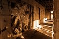
| 12/15/2009 08:22:52 PM |
Reform Schoolby npaselComment: Great shot, I love the art on the bricks in the center. The contrast of the letters really draws your eye in. Great detail all around. I also appreciate that you didn't super duper HDR this. |
| Photographer found comment helpful. |
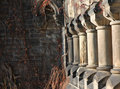
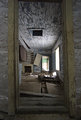
| 12/15/2009 08:17:22 PM |
A foundation witheredby wolfComment: I love the patterns of the pillars and wish I could see more of it. I think it would have worked better without so much empty space on the left and more pillars. Perhaps a portrait crop? |
| Photographer found comment helpful. |
| 12/15/2009 08:13:16 PM |
Artsy Decayby nicoleangelComment: There is a softness to this that seems odd and the composition is not to my liking. I do like the streaks of light and the chaotic wall murel. |
| Photographer found comment helpful. |
| 12/15/2009 08:08:43 PM |
End of the Working Dayby BarbBComment: Not a bad composition and I can see how it would appeal to hdr fans. For my personal taste it is a little much. I love the flow of the composition though and the color scheme. |
| Photographer found comment helpful. |
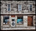
| 12/15/2009 08:06:22 PM |
No. 24by pwm6Comment: This is such an interseting composition. I love the stark difference between the top level and bottom level. I guess because the top is b/w and bottom in color, the top is symetrical and simple, bottom chaotic and ouit of balance. Well anyway, I really like it. Great eye. |
| Photographer found comment helpful. |
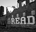
| 12/15/2009 07:59:29 PM |
Graffiti Adviceby bcrantsComment: I'm enjoying looking at this, it makes for an interesting b/w. I think it needs some more contrast on the bricks to make the white "read" pop. Great find though. |
| Photographer found comment helpful. |
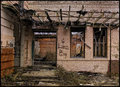
| 12/14/2009 10:58:46 PM |
Decrepitby snafflesComment: I really like the cool tones and great textures. My imagination runs wild with that hole in the roof, and all the other things going on. Great capture. |
| Photographer found comment helpful. |
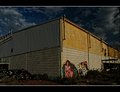
| 12/14/2009 06:10:10 PM |
Suburbs Artby androgeusComment: I like this composition and placement of the subject. It could have stood for some curves adjustment to draw those great clouds out (push the highlights) and create better seperation for the art and wall. Good shot though. |
| Photographer found comment helpful. |
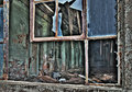
| 12/14/2009 05:58:36 PM |
Window Viewby dswannComment: This is way overboard for my taste on the HDR. I kinda like what is going on, but just can't get over the processing. I'll go ahead and give it a 6 for composition and challenge relevence though. I particularly like that little red face stareing at me from the lower left corner. |
| Photographer found comment helpful. |
Home -
Challenges -
Community -
League -
Photos -
Cameras -
Lenses -
Learn -
Help -
Terms of Use -
Privacy -
Top ^
DPChallenge, and website content and design, Copyright © 2001-2026 Challenging Technologies, LLC.
All digital photo copyrights belong to the photographers and may not be used without permission.
Current Server Time: 06/22/2026 07:27:32 AM EDT.