| Image |
Comment |
| 05/26/2003 03:44:45 PM |
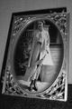
A Portrait from the Pastby MarjoComment: I really like the cropping done here. Fits well. I would like to see some diffuse lighting up on the left side also, to help bring out the frame detail and contrast. Alittle bright in the bottom right corner |
 Photographer found comment helpful. Photographer found comment helpful. |
| 05/26/2003 03:43:03 PM |
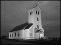
Midnight Churchby tyrkinnComment: Excellent photo. the lighting/exposure is superb. Very crisp and great tones |
| Photographer found comment helpful. |
| 05/26/2003 02:50:48 AM |
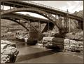
Salt River Gorgeby rcrawfordComment: Great tones and DOF. Love the shadows included, helps the contrast of the photo. Nice use of lines |
| Photographer found comment helpful. |
| 05/26/2003 02:49:59 AM |
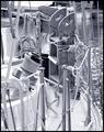
Mooringby crabappl3Comment: Great DOF/focus. Great detail and feel. Not sure if you used a platinum type of coloring, but I would like to see a touch more contrast (some more shadowed areas), that would make it pop a bit more. Nice job |
| Photographer found comment helpful. |
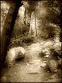
| 05/26/2003 02:48:21 AM |
Path Through The Woodsby jodiecostonComment: Lots of great tones in this one. Not sure if a softer focus was used, but seems like it. May just be the tones, though, that make it seem too soft. So, I would like to see a bit more sharpness for my taste on this type of subject, unless you want a Midsummer's Night Dream feel. (C: |
| Photographer found comment helpful. |
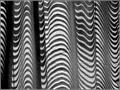
| 05/26/2003 02:46:43 AM |
The Light Insideby xertionComment: this is a very interesting shot. Having a hard time deciding if it is duotoned. I can tell the blues (that can go to a dark blue that looks black, and light blue to almost white), but the magenta showing on the white half squares and the mid left walkway are confusing me. ahhh what the crap, who cares |
| Photographer found comment helpful. |
| 05/26/2003 02:44:07 AM |
Winner!by buck4freeComment: Great lighting and contrast. DOF and focus on the middle subject is great. Nice dandid type of shot |
| Photographer found comment helpful. |
| 05/26/2003 02:20:32 AM |
Z-sunby justineComment: My lines and shadow abstract, isn't do so hot. (hope yours is), because this is very interesting. I think that people do not look at them long enough to see all the different things in them I like the comtrasting colors and DOF. Able to see the detail in the middle fabric and then sort of blends out. Like a Jedi mind trick |
| Photographer found comment helpful. |
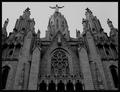
| 05/26/2003 02:14:49 AM |
Tibidabo´s churchby AlexysComment: Excellent choice. I wonder if having/waiting for the light to fall across the front (if possible) would brigng out more shadow and detail and contrast. A touch flat, but I still adore it. Evening out the crop left to right also, just a bit off, to even it out |
| Photographer found comment helpful. |
| 05/26/2003 02:11:08 AM |
Through Rose Tinted Glassesby WesComment: Nice idea, but a bit bland, the lighting, etc. has little contrast. The water is almost blown out and distracts the eye to the right side. Maybe a bit lower into the plants would have given a bit more texture and interest (?). |
| Photographer found comment helpful. |
Home -
Challenges -
Community -
League -
Photos -
Cameras -
Lenses -
Learn -
Help -
Terms of Use -
Privacy -
Top ^
DPChallenge, and website content and design, Copyright © 2001-2026 Challenging Technologies, LLC.
All digital photo copyrights belong to the photographers and may not be used without permission.
Current Server Time: 07/18/2026 09:27:38 AM EDT.