| Image |
Comment |
| 05/15/2009 09:14:47 AM |
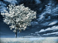
Near Infraredby BalkoComment: I think this was pretty well received! I thought the tree and the sky were gorgeous. You did a great job with swapping out the channels. I usually skip that and go straight for black and white lol. Congrats on a great placement :) |
| 05/15/2009 09:13:04 AM |
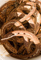
Horseshoesby boyd2000Comment: from the thumbnail, i thought i was going to be looking at a snake lol! you really pulled out some interesting details! |
 Photographer found comment helpful. Photographer found comment helpful. |
| 05/15/2009 09:12:05 AM |
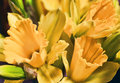
Daffodilsby BalkoComment: I like how you made something delicate look like it has some rough, gritty textures. |
| Photographer found comment helpful. |
| 05/15/2009 09:10:56 AM |
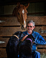
_MG_8750.jpgby sfmorrisComment: I love how you brought out the details in the man's face. His expression is quite pivotal to this story. Wonderful capture. |
| 05/15/2009 09:10:16 AM |
|
| Photographer found comment helpful. |
| 05/14/2009 08:37:13 PM |
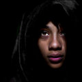
Inyanga by MAKComment: The lighting in this is amazing. She is so beautiful. Never would have guessed she was 14. Congrats on the ribbon! |
| Photographer found comment helpful. |
| 05/14/2009 12:33:53 PM |
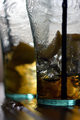
Cafeby quiet_observationComment: I liked this for the toned down lighting and the blur of textures in the glasses. I think it's also cool that you can just barely read the Coca (?) in the glass as well. |
| Photographer found comment helpful. |
| 05/14/2009 12:32:33 PM |
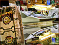
Cigar Storeby JuliBocComment: Wowzy the topaz really made this look flippin cool! The reflection is fabulous and this has an almost 3-D feel - very very wickedly cool Julianne! |
| Photographer found comment helpful. |
| 05/14/2009 12:31:17 PM |
|
| 05/14/2009 12:29:33 PM |
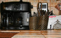
Caffe' On The Cornerby rodfulkComment: Someone once told me to try and shoot so that your photo is not title dependent. When I vote, I usually do not see the title so I kind of depend on the image to tell me a story. When I voted on your photo, I gave it a 5. I saw several different elements all competing for my attention so I did not know what your main subject was in the shot. You don't need so much of the counter in the foreground because it does not enhance the image. Personally, what I think would have been cool would be to remove everything but the coffee maker. Pull it away from the wall a bit and have the photo be that and the tile. The black against the beautiful colors in that tile would have made for a great contrast. |
| Photographer found comment helpful. |
Home -
Challenges -
Community -
League -
Photos -
Cameras -
Lenses -
Learn -
Help -
Terms of Use -
Privacy -
Top ^
DPChallenge, and website content and design, Copyright © 2001-2026 Challenging Technologies, LLC.
All digital photo copyrights belong to the photographers and may not be used without permission.
Current Server Time: 08/08/2026 07:45:46 PM EDT.