| Image |
Comment |
| 07/23/2007 06:28:33 PM |
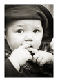
Munch Timeby lentilComment: I rarely find photographs of babies eating attractive, but that aside, the frame filling composition is effective. |
 Photographer found comment helpful. Photographer found comment helpful. |
| 07/23/2007 06:28:17 PM |
FUBUby geneward2Comment: Not the best of light for a portrait, and I do find the background rather distracting. That said, you have produced a portrait that is interesting and has some narrative to it. |
| Photographer found comment helpful. |
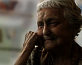
| 07/23/2007 06:27:12 PM |
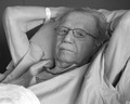
Dad at 94by mnobleComment: This makes for an interesting portrait, but would benefit from some further post-processing work. The tonal range is on the flat side, with little in the way of true blacks. Your Dad looks pretty amazing for 94, even in a hospital bed! |
| 07/23/2007 06:27:08 PM |
unawareby fredandaudComment: The light was not playing to your advantage here. The photo is fine as a record shot, but lacking something as a portrait. |
| 07/23/2007 06:27:04 PM |
Laughterby parma182Comment: A happy smile, but a shame there isn't some eye contact with the viewer. I like the out of focus street cafe, adding some context to the shot. |
| 07/23/2007 06:27:01 PM |
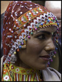
Old Portraitby katamaresComment: From the title I guess that you were trying to recreate the feel of a vintage photo. In terms of that aim this photo doesn't work for me - the colour caste is more pinkish than sepia and the clear modernity of the model doesn't match the style. As a portrait in terms of this challenge it has both pluses ad minuses: other than what I have already said, the soft focus on the face combined with the sharp focus on the ear-rings seems wrong, however I do like the composition,and also the stare of the model. |
| 07/23/2007 06:26:43 PM |
Self Portrait by ladpupmoeComment: i am not keen on this photo - the slotted blind behind you does little to compliment the portrait, and your pose looks rather uncomfortable, as thoug you didn't really want to be being photgraphed. |
| 07/23/2007 06:26:36 PM |
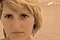
Balanceby simplesilentComment: You have the basis of a super portrait here, but I suspectthat you got the exposure wrong in-camera. The tell tale processing signs, in particular the halo, are too visible. |
| Photographer found comment helpful. |
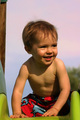
| 07/23/2007 06:26:32 PM |
A nice day beginsby fchossonComment: A sweet looking child, it is a shame his eyes aren't a little more visible. Watch out for unwanted elements (in this case the post) creeping in to the frame and distracting the viewer. |
| Photographer found comment helpful. |
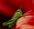
| 07/23/2007 06:26:19 PM |
Portrait of a Grasshopperby scotthadlComment: Perhaps not what I would expect to see if I went to an exhibition of portraits! As far as the photo goes, the colour combination of red and green is good, and the diagonal nature of the composition works. The focus is slightly soft - a very slightly deeper depth of field might have helped. I find the black and red stripiness of the background slightly off-putting. |
| Photographer found comment helpful. |
Home -
Challenges -
Community -
League -
Photos -
Cameras -
Lenses -
Learn -
Help -
Terms of Use -
Privacy -
Top ^
DPChallenge, and website content and design, Copyright © 2001-2026 Challenging Technologies, LLC.
All digital photo copyrights belong to the photographers and may not be used without permission.
Current Server Time: 06/20/2026 09:27:09 PM EDT.