| Image |
Comment |
| 07/31/2012 09:20:34 AM |
farewell to an eraby JutildaComment: These are the bittersweet moments. But think of the love that the home has fostered for your family and how it will pass it on to the new one that will soon be making it theirs. |
 Photographer found comment helpful. Photographer found comment helpful. |
| 07/31/2012 09:09:32 AM |
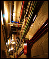
The hall of tubesby JamesDowningComment: The image seems like the focal point is missing - the dead end itself. I see the lines leading to the dead end, but as currently composed, we don't see that we don't have a way out. Maybe composing it so that the dead end is actually visible so that the lines overwhelm us and make us feel trapped would have made this score better.
looking at the challenge entries, those images that worked best actually showed the viewer where the dead end was located. In your shot, it is merely implied. Message edited by author 2012-07-31 09:14:04. |
| Photographer found comment helpful. |
| 07/31/2012 09:07:40 AM |
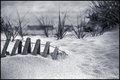
days of gloryby PennyStreetComment: The mirroroing of the fence line and the grasses behind, where triangles are repeated throughout gives this image a complete and balanced feel.
The processing is rich, yet subtle.
it is a very good image and i could easily see this on a nice big wall in someones beach bungalow |
| Photographer found comment helpful. |
| 07/31/2012 09:03:14 AM |
Splashing the Potby Jon_HComment: That is quite an improvement on the original that you based yours on.
The pose and expression really make the shot - lots of attitude. The reflection on the glasses provides that level of detail that takes it to the next level.
As others have stated, the background doesn't work for me and gives this too much of a staged look and seems 'processed' rather than real. |
| Photographer found comment helpful. |
| 07/31/2012 08:53:39 AM |
Up a Creekby Yo_SpiffComment: Lots of good stuff in this image, the old car with the flat tire, the garbage around it, the awesome worn sign - all this to contrast the pretty sky and bright colors. I just wonder about the angle you chose...the edge of the object on the far left is a bit of distraction and the back of the car seems a bit crowded. A step or two to your left may have allowed you a bit more 'standard' composition with the car more centered while still allowing the entire sign to stay 'in play'.
And dang! it is amazing how good shots are with camera phones! |
| Photographer found comment helpful. |
| 07/31/2012 08:47:55 AM |
Nobody Plays On Cold Wet Daysby stphqComment: First off, i like this type of diptych where the mundane is captured and presented as a collage to provide a story or a recurring theme.
The individual images themselves are carefully photographed using very good choice of DOF to bring out the subject and provide context in the background. The lighting is also soft and rich allonwing good details throughout.
I almost wish this was a triptych as it seems a third image of another scene would boost this 'scene' even more. With only two images, i wonder if focusing on one playset (swings or jungle gym) would have been better, using differing angles.
Regarding the title, I think it may have hurt you a bit, but in general I just think it doesn't have a lot of 'wow' to really pull in the high scores.
One thing I did notice was a bit of oversharpening under the swing - you can see a line of white that gives the image an 'overpushed' feel.
|
| Photographer found comment helpful. |
| 07/31/2012 08:39:48 AM |
Mountain Viewby cryanComment: Beautifully rendered image, especially the ground with the rich greens and yellows. the sky is a bit overcooking in my opinion, but this is likely due to the limitations of the technology, not the photog.... |
| Photographer found comment helpful. |
| 07/31/2012 06:25:29 AM |
Wildfire!by vawendyComment: wonderful blur in the background and a cute little insect. Comparing it to the challenge, it really doesn't feel harsh to me... |
| Photographer found comment helpful. |
| 07/31/2012 06:24:31 AM |
"I think the sun is a flower, That blooms for just one hour."by LanndonKaneComment: Bradbury rocks and you picked a wonderful quote to emulate!
I like the minimal feel of this a lot, from the composition, to the hint of the table on the right side. As Bob said below, there are a few things that give it a slightly unfinished feel - from the water in the vase to the slightly blown out feel of the left side of the image. |
| Photographer found comment helpful. |
| 07/31/2012 06:15:00 AM |
|
| Photographer found comment helpful. |
Home -
Challenges -
Community -
League -
Photos -
Cameras -
Lenses -
Learn -
Help -
Terms of Use -
Privacy -
Top ^
DPChallenge, and website content and design, Copyright © 2001-2026 Challenging Technologies, LLC.
All digital photo copyrights belong to the photographers and may not be used without permission.
Current Server Time: 05/10/2026 01:48:22 AM EDT.