| Image |
Comment |
| 03/14/2007 06:51:39 PM |
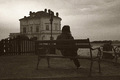
Desolationby Rino63Comment: Neat feel to this photo. This would have probably come off a little better if the person was not 'running into' the building behind it. Moving your position a little to the left when shooting this should take care of it. |
 Photographer found comment helpful. Photographer found comment helpful. |
| 03/14/2007 06:45:46 PM |
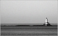
The Lighthouseby salmiakkiComment: Nice set up and lighting, but something seems strange with the grain in this photo - it seems to have color to it...I swear I see pinks and greens |
| Photographer found comment helpful. |
| 03/14/2007 06:43:02 PM |
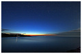
Starry Dawnby Bear_MusicComment: Thisis a great vista and great colors - but I am afraid I don't like this subject with the grain. This looks like it would be a wonderful image if the grain were not there (I know this is a grain challenge...) |
| Photographer found comment helpful. |
| 03/14/2007 06:38:37 PM |
|
| Photographer found comment helpful. |
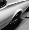
| 03/14/2007 06:37:59 PM |
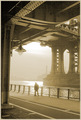
classicby sevilduvarciComment: nice use of grain on this classic car image - could have been taken years ago with real film. |
| Photographer found comment helpful. |
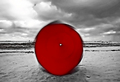
| 03/14/2007 10:17:38 AM |
part 1by tateComment: I am not sure how you received so many 1's. This is very creative and definetly has red in it (Meets challenge). I really like the motion you show and the crispness of the background. Likely the low votes were due to either desaturation (which I liked on this entry) or the blur (which may have been interpreted falsely as out of focus).
I am not sure about your placement of the umbrella dead center. This may have worked a little better if it were shot from the same location and you and the umbrella were off center and slightly smaller in the image. |
| Photographer found comment helpful. |
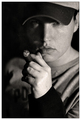
| 03/14/2007 09:48:23 AM |
Jacquesby BrielleComment: Gorgeous - love the lighting and feeling of this one. |
| Photographer found comment helpful. |
| 03/14/2007 09:44:35 AM |
|
| 03/14/2007 09:42:50 AM |
|
| Photographer found comment helpful. |
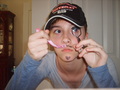
| 03/14/2007 09:41:09 AM |
Can't make a decisionby kadybug_4-22Comment: I like the idea you were going for here, but it seems to need a little more polish. There are a couple of issues with this one that bring it down for me. First, the image really needs to be cropped differently. The fuzzy white line at the bottom of the image needs to be cropped out, and the cabinet on the left side of the image is distracting Second, the lighting with the flash is very harsh and looks like a quick snapshot. I think a different perspective where we see you looking in the mirror, holding both the eyelash tool and the razor (with stubble on face) and a look of which do I do today would have worked better. Having both your hands up to your face doesn't seem to work really well for me, and covers up a nice face! |
Home -
Challenges -
Community -
League -
Photos -
Cameras -
Lenses -
Learn -
Help -
Terms of Use -
Privacy -
Top ^
DPChallenge, and website content and design, Copyright © 2001-2026 Challenging Technologies, LLC.
All digital photo copyrights belong to the photographers and may not be used without permission.
Current Server Time: 05/10/2026 04:32:06 AM EDT.