| Image |
Comment |
| 05/09/2007 05:59:23 AM |
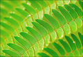
Simple Greenby noranekoComment: Really nice image Catherine - love the depths of the green tones in the leaves, the dew to add needed contrast, and the placement at an angle across the field of view. I think this last observation may have hurt you a little with the viewers as people wanted to see a 'symmetrical' image more than symmetrical objects. I gave it a 7 during the challenge. |
 Photographer found comment helpful. Photographer found comment helpful. |
| 05/09/2007 05:40:46 AM |
|
| Photographer found comment helpful. |
| 05/08/2007 09:34:07 PM |
|
| Photographer found comment helpful. |
| 05/08/2007 01:17:39 PM |
Calm Harborby noranekoComment: simply gorgeous - love the colors, love the light bursts, love the composition, love the quietness - would have given it at least an 8 had I got around to voting on the whole challenge (I only made it about 40% through...) |
| Photographer found comment helpful. |
| 05/07/2007 08:14:19 PM |
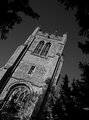
Day 7 - Towerby meneleComment: good choice of the off angle for this shot - it seems a little dark to me but i like the textures that the light bring out in the church |
| Photographer found comment helpful. |
| 05/07/2007 08:11:45 PM |
shallow dof outtakeby Rino63Comment: lots of grain in the background - there is some nice bokeh in the bottom right corner - but the grain overwhelms the image a little. in addtion, the highlights seem a bit blown out |
| Photographer found comment helpful. |
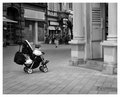
| 05/07/2007 08:09:51 PM |
Child waitingby MelethiaComment: gosh - fabulous image - the tension created by the child with no parents around is quite unnerving - good capture... now drop that camera and go find those parents! |
| Photographer found comment helpful. |
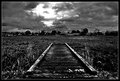
| 05/07/2007 08:08:14 PM |
Day 4 - Bridge, Stormby Bruce_the_RobertComment: very funky processing - i like it. it is dark but it would be rather static and a little boring without the contrast and darkness that you have brought here |
| Photographer found comment helpful. |
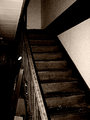
| 05/07/2007 08:06:19 PM |
itby PhilComment: cool processing to really give this a worn and dark feel - nice job. I think I would be too scared to take a photo here.. ;-) |
| Photographer found comment helpful. |
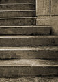
| 05/07/2007 08:04:25 PM |
Stairsby ElaineComment: nice choice of sepia to bring out the tones and textures of the stairs - the cropping of the stairs to show the slight bend really helps this avoid being a very static image |
| Photographer found comment helpful. |
Home -
Challenges -
Community -
League -
Photos -
Cameras -
Lenses -
Learn -
Help -
Terms of Use -
Privacy -
Top ^
DPChallenge, and website content and design, Copyright © 2001-2026 Challenging Technologies, LLC.
All digital photo copyrights belong to the photographers and may not be used without permission.
Current Server Time: 05/11/2026 08:37:30 AM EDT.