| Image |
Comment |
| 07/24/2007 03:14:58 PM |
Summer Innocenceby dssagent88Comment: the selective desaturation does not work at all for me on this shot. The girl is beautiful and either b/w or color would have worked SO much better. |
| 07/24/2007 03:07:36 PM |
Sophiaby njsabsComment: wonderful lighting - maybe a bit much on the sharpening of the eyes |
| 07/23/2007 11:52:22 AM |
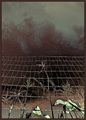
Corn by pointandshootComment: very intense use of editing - very surreal - not sure I like it but it sure made me look more than once! |
 Photographer found comment helpful. Photographer found comment helpful. |
| 07/23/2007 11:51:03 AM |
|
| 07/23/2007 08:50:52 AM |
Darwin's Keyboardby jonfrommkComment: jon - very creative shot - gave it an 8 during the challenge. The silly thing is that I needed to look at my keyboard to figure it out |
| Photographer found comment helpful. |
| 07/22/2007 06:59:01 AM |
Day 22 - Rosebud - Dedicated to SandyPby sherpetComment: I really love the treatment of this photo. The colors and watercolor feel of this are so cool. I'm glad you are feeling better and are able to get out and take pictures again. |
| Photographer found comment helpful. |
| 07/19/2007 02:58:26 PM |
|
| Photographer found comment helpful. |
| 07/19/2007 02:37:45 PM |
|
| 07/19/2007 02:35:11 PM |
Every little girls dream...by piaffe529Comment: It is a pretty horse and you have captured a dream of many a young girls. However, as others have stated, the image really has some technical issues that resulted in the sub 5 score.
First, the lighting is not flattering and works against you - the background is too bright and takes us away from the horse. Second, the extraneous pole, harness, and other lines distract from the beauty of the horse. Third, the color cast seems off.
I understand that you were trying to use blur to give a feeling of dreaminess - but with the other technical issues, this blur just seemed like OOF.
Simplifying the image is what is needed for photos on this site to do well - taking a shot of the horse head without the harness and making sure the background does not distract would have scored much better.
|
| Photographer found comment helpful. |
| 07/19/2007 02:28:51 PM |
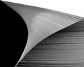
iBook by AbstractComment: very creative shot - love the composition and concept. I think this could have been just about perfect if there was slightly better cutting of the pages on the left hand side of the slice - a couple of the pages don't quite line up - but that is being ever so picky!!! 9 |
| Photographer found comment helpful. |
Home -
Challenges -
Community -
League -
Photos -
Cameras -
Lenses -
Learn -
Help -
Terms of Use -
Privacy -
Top ^
DPChallenge, and website content and design, Copyright © 2001-2026 Challenging Technologies, LLC.
All digital photo copyrights belong to the photographers and may not be used without permission.
Current Server Time: 05/17/2026 03:28:00 AM EDT.