| Image |
Comment |
| 10/18/2007 06:18:01 AM |
|
 Photographer found comment helpful. Photographer found comment helpful. |
| 10/18/2007 06:16:40 AM |
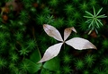
duoby arm66Comment: nice point of view but the oversaturated greens don't work for me |
| Photographer found comment helpful. |
| 10/18/2007 06:14:37 AM |
|
| Photographer found comment helpful. |
| 10/17/2007 08:05:33 PM |
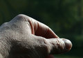
B&W_hand_9469.jpgby dsternerComment: Deb - this clearly shows the textures so much better than the color. nice job on the b/w conversion - nice and contrasty! |
| Photographer found comment helpful. |
| 10/17/2007 04:13:56 PM |
hand_9469.jpgby dsternerComment: Deb - the light sure does pick up the textures in the skin on your hand. I really think that a b/w image would work much better here - the color actually distracts the viewer. By desaturating carefully in PS using single color channels, you may be able to draw more of the texture out.
As far as subject - a portion of a hand is not a particularly exciting subject. This likely has a bit to do with why you have not had many comments.
I have tried a hand at a b/w processing and cropped it down a bit - What do you think? Does is jump more and show the lighting better? Maybe...
[thumb]601711[/thumb] |
| Photographer found comment helpful. |
| 10/17/2007 12:46:21 PM |
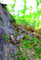
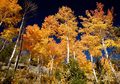
Amongst the Starsby KarenNfldComment: Scary cool image - I gave this a 9 but didn't have a chance to comment during voting. I really think what sets this one apart for me is the recurring yet differing shapes - the stars from the pines and the brown leaf as the main subject with the other green one in the background. The warmth of the colors is another selling point. I do think that the reddish brown section in the upper left tends to pull my eye away a bit, but I like the shapes so much! |
| Photographer found comment helpful. |
| 10/17/2007 09:16:46 AM |
Frangipani abstractby hkimageryComment: I really liked this one a great deal (in fact I was your 10). I thought it was a risky take on the challenge. It was clear to me that you intended to have the focus so that the petals were drawing us in and I clearly got the idea of watercolor or impressionism. |
| 10/17/2007 08:48:15 AM |
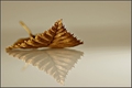
Dry old leaf by IreneMComment: Fantastic job - you did take a risk, but with a quality photo like this using excellent skill and composition, your risk sure paid off. Congrats! |
| Photographer found comment helpful. |
| 10/17/2007 08:45:59 AM |
|
| Photographer found comment helpful. |
| 10/17/2007 08:44:14 AM |
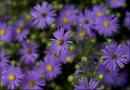
Autumn Smilesby SandyPComment: Sandy, I really thought this was excellent. The composition is so lovely and the colors so true to life. Great work (as usual!) |
| Photographer found comment helpful. |
Home -
Challenges -
Community -
League -
Photos -
Cameras -
Lenses -
Learn -
Help -
Terms of Use -
Privacy -
Top ^
DPChallenge, and website content and design, Copyright © 2001-2026 Challenging Technologies, LLC.
All digital photo copyrights belong to the photographers and may not be used without permission.
Current Server Time: 06/19/2026 07:39:47 PM EDT.