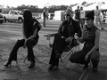
DPChallenge: A Digital Photography Contest You are not logged in. (log in or register
 
Browse Settings
Currently viewing:
Memberbassbone

Show comments:

Per page:

Order:

Comments:


Comments Made by bassbone
Pages:   ... [1036] [1037] [1038] [1039] [1040] [1041] [1042] ... [1517]
Showing 10381 - 10390 of ~15170
Image Comment
Asphalt Divas
11/21/2007 11:06:17 AM
Asphalt Divas
by jonnienye

Comment:
nice b/w processing, but i am not sure how these guys are actually portraying street smarts - what are they doing? 6
Photographer found comment helpful.
Above-the-Street Smarts (on the job training)
11/21/2007 11:05:41 AM
Above-the-Street Smarts (on the job training)
by Donna21

Comment:
i like the reflections to continue the road and the placement of the workers in the upper left third
Photographer found comment helpful.
Hustling in Dupont
11/21/2007 11:05:07 AM
Hustling in Dupont
by treyvus

Comment:
i like the fous on the man and the perspective - i am not sure about the sepia choice, but it's cleary one of the better entries in the challenge
Photographer found comment helpful.
Lessons Learned on The Street
11/21/2007 11:04:28 AM
Lessons Learned on The Street2nd Place
by Ivory

Comment:
a bit overexposed from a light perspective - but this seems to fit the challenge pretty well and as the saying goes - sex sells
Photographer found comment helpful.
In My Hood - Ode to 50 Cent
11/21/2007 11:03:56 AM
In My Hood - Ode to 50 Cent
by elizadeb

Comment:
what a great stare - that is one tough dude! I am not a big fan of the brick wall background, and it seems that there is a bit of a heavy hand with the neat image/ noise ninja
Photographer found comment helpful.
de la noche
11/21/2007 11:03:53 AM
de la noche
by mxbrown

Comment:
i like the lighting on the face and the centered crop - but the motion of the hand is distracting
Cramming
11/21/2007 10:32:54 AM
Cramming
by gfied

Comment:
hilarious take on the challenge - i just wish the cropping were not so close on the sides.
Photographer found comment helpful.
Getting your priorities right
11/21/2007 10:31:51 AM
Getting your priorities right
by Judi

Comment:
Excellent -Well composed, excellent lighting, love the cartoon book, and the face it perfect.

I especially like the use of Zumdahl's Chemistry book. He is a cool guy - one of those guys that meets you once in a class of 1000 students and will forever know your name.
Photographer found comment helpful.
Celebrate...go Topless
11/21/2007 09:58:27 AM
Celebrate...go Topless
by zclare

Comment:
Clare - Here is my reply to your PM asking for assistance on post processing. I really liked the image you put in this challenge. It just needed a bit of touch up to really do it justice.

A couple of things that could really help the image would be to adjust the levels of light in your image and potentially adjust the hue of the image due to the flash.

You can find the levels under Enhancements/Adjustments in Photoshop. If you open up levels, you will see a histogram (a graph) that shows the exposure in a graphical format. On the left of the graph is the amount of 'black' in the image and the right side has the amount of 'white' in the image. By moving the sliders under the graph (the arrows) you can quickly adjust the exposure of the image that is displayed to the view.

Here's the original histogram:


If you notice, there is no information at the right (white) side of the image. By moving the white slider to the left, the whites in the man's shirt start to shine more.

Another approach that works really well are to use the 'eyedroppers' on the histogram dialogue box (lower right portion). By clicking on the white dropper and then clicking on the whitest portion of the image once - you automatically set the whites. Then select the black eye dropper and do the same for the blacks (the background in your case). Finally, you can select on the grey (midtone) eyedropper and then select a mid point of the image. WHat you will see is that by clicking on different 'grey' or mid-tone portions of the image, the white balance (overall hue) of the image will change. By doing this trial and error approach, you can then make it look the way you want.

It is a small step that can make all the difference.

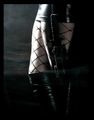
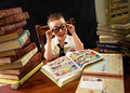
Here is the 'edit' I did by adjusting levels, adding a bit of unsharp mask (USM), and adjusting the hue/saturation of the yellows and reds a bit. Also, I did a bit of cropping - i agree with at least one other commenters view on cropping out a bit more of the arms/ sleeves. Show the spray - that is the cool part - and the sleeves detract from it a bit.


Good luck!

Peter

Message edited by author 2007-11-21 10:08:30.
Late Night
11/21/2007 07:16:52 AM
Late Night
by dwainasaurus

Comment:
nice formulas! this could really benefit from some adjustments in levels to bring out the whites and create some strong blacks.
Photographer found comment helpful.
Pages:   ... [1036] [1037] [1038] [1039] [1040] [1041] [1042] ... [1517]
Showing 10381 - 10390 of ~15170


Home - Challenges - Community - League - Photos - Cameras - Lenses - Learn - Help - Terms of Use - Privacy - Top ^
DPChallenge, and website content and design, Copyright © 2001-2026 Challenging Technologies, LLC.
All digital photo copyrights belong to the photographers and may not be used without permission.
Current Server Time: 06/22/2026 02:59:58 PM EDT.