| Image |
Comment |
| 01/04/2007 06:26:00 PM |
5th day of christmas by LalliSigComment: Not sure what the dirty hands are supposed to symbolize, but I'll admit they make the rings stand out better. Good lighting and color temp. 7. |
 Photographer found comment helpful. Photographer found comment helpful. |
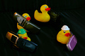
| 01/04/2007 06:24:59 PM |
Four Calling Birdsby PrismComment: LOL. Most excellent, love that it is nicely OOB. Great lighting, too. I'm not wild about the composition, but still a great effort and appreciate the laugh. |
| Photographer found comment helpful. |
| 01/04/2007 06:24:50 PM |
|
| Photographer found comment helpful. |
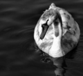
| 01/04/2007 06:24:10 PM |
Swan-a-Swimmingby KarenNfldComment: I know his six brothers are around somewhere... :-) This is an interesting shot with great perspective. I love the water droplets spilling off his beak, love the b&w treatment, and even though some of the whites are a bit blown, not a major issue here. Good job. 7. |
| Photographer found comment helpful. |
| 01/04/2007 06:23:58 PM |
|
| Photographer found comment helpful. |
| 01/04/2007 06:23:25 PM |
fiveby idpComment: Creative take. Selective desat and sharpness is interesting. 7. |
| Photographer found comment helpful. |
| 01/04/2007 06:23:03 PM |
|
| Photographer found comment helpful. |
| 01/04/2007 06:22:33 PM |
|
| Photographer found comment helpful. |
| 01/04/2007 06:22:26 PM |
|
| Photographer found comment helpful. |
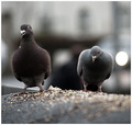
| 01/04/2007 06:22:23 PM |
...two turtle dovesby gsalComment: I wonder what a turtle dove is? These are doves, at any rate. Nice photo, soft focus works here, and the big bokeh spot actually enhances rather than detracts. 7. |
| Photographer found comment helpful. |
Home -
Challenges -
Community -
League -
Photos -
Cameras -
Lenses -
Learn -
Help -
Terms of Use -
Privacy -
Top ^
DPChallenge, and website content and design, Copyright © 2001-2026 Challenging Technologies, LLC.
All digital photo copyrights belong to the photographers and may not be used without permission.
Current Server Time: 06/25/2026 12:54:51 AM EDT.