DPChallenge: A Digital Photography Contest You are not logged in. (log in or register
 
Browse Settings
Currently viewing:
Registered UserCitadel

Show comments:

Per page:

Order:

Comments:


Comments Made by Citadel
Pages:   ... ... [235]
Showing 391 - 400 of ~2344
Image Comment
Ommmmmmm.........
06/22/2009 01:14:41 AM
Ommmmmmm.........
by hesitant

Comment:
I'd like to see some separation between the ear and the blossom. That aside this works really well for the challenge.
Photographer found comment helpful.
When you let go of what you are, you become what you might be.
06/22/2009 01:13:14 AM
When you let go of what you are, you become what you might be.
by skewsme

Comment:
This will probably suffer for being abstract but I personally enjoy this and I think that it does indeed meet the challenge with its soft subtle tones and pleasing shapes
Photographer found comment helpful.
Untitled
06/21/2009 10:25:33 PM
Untitled
by aznym

Comment:
I think the needs to be shown in color. The mass of flowers in the foreground look too uniform in monochrome to be interesting.
Photographer found comment helpful.
Maggie
06/21/2009 10:24:32 PM
Maggie
by karenk

Comment:
Really great subject for the challenge and presented well. Terrific focus on the eye and good detail captured where its needed. The soft focus on the outside of the image as well as the vignette may have been added in post but its done well without being too heavy handed.
Photographer found comment helpful.
The fly
06/21/2009 10:22:54 PM
The fly
by zarozinia

Comment:
Great image but I'm not sure if monochrome (or duotone for that matter) is the best way to present it. I really want to see the colors in this image. Then again, you've captured the textures really well which does make it a good candidate for monochrome. Tough call.
Enter
06/21/2009 10:21:35 PM
Enter
by SEG

Comment:
A bit more contrast would really make this pop. Great subject for the challenge.
Photographer found comment helpful.
Down in the Valley...
06/21/2009 10:21:14 PM
Down in the Valley...
by tfarrell23

Comment:
the central object (the tree) is really underexposed and with it being smack dab in the middle it really prevents the viewer from enjoying the rest of the scene
Photographer found comment helpful.
henri
06/21/2009 10:20:02 PM
henri
by nixter

Comment:
nice homage. Similar composition to the original. I like the graininess of the image too
Photographer found comment helpful.
Depth
06/18/2009 04:33:04 PM
Depth
by miary

Comment:
Greetings from the critique club!

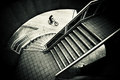
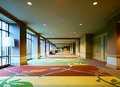
This is a tough scene to expose for and as a result only the right most quarter of the image is exposed well. You may have been able to move to the far left and try to line up the columns between the windows to minimize the brightness on the left. (Basically to eliminate the windows).

Looking at your settings you used a pretty slow shutter. The image is a little soft so a tripod might have been necessary (the softness might have come from proccessing too). Ideally, you'd also want to use a small aperture like f/22 to get more depth of field. If anything you could have used the floor for support and in fact that would have created a more interesting angle.

The processing on this has a lot of artifacts. It almost seemed like you were trying to push the image a little too much. (I myself am really guilty of this). Processing is like makeup for a woman. If you apply too much it looks gaudy and cheap. It should subtle and not noticable. (Again, I am bad for the "too much" category myself).

The scene does have great potential and you do show off what caught your eye. I like the leading lines in the shot that really provide depth and the colors are great. If you are to reshoot this I'd try a vertical and just concentrate on the right half of the scene you've presented here. As I mentioned earlier that part is exposed well. You'd still retain the leading lines and the great colors without having the washed out look of the left side.

In terms of the challenge? It meets it but it is kinda blah as an architectural piece. Its really just a hall way and not really a remarkable one. The carpeting and the warm colors of the walls are nice but I guess what I am saying is the structure itself isn't remarkable.

Abstract Architecture
06/17/2009 01:28:30 AM
Abstract Architecture2nd Place
by buffysnee

Comment:
Congrats on the ribbon...but WHERE IS THIS???? :) (Besides Milwaukee)
Photographer found comment helpful.
Pages:   ... ... [235]
Showing 391 - 400 of ~2344


Home - Challenges - Community - League - Photos - Cameras - Lenses - Learn - Help - Terms of Use - Privacy - Top ^
DPChallenge, and website content and design, Copyright © 2001-2025 Challenging Technologies, LLC.
All digital photo copyrights belong to the photographers and may not be used without permission.
Current Server Time: 09/15/2025 07:02:15 PM EDT.