| Image |
Comment |
| 11/20/2006 01:52:13 AM |
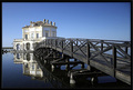
Greetings from Italyby Rino63Comment: Great shot. This challenge allowed you to add text. Doing this would have given this more of a postcard feel to it. 7 |
 Photographer found comment helpful. Photographer found comment helpful. |
| 11/20/2006 01:48:42 AM |
|
| Photographer found comment helpful. |
| 11/20/2006 01:45:45 AM |
Old Westby cryingdragonComment: I wasn't going to vote based on text however in this one I have. The red text with the back ground colors kills this image. The viewer's eye is drawn to the text with a fish hook. |
| Photographer found comment helpful. |
| 11/20/2006 01:44:16 AM |
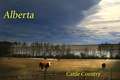
CattleCountryby Len ScapComment: I'd like to know what part of Alberta this is in (since I'm an Albertan myself). In any event, the image is a little dark on the left hand side. Cropping the image to just take out the cow on the left would have made this image superb. The text is a little bit blocky (of course I am not voting based on the text and I am merely remarking on it). |
| Photographer found comment helpful. |
| 11/20/2006 01:42:04 AM |
The Roof: SLC, Utahby rjksteschComment: The text at the top takes away from the visual appeal of the rest of the picture. The text you included at the bottom is far more effective since its descriptive but doesn't take away from the picture. If you were to actually crop this picture just below the top text and above the circle it would look great. |
| Photographer found comment helpful. |
| 11/20/2006 01:40:13 AM |
|
| Photographer found comment helpful. |
| 11/20/2006 01:39:21 AM |
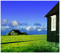
Outdoor Museumby gsalComment: Text could have added to this image. Its a great picture but its size (relatively square) work against it as a postcard. This also looks oversaturated. |
| Photographer found comment helpful. |
| 11/20/2006 01:37:47 AM |
|
| Photographer found comment helpful. |
| 11/20/2006 01:36:53 AM |
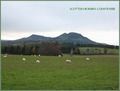
"The Three Sisters"by ThaiComment: Your horizon line could be either a little higher or lower. The image is also not quite balanced. (All the sheep are on the left hand side of the picture without some element to balance things on the right). Can't wait to find out where this is because I was in Scotland over the summer and I loved it. |
| Photographer found comment helpful. |
| 11/20/2006 01:34:07 AM |
|
Home -
Challenges -
Community -
League -
Photos -
Cameras -
Lenses -
Learn -
Help -
Terms of Use -
Privacy -
Top ^
DPChallenge, and website content and design, Copyright © 2001-2026 Challenging Technologies, LLC.
All digital photo copyrights belong to the photographers and may not be used without permission.
Current Server Time: 06/22/2026 12:07:25 AM EDT.