| Image |
Comment |
| 11/22/2006 12:35:22 AM |
|
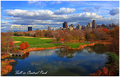
| 11/21/2006 11:31:54 AM |
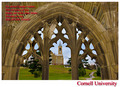
Greetings from Cornellby cresusComment: I would have either not included the text in the top left corner or put it in a more readable color. As it is the text actual detracts from the image. |
 Photographer found comment helpful. Photographer found comment helpful. |
| 11/21/2006 12:21:36 AM |
|
| Photographer found comment helpful. |
| 11/21/2006 12:19:49 AM |
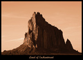
Sacred Rockby DustDevilComment: Great photo. I think the text should be more indicative of where this is. (No big deal however). 8 |
| Photographer found comment helpful. |
| 11/21/2006 12:17:45 AM |
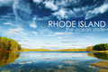
Rhode Islandby nico_blueComment: Incredible image. The purpose of a post card is to make you want to visit the place and you have definitely succeeded in this task. 10 |
| Photographer found comment helpful. |
| 11/20/2006 02:27:40 PM |
|
| Photographer found comment helpful. |
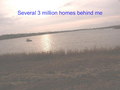
| 11/20/2006 02:24:23 PM |
Million dollars viewby whiterookComment: Looks very bleached out. The horizon isn't straight either (not sure if thats intentional but I think it would work better being straight) |
| Photographer found comment helpful. |
| 11/20/2006 02:22:44 PM |
|
| Photographer found comment helpful. |
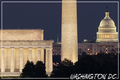
| 11/20/2006 02:12:21 AM |
Washington, DCby LanceWComment: The structure in the center is a distraction because we can't see it in its entirety. A different angle would help. |
| Photographer found comment helpful. |
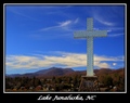
| 11/20/2006 02:07:36 AM |
Lake Junaluska, NCby karmatComment: Unfortunately it appears you were a little heavy handed with the saturation. The sky looks quite artificial and detracts from the quality of this shot. |
| Photographer found comment helpful. |
Home -
Challenges -
Community -
League -
Photos -
Cameras -
Lenses -
Learn -
Help -
Terms of Use -
Privacy -
Top ^
DPChallenge, and website content and design, Copyright © 2001-2026 Challenging Technologies, LLC.
All digital photo copyrights belong to the photographers and may not be used without permission.
Current Server Time: 06/22/2026 12:06:41 AM EDT.