| Image |
Comment |
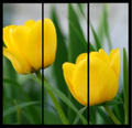
| 04/30/2007 01:18:21 AM |
Spring Flowersby Shea927Comment: A bit too soft for my tastes. Having a third blossom would also add a bit more effect to the shot. (Not just because its a triptych but generally odd numbers have more visual interest) |
 Photographer found comment helpful. Photographer found comment helpful. |
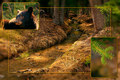
| 04/30/2007 01:16:13 AM |
Blackbear Creekby Len ScapComment: A little over processed (over saturated and over sharpened). The bear appears a bit bristly.
The composition of the creek works well as it leads your eye from bottom left to top right. Positioning the other two pictures to make use of this might have been effective. |
| Photographer found comment helpful. |
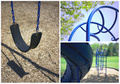
| 04/30/2007 01:14:28 AM |
N'Oubliez Pas De Jouer (Don't Forget to Play)by shutterpuppyComment: I really like the theme you chose and the way you incorporated color to tie it all together. The colors are nicely saturated and each frame has a good composition. The triptych is well laid out seems to take your eye effectively to each frame. |
| Photographer found comment helpful. |
| 04/11/2007 02:12:48 AM |
Archby CitadelComment: Just for the record, I don't think the score is bad for the image. I'm just looking for areas in which it could be improved. (Since I had ONE comment during the entire challenge). Message edited by author 2007-04-11 02:13:19. |
| 04/04/2007 02:02:38 AM |
hold still - the makeup artist at workby m2iwComment: Interesting colors in this shot and I like the catch lights in the models eyes. Normally I don't like when a subject is looking out of the frame but the model is looking at the makeup artist so it adds some nice "action" so to speak. A little overexposed particularly in the hair and the neck. Were this in advanced editing I would clone out the stray hairs.
|
| Photographer found comment helpful. |
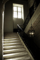
| 04/04/2007 01:56:53 AM |
tungsten or daylight, that is the questionby taseComment: Interesting approach to the challenge. (Which did you use by the way?). This could use a bit of straightening but nothing major.
Something about the composition is a little "off". Part of me wants to get rid of some of the stairs however I like the play of shadows/light on them. I guess its the dark area around the lamp that is the problem for me.
Well done in any event. |
| 04/04/2007 01:53:46 AM |
Awaiting Springby DJWoodwardComment: A smaller border would be nice here. The thick border is somewhat distracting.
The composition works well and draws your eye to the sun as the focal point. |
| Photographer found comment helpful. |
| 04/04/2007 01:52:24 AM |
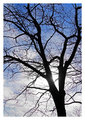
Before The Crowdby david1707Comment: The subject appears to be the flag however it gets lost in the trees in the background. Not sure how to get this so it still meets the challenge and avoid getting the trees in the background. |
| 04/04/2007 01:49:53 AM |
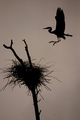
Great Blue Heronby DianaComment: Nice silhouette. Remember in basic you are allowed to clone out sensor dust. Other than that this is a nice picture which has good detail. |
| Photographer found comment helpful. |
| 04/04/2007 01:49:08 AM |
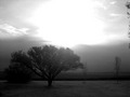
Serinitreesby onecsguyComment: This does meet the challenge but the sun creates a really big blown highlight which is really distracting. Getting behind the tree to "cover" the sun would have helped. |
| Photographer found comment helpful. |
Home -
Challenges -
Community -
League -
Photos -
Cameras -
Lenses -
Learn -
Help -
Terms of Use -
Privacy -
Top ^
DPChallenge, and website content and design, Copyright © 2001-2026 Challenging Technologies, LLC.
All digital photo copyrights belong to the photographers and may not be used without permission.
Current Server Time: 06/26/2026 04:32:34 PM EDT.