| Image |
Comment |
| 04/30/2007 01:36:10 AM |
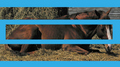
Grieving geldingby snafflesComment: This feels really "chopped" to me. Your title tells us that there should be a story here. Tell us the story. You could have used three shots to do so. From what I can see in this I think we would have really enjoyed looking at it. |
 Photographer found comment helpful. Photographer found comment helpful. |
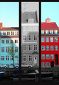
| 04/30/2007 01:34:19 AM |
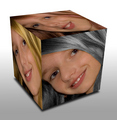
Color my Worldby BrianRComment: To be honest I don't really like this effect. It really distorts your subject and your "mind's eye" looks at the cube rather than the faces of the cube. Nice try going out of the box however with the use of um...a box. |
| Photographer found comment helpful. |
| 04/30/2007 01:31:52 AM |
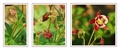
Purple Columbineby MaryOComment: Nice presentation of the panels. I think the ratio you chose works really well. It would be nice to see this in "full" size as the shots do appear quite small but of course you were limited to 720 px |
| Photographer found comment helpful. |
| 04/30/2007 01:30:19 AM |
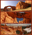
Natural Bridgesby Nikolai1024Comment: I really like the shots you chose and the order you've presented them in. I wouldn't have used the white and/or made the sienna portion of the border thinner. (I'm a big fan of thin borders though) |
| Photographer found comment helpful. |
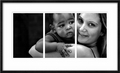
| 04/30/2007 01:28:57 AM |
promiseby whiteroomComment: Interesting shot and well captured. The first panel is a little weak unfortunately as there isn't a lot to look at other than two elbows. |
| Photographer found comment helpful. |
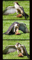
| 04/30/2007 01:27:50 AM |
Nice Shotby remboComment: A touch on the bright side but still effective. I like the borderless triptych you've created and the freeze of motion you captured. |
| Photographer found comment helpful. |
| 04/30/2007 01:27:05 AM |
Hungryby SaraRComment: The border distracts from the triptych here. Its a bit thick and its also not even.
The subject is interesting but I think other activities besides eating might have been more interesting and told more of a story. |
| Photographer found comment helpful. |
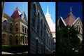
| 04/30/2007 01:25:15 AM |
Campus in the Springby kellyrc01Comment: The second panel is a bit overexposed (at least the part in the sunlight). The third frame is a quite a bit underexposed. Perhaps putting the 1st panel in between the two you wouldn't draw so much attention to it. |
| Photographer found comment helpful. |
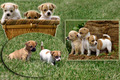
| 04/30/2007 01:23:30 AM |
Total Innocenceby DianaComment: To be honest I am not a fan of the framing for the shots. The frames are what catch my eye rather than your subjects. |
| Photographer found comment helpful. |
| 04/30/2007 01:22:32 AM |
Color Boatby djofiComment: This has a sort of "squeeshed" feeling to it. The broad panel border on the inside that are lacking on the outside might be contributing to this. It makes the center frame seem smaller when in fact its the same size. Adding a consistent border around each panel would give this more balance. |
| Photographer found comment helpful. |
Home -
Challenges -
Community -
League -
Photos -
Cameras -
Lenses -
Learn -
Help -
Terms of Use -
Privacy -
Top ^
DPChallenge, and website content and design, Copyright © 2001-2026 Challenging Technologies, LLC.
All digital photo copyrights belong to the photographers and may not be used without permission.
Current Server Time: 06/26/2026 09:20:50 PM EDT.