| Image |
Comment |
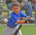
| 05/13/2007 01:24:41 AM |
T Ball Batterby eaglebeckComment: Nice shot but it is terribly noisy. You probably could have used a lot lower ISO to get the shot I think |
 Photographer found comment helpful. Photographer found comment helpful. |
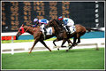
| 05/13/2007 01:20:44 AM |
Winning momentby ryan_li64Comment: This could use some levelling but you captured a great moment here. I like the musculature that was captured in the horses. Its cool that you can even see the one horse's shoe. The board in the background really adds to the shot too. The motion blur in their legs really gives this a great feeling of action. |
| Photographer found comment helpful. |
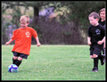
| 05/13/2007 01:18:09 AM |
Catch me if you can!by glad2badadComment: The two children on the right could have been cropped out to make a stronger composition. Of course they also show part of the story as well. |
| Photographer found comment helpful. |
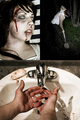
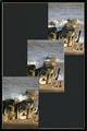
| 05/07/2007 01:30:59 AM |
Domestic Abuseby UbersteinyComment: I have to kinda agree with Art. If you'd gone with a title that might have fit with old pulp fiction or a B movie it would be less offensive (which would have knocked off a few ones and twos) and more macabre.
That aside I like the series and the bottom frame really ties the three shots together really well.
This series kinda reminds me almost of the scene in the first Evil Dead where Ash has to kill Linda. |
| Photographer found comment helpful. |
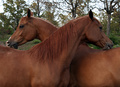
| 05/04/2007 02:17:11 AM |
Paternal Brothersby sfmorrisComment: Interesting capture and a unique take on the challenge especially with the similarily colored horses. The image is well framed and the heads of the horses are composed nicely using the rule of thirds. A narrower depth of field here would help blur the background a bit more and make it less distracting.
The exposure is generally good but the sky is a bit bright. Not a lot that could be done about it however if a circular polarize was available it might have helped a bit.
Good sharpness in the subjects and nice detail in the face and neck especially.
If I were to shoot this again I would perhaps try a portrait orientation as well and compare. |
| Photographer found comment helpful. |
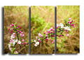
| 04/30/2007 02:40:06 PM |
In the Gardenby jerseyjimComment: To be honest the drop shadow is really distracting and takes away from the overall image |
| 04/30/2007 01:41:54 AM |
Making Wavesby rosiehallComment: The thought behind a "different" triptych is apparent and certainly worth a try. However, because you are basically trying to convey motion, putting the shots side by side would have been more effective. |
| Photographer found comment helpful. |
| 04/30/2007 01:40:32 AM |
After the Stormby wildirisComment: I like the attempt but while you used the full width allowed this shot is too short to be appreciated fully. You could have "stacked" the images and been able to use a large panel for each one. |
| Photographer found comment helpful. |
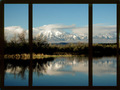
| 04/30/2007 01:39:29 AM |
Reflectionsby vtruanComment: The right hand panel has something weird about it. (The border is missing in a spot?) I'm also not sure about dividing the landscape vertically this way. There's no real natural "break points". Horizontally you could divide the water from the land and the land from the sky. |
| Photographer found comment helpful. |
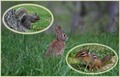
| 04/30/2007 01:37:40 AM |
My Backyard Friendsby woodseyComment: I really don't like the ellipses you used as frames. It feels like you are circling the subjects and basically saying "LOOK RIGHT HERE!" with the capital letters and write large. |
| Photographer found comment helpful. |
Home -
Challenges -
Community -
League -
Photos -
Cameras -
Lenses -
Learn -
Help -
Terms of Use -
Privacy -
Top ^
DPChallenge, and website content and design, Copyright © 2001-2026 Challenging Technologies, LLC.
All digital photo copyrights belong to the photographers and may not be used without permission.
Current Server Time: 06/26/2026 06:36:58 PM EDT.