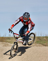
DPChallenge: A Digital Photography Contest You are not logged in. (log in or register
 
Browse Settings
Currently viewing:
Registered UserCitadel

Show comments:

Per page:

Order:

Comments:


Comments Made by Citadel
Pages:   ... [143] [144] [145] [146] [147] [148] [149] ... [235]
Showing 1451 - 1460 of ~2344
Image Comment
That Silky Swimmer
05/23/2007 02:51:06 PM
That Silky Swimmer
by rdlorf

Comment:
Greetings from the critique club!

Relatively good focus and good exposure. Composition is okay. The swimmer creates a "line" that takes the eye across the frame. The image is a bit "flat" because of the refraction of the water. A higher shooting position would help with this perhaps.

Colors are pleasing and well saturated without going overboard.

The challenge:

Interesting and unique choice of topic for this challenge. When a swimmer has a good stroke it is certainly smooth though perhaps not silky in my opinion. In any event it definitely meets the challenge criteria.

Good job!
Photographer found comment helpful.
Silky Eyelashes,
05/23/2007 01:51:06 AM
Silky Eyelashes,
by AmeedEl-Ghoul

Comment:
Greetings from the critique club!

Nice soft lighting works well with this subject. Shadows are a little dark and could use a bit more fill light especially around the baby's mouth. That might be a bit nitpicky though. (Good idea with using foil as a reflector btw)

Terrific focus on the lashes. Good use of depth of field to really bring the eye to the lashes as well.

Interesting composition. Again - it really draws the eye to the lashes.

The challenge: I have to admit that the eyelashes don't say silky to me (at least in my opinion). However, the overall image does say smooth to me. The whole mood of the piece is very peaceful which accentuates the "smooth" feeling of the picture.

Overall: Excellent job. Good subject choice and well handled technicals.
Photographer found comment helpful.
Denver to a Point
05/23/2007 01:43:30 AM
Denver to a Point
by lil_mo

Comment:
Greetings from the critique club!

The black and white conversion works well for this image especially in light of the challenge. The black and white makes the lines more evident and help draw the eye through the image.

While there's not a lot of noise in this image, going with a wider aperture would have allowed the use of a lower ISO setting especially considering it was a mid day shot. The high shutter speed used however created a good sharp image otherwise. I would consider exposing for the sky next time so that more of cloud detail could be drawn out. (That might underexpose other parts of the shot but I'd be interested in seeing if it does though).

The composition is good and the choice of angle excellent. Many shots in this challenge put the vanishing point in a roughly central position. Putting the vanishing point almost outside the frame creates a lot of visual appeal.

The challenge: Previous comments indicate the need for more convergine lines. I disagree. The streets and the buildings themselves create a very definite vanishing point. The choice of topic, while not unique is quite unique in its approach.

Photographer found comment helpful.
Tracks
05/23/2007 01:35:34 AM
Tracks
by MCCullen

Comment:
Greetings from the critique club!

The off centered composition here could be taken as a positive or a negative. Off center makes this a more dynamic composition. Centering would have helped strengthen the leading lines of the tracks.

The limited depth of field works well here. It creates good visual interest in the foreground while also creating a vehicle to take the eye further into the photo.

The colors are nice however it would be interesting to see this as black and white or sepia as mentioned below. (Just out curiousity more than anything though).

The challenge:

While not the most unique choice of topic it is one the more unique approaches. Unfortunately in my opinion the vanishing point isn't quite as obvious as it could be. There is converging lines thats meet within the fram then the lines appear to diverge and head off into the distance. The right hand track however appears to converge the centre rail creating more of a true vanishing poing. Perhaps if there was more of the right hand rail in the shot it would help strengthen the distant vanishing point.

Overall: Well done!
Jeep Tracks on Sandy Neck
05/23/2007 01:27:04 AM
Jeep Tracks on Sandy Neck
by alexzen

Comment:
Greetings from the critique club!

As mentioned in previous comments the sharpening is a little overdone. Taking it back a bit would definitely help. The colors are nicely saturated without going too far however.

The composition is good with strong leading lines that take the eye throughout the frame. Taking a bit off the bottom to have the left track come out of the corner might have helped but its still pretty good with its current crop.

The horizon does seem to "cut" the people walking. Not a lot that could be done about from this distance however.

Unfortunately the cloud in the sky moves the eye away from the heart of the image. Again, not much that could be done about.

The ocean on the left and the rocks to the right really help "contain" the image quite well. A border would have definitely hurt this image so going without was a good choice.

The challenge: Excellent way of conveying a vanishing point. There's about 7 lines that are converging on the vanishing point. (The horizon, The coast line, the edges of the tracks, the rocks). Moving a bit to the left would have put the people pretty much right on the vanishing point to make this even better.

A good job overall
Photographer found comment helpful.
+ Faith + Hope + Wisdom +
05/16/2007 10:32:26 PM
+ Faith + Hope + Wisdom +
by djofi

Comment:
Composition could be a bit stronger. Moving to the left a bit would effectively remove the woman behind the priest. Moving to the right would also work and create an interesting profile shot.

A larger aperture, even with this setup, would help isolate the priest from the background as well.

The selective desat is okay but as mentioned in previous comments not quite as effective as a full color version would be. The purple in his collar is particularly distracting. I imagine his robes were quite colorful and bright. The desat makes them look somewhat dreary.

The challenge: Great idea and the title ties it all together quite well.
Rite of passage
05/16/2007 10:24:06 PM
Rite of passage
by FairyWings

Comment:
Greetings from the comment club!

Well composed with the main subject being right on one of the "sweet spots". Nice colors and great exposure. The light mark on the post is somewhat distracting. Cloning it out would help but may not be legal under basic editing. Good detail in the hair of the people in the foreground. The positioning of the graduates creates a nice leading line throughout the frame.

The challenge: Interesting take on this challenge. I don't believe I remember seeing this approach used on any other submission. The title really brings home that graduation is indeed a passage into adulthood.
Photographer found comment helpful.
Landing Strip
05/16/2007 10:07:41 PM
Landing Strip
by Citadel

Comment:
The "flag" that got my submission noticed was the hard edges transitions.
In particular, the sky in a few "inside corners" like the rider's armpit, between the right knee and the handlebar, under the seat
and within the wheel is much lighter, and shows a hard-edged
transition to the darker tones of the rest of the sky.

I was baffled at the edges myself because I honestly didn't put them there. However, I was able to reproduce it and quite well after I played with it for a while.

My steps were like I mentioned:

Crop
Resize
Levels
Saturation

What I didn't mention was the USM I did but that was my last step. That was the step that did it.
In PSP I did a Unsharpen mask with these settings

Radius 10
Strength 30
Clipping 80

Even just doing the crop and resize then the USM the effect nearly mirrored what was seen in my submission.

Not sure what's next in store but at least I know what the heck happened.
Landing Strip
05/16/2007 04:40:37 PM
Landing Strip
by Citadel

Comment:
I'm actually in discussion with SC about this. I will pass on my findings as appropriate. Thanks for your interest guys!

Message edited by author 2007-05-16 16:41:00.
chicane unlimited
05/16/2007 01:10:09 AM
chicane unlimited
by ashishparmar

Comment:
ouch...this is way overprocessed.
Pages:   ... [143] [144] [145] [146] [147] [148] [149] ... [235]
Showing 1451 - 1460 of ~2344


Home - Challenges - Community - League - Photos - Cameras - Lenses - Learn - Help - Terms of Use - Privacy - Top ^
DPChallenge, and website content and design, Copyright © 2001-2025 Challenging Technologies, LLC.
All digital photo copyrights belong to the photographers and may not be used without permission.
Current Server Time: 09/12/2025 04:28:09 AM EDT.