| Image |
Comment |
| 08/27/2007 12:49:52 AM |
A Scheme of Thingsby raishComment: I'm afraid I didn't rate this very high. I am bothered by the not being able to see the entire butterfly on the left, and I can't see the right butterfly clearly. The background seems to overpower the subject. The flower is very nice and I like the way the colors of the right butterfly match the flower. I like the DOF. It feels almost 3D.
All that being said, I think your pictures are usually very carefully composed, and I am thinking that you probably created this exactly as you wanted it. Therefore we probably just have a different way of looking at butterflies. |
 Photographer found comment helpful. Photographer found comment helpful. |
| 08/26/2007 05:56:05 PM |
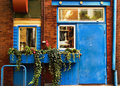
Blue, Eyesby levyj413Comment: This is so cool. I love the eyes. I hadn't seen this shot, the challenge was before I joined DPC. |
| Photographer found comment helpful. |
| 08/26/2007 02:29:30 AM |
|
| Photographer found comment helpful. |
| 08/26/2007 02:26:10 AM |
kirsten-3357.jpgby griz210Comment: This is my least favorite of the series. Her eyes being half closed give it a pensive mood, but that also seems to sap the energy from the shot. Also I like the crop of the others better. Here she is looking out the window, so my gaze goes to the left where I see clutter outside. The chair and the darkness on the right seem unnecessary and shot seems a little unbalanced. |
| Photographer found comment helpful. |
| 08/26/2007 02:07:51 AM |
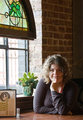
kirsten-3352.jpgby griz210Comment: I like the composition of this shot -- the plant, menu, stained glass window, and the brick wall all come together nicely. And I like the highlights on her hair. I think the shadow on her face is a little harsh. And she seems a little washed out. Maybe a levels adjustment would help, or a bit of tinkering with the sliders in exposure. |
| Photographer found comment helpful. |
| 08/26/2007 01:59:05 AM |
kirsten-3364.jpgby griz210Comment: As in the other shot on the sofa, I like the lighting. You do a very nice job on the pretty girls at work. You have a knack for capturing something of interest in their eyes. I like the softness of the shot, but I think I'd like to see her eyes sharpened. They are the real focal point of this shot. |
| Photographer found comment helpful. |
| 08/26/2007 01:51:37 AM |
kirsten-3359.jpgby griz210Comment: Nice going to have the interior and exterior so well exposed. I also like the lighting, with the back light on her hair and the reflected light on her face. I think I would try adjusting the gamma setting (under image > adjustment > exposure) a little bit to see if I could get a bit more depth in the image. |
| Photographer found comment helpful. |
| 08/25/2007 10:48:37 PM |
|
| Photographer found comment helpful. |
| 08/23/2007 10:19:38 PM |
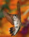
70 Beats Per Secondby RefocusedComment: Amazing stop action to have caught the wings in focus. Also beautiful photo. Love the background and the little sheen on the back of the hummingbird. 10 |
| Photographer found comment helpful. |
| 08/23/2007 10:07:35 PM |
Wings of the Windby photokid69Comment: I like this a lot. The colors and abstract blur combined with the sharp birches are very artistic. I'll be interested to see how you accomplished this. 10 |
| Photographer found comment helpful. |
Home -
Challenges -
Community -
League -
Photos -
Cameras -
Lenses -
Learn -
Help -
Terms of Use -
Privacy -
Top ^
DPChallenge, and website content and design, Copyright © 2001-2026 Challenging Technologies, LLC.
All digital photo copyrights belong to the photographers and may not be used without permission.
Current Server Time: 07/19/2026 03:57:24 PM EDT.