| Image |
Comment |
| 10/29/2008 08:58:12 AM |
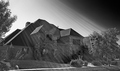
And it just makes me wonder, why so many loose, so few win.by seeComment: The light rays are amazing in this shot and I love the highlights on the roof. I am a bit frustrated, though, by not being able to see more of the front of the house -- the shadow is so dark. Also, I would like this better if it were straightened (rotated a bit counter clockwise), because the lines of the windows are sloping downhill to the right. Quite a good subject for affluence. |
 Photographer found comment helpful. Photographer found comment helpful. |
| 10/29/2008 08:42:00 AM |
Diamonds and Pearlsby colorcarnivalComment: The star spectrum from the diamond ring is the highlight of this photo for me. While this is a very 'busy' photo, I think the five rings remain the key elements and guide my eye around the image. I really like the colors and clarity. |
| Photographer found comment helpful. |
| 10/29/2008 08:27:06 AM |
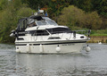
Cruising On The Riverby SteveJComment: I think this might have gotten a higher score if the composition was a bit more interesting. When the rule of thirds is used, the image often has a higher impact. Centered compositions are usually static, unless there is some sort of geometric reason for that sort of composition, such as emphasizing the symmetry of the image. I like the swan in the background; it's a nice extra bit of affluence. |
| Photographer found comment helpful. |
| 10/29/2008 08:16:01 AM |
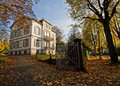
The Summer Placeby MelethiaComment: Beautiful day and great subject. I can't believe I am going to comment on your composition, because that is one of your strong points, but I would have liked a different crop -- the whole shot a bit more to the left. I think the wall and gate are a key element in this subject, and there would be a bit more feeling of exclusivity if the left gate was at least partially visible. It would be a tricky composition, because you wouldn't want to obscure any of the house with the right gate, but I think it could be done. Also the whole composition feels just a bit heavy on the left. That being said, I really like the way you captured the neighborhood (street and sidewalk) as well as the house. The view down the walk draws me past the house and further on down the road.
BTW, I think your comment about the file size being an indicator of 'too busy' is interesting. I'm going to keep an eye on my file sizes for that purpose. |
| Photographer found comment helpful. |
| 10/29/2008 07:57:39 AM |
Ugh...down to the nasty cheap stuff...by snafflesComment: Susan, I really liked this shot and gave it a high score. I haven't read the other comments, so I can't imaging why there were so many low ratings. Your idea is wonderful, and you executed it quite well, IMO. I'm just not quite sure about the shadow. I spent a bit of time trying to decide if they were good or not. So I guess that means they were distracting. I love the glove and bracelet, and the position of the hand is perfect. The roll of ones is convincing too. I think it is hilarious to be using TP with a fancy glove on. Oh, great title too.
eta: I have not read the other comments, and I disagree with the ones that said the contrast is too strong. I like High Key images, and I think that style fits your idea very well. Message edited by author 2008-10-29 08:01:34. |
| Photographer found comment helpful. |
| 10/27/2008 11:34:08 PM |
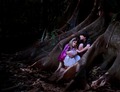
Hansel and Gretelby jettyimagesComment: All that work really paid off. Wonderful illustration. That's an amazing tree, and the kids are perfect. Congratulations on a fine image, your PB, and the top ten placement. |
| Photographer found comment helpful. |
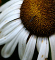
| 10/27/2008 08:01:15 PM |
macro6.jpgby incubusComment: This was a surprise. From the thumbnail, I expected another flower closeup, and was surprised to find it is actually an insect shot. I like the composition. I think some work with a low opacity soft light brush in white (dodging) might help the bug to stand out a bit more. It could give a bit of a glow to the flower behind the bug. |
| Photographer found comment helpful. |
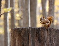
| 10/27/2008 06:05:47 AM |
Red squirrelby snafflesComment: Wow, congratulations on the PB, and what a great score? But especially what a beautiful photo. Love the colors and DOF. And I like the point of view -- the squirrel looks very small on that big stump. I think it is good that you left the surrounding environment in the shot rather than cropping down to the squirrel. Oh, I forgot to mention how much I like the focus and texture. |
| Photographer found comment helpful. |
| 10/26/2008 05:45:54 PM |
|
| Photographer found comment helpful. |
| 10/26/2008 12:14:04 AM |
|
| Photographer found comment helpful. |
Home -
Challenges -
Community -
League -
Photos -
Cameras -
Lenses -
Learn -
Help -
Terms of Use -
Privacy -
Top ^
DPChallenge, and website content and design, Copyright © 2001-2026 Challenging Technologies, LLC.
All digital photo copyrights belong to the photographers and may not be used without permission.
Current Server Time: 07/24/2026 10:20:30 AM EDT.