| Image |
Comment |
| 05/25/2009 11:44:59 AM |
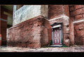
knock knock by dougi555Comment: Very effective work with Topaz -- the perfect subject. Really brought out the light and texture. Of course it didn't hurt to have a fabulous subject to shoot for this challenge. Congratulations on your ribbon! |
| 05/25/2009 11:37:33 AM |
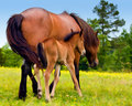
_MG_9571.jpgby sfmorrisComment: How beautiful and precious. I love the "painted" field and background with the natural look horses. They too look a little painted, but not too much. Wonderful image. |
| 05/25/2009 11:33:34 AM |
The Fogby KelliComment: Oh, Kelli, I love the light (as in lighting) in this shot. Actually I like everything about it. The only thing missing is the light in the lighthouse. I thought they were supposed to shine in the fog -- the whole purpose of a lighthouse. :) I like the composition and the tiny people there for perspective. Really excellent, IMHO. |
 Photographer found comment helpful. Photographer found comment helpful. |
| 05/25/2009 11:29:16 AM |
Yo Spiff on the ground againby Yo_SpiffComment: Good work masking the ground -- it's interesting, but still allows the handsome subject to stand out. Speaking of which, that handsome subject looks like he better get out of the sun now! ;) |
| Photographer found comment helpful. |
| 05/24/2009 10:31:23 PM |
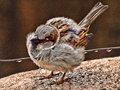
Sparrowby BAMartinComment: Love the color, and you really did bring out the softness in the feathers. What an adorable little fuzzball! |
| Photographer found comment helpful. |
| 05/24/2009 05:54:14 PM |
|
| Photographer found comment helpful. |
| 05/24/2009 02:26:44 AM |
|
| Photographer found comment helpful. |
| 05/24/2009 02:22:59 AM |
|
| Photographer found comment helpful. |
| 05/24/2009 02:20:01 AM |
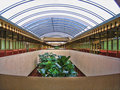
-frank-lloyd-wright-center-by sfaliceComment: This is like HDR to the max. It eliminated all the variations in exposure. It looks like an architect's rendering. Actually I like the original very much, especially the feeling of distance. I like what Topaz did for the plants in this version, but I like the smoothness of the building and skylight in the original. |
| Photographer found comment helpful. |
| 05/24/2009 01:59:32 AM |
Rex by fldaveComment: It brought out the details nicely and gave it a very nice atmosphere. I really like what you did with the background and border. I just wish that lovely golden color wasn't lost. I think this makes him look a bit dirty -- at least compared with the original. |
| Photographer found comment helpful. |
Home -
Challenges -
Community -
League -
Photos -
Cameras -
Lenses -
Learn -
Help -
Terms of Use -
Privacy -
Top ^
DPChallenge, and website content and design, Copyright © 2001-2026 Challenging Technologies, LLC.
All digital photo copyrights belong to the photographers and may not be used without permission.
Current Server Time: 07/21/2026 07:39:43 PM EDT.