| Image |
Comment |
| 06/07/2007 11:53:14 AM |
Two jacks, no kings, queens or acesby SoulMan1978Comment: pretty boring subject. tough to make this one look good. The lighting is also a little unidirectional, judging by the shadows. try using another light, or at least a reflector (can even be a piece of white cardboard or paper) to help even out the light. To improve this (forgetting about the subject), add in some more contrast and overall lighting through curves and levels adjustments. |
 Photographer found comment helpful. Photographer found comment helpful. |
| 06/07/2007 11:50:53 AM |
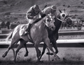
Smalltown Duelby RistyzComment: I like this shot! nice lighting, good composition. I get a real sense of their motion! |
| Photographer found comment helpful. |
| 06/07/2007 11:49:48 AM |
|
| 06/07/2007 11:48:57 AM |
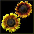
Father and Daughterby jasonlpriceComment: nicely composed. the difference in lighting of the two flowers bothers me a little though. I would have liked to see the top flower a little brighter. |
| Photographer found comment helpful. |
| 06/07/2007 11:47:50 AM |
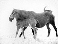
Togetherby artvetComment: I like the grain in this one. maybe a touch too bright near the heads, but it looks like it was a very tough lighting situation anyway. pretty good handling that. |
| Photographer found comment helpful. |
| 06/07/2007 11:46:01 AM |
Double Faultby rahimComment: I like the lines in this one. just a touch more DOF would have helped. |
| Photographer found comment helpful. |
| 06/07/2007 11:45:15 AM |
|
| Photographer found comment helpful. |
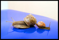
| 06/07/2007 11:41:41 AM |
The Last Touch Of Goodbyeby mian3010Comment: focus looks OK. the shallow DOF, likely used to isolate subjects from background, lets that left hand snail get a little OOF. Also, be aware of the rest of the frame (like the edge of the blue, and the distracting square of white in the top left). A flat (not shiny) surface might have worked better here. |
| Photographer found comment helpful. |
| 06/07/2007 11:39:40 AM |
My 2 Yorkiesby teebee2eComment: very cute. I like how you got them to pose like that! Lighting looks a little flat,though. could have used a little more pop, either through a curves adjustment for contrast, and hue/sat or channel mixer for a touch more color. |
| 06/07/2007 11:37:33 AM |
Iron Dragonfliesby pixelpigComment: probably should've taken those dragonflies out and put them in a more interesting surroundings. the background is too busy, and detracts from your main subject. |
| Photographer found comment helpful. |
Home -
Challenges -
Community -
League -
Photos -
Cameras -
Lenses -
Learn -
Help -
Terms of Use -
Privacy -
Top ^
DPChallenge, and website content and design, Copyright © 2001-2026 Challenging Technologies, LLC.
All digital photo copyrights belong to the photographers and may not be used without permission.
Current Server Time: 07/22/2026 07:15:35 PM EDT.