| Image |
Comment |
| 05/01/2007 08:52:26 PM |
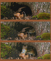
Chipmuck's homeby ladpupmoeComment: Cute sequence. I would fix the chipmunk's red eyes and use a darker border/background so as to not distract from the images. |
 Photographer found comment helpful. Photographer found comment helpful. |
| 05/01/2007 08:49:55 PM |
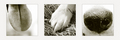
Tongue : Toes : Noseby elemessComment: Gotta' love a big, wet nose :-) I might prefer the paw against a plain light background instead of grass. Monotone works nicely to unify the panels. |
| Photographer found comment helpful. |
| 05/01/2007 08:47:42 PM |
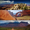
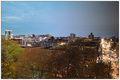
The American Southwestby CutterComment: Stunning scenery. Would like a bit more seperation between panels to better appreciate each individually, particularly as the colors and exposure vary somewhat. |
| Photographer found comment helpful. |
| 05/01/2007 08:44:25 PM |
|
| Photographer found comment helpful. |
| 05/01/2007 08:36:48 PM |
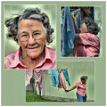
Laundry Dayby HipychikComment: Like the story here quite a bit. The background works very well, too. Halo effect around her head is kind of patchy and unrealistic on my monitor, particularly on the portrait. |
| Photographer found comment helpful. |
| 04/30/2007 08:32:37 PM |
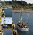
Dry Dock Hoistby ScholtenComment: The panels are busy and there is only a partial border between the top left panel and the right panel. Consistency is also an issue with white balance amongst the panels. Consistent color adjustment and clear, distinct borders would make it easier to appreciate each image and the whole. |
| Photographer found comment helpful. |
| 04/30/2007 08:28:20 PM |
|
| Photographer found comment helpful. |
| 04/30/2007 08:25:24 PM |
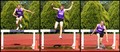
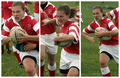
Steeplechaseby andrea22_alsComment: That was always a fun race to watch when my kids were on the track team. Shots look a little overexposed but I like the sequence; hope he wasn't hurt as his landing looks a bit awkward! |
| Photographer found comment helpful. |
| 04/30/2007 08:23:58 PM |
|
| 04/30/2007 08:23:26 PM |
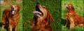
The Biscuitby Dona_kComment: He looks like a happy dog. A few suggestions: the lighting seems quite different in the center panel, which leads my eye to the grass instead of the dog. The bit of building in the left panel is distracting when the other panels have pure grass background. Lastly, part of the dog is cut off in both the sitting and standing views; I think they would be better as full body views or head shots, but not this in-between-type view. |
| Photographer found comment helpful. |
Home -
Challenges -
Community -
League -
Photos -
Cameras -
Lenses -
Learn -
Help -
Terms of Use -
Privacy -
Top ^
DPChallenge, and website content and design, Copyright © 2001-2026 Challenging Technologies, LLC.
All digital photo copyrights belong to the photographers and may not be used without permission.
Current Server Time: 07/31/2026 04:21:26 AM EDT.