| Image |
Comment |
| 10/26/2007 04:47:32 PM |
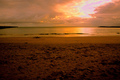
Distant Shoresby BrianRComment: I'm sure it's a lovely location and it probably looked spectacular in your eyes, I don't think the camera has done it justice.
The excessive messy sand in the foreground is distracting.
There appears to be some driftwood towards the shore, I think I'd have explored the option of getting closer to that and using it as a diagonal 'anchor' to the sunburst clouds. |
 Photographer found comment helpful. Photographer found comment helpful. |
| 10/26/2007 04:45:25 PM |
|
| Photographer found comment helpful. |
| 10/26/2007 04:44:36 PM |
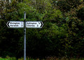
SIGNPOSTby sunraygpComment: Cute idea. I'm thinking this image was not shot using a tripod. It suffered clarity by being 'hand held'.
I like the position of the sign.
The foliage lack Shadows and Highlights. |
| Photographer found comment helpful. |
| 10/26/2007 04:43:03 PM |
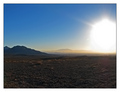
Sun Cityby BlackboxComment: WOW - that's some light blob! I think it's 'too much'. I can get what you're trying to convey but the white has just blown out 'too much'. Might also want to consider cropping the forground out quite aggressively. I don't think it serves any assistance to the image. |
| Photographer found comment helpful. |
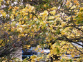
| 10/26/2007 04:41:33 PM |
Wind Storm 2K7#1 v. Autumn Leaves Parallaxby TheZStationComment: This image in no way suggests 'distance' to me. It would work for a 'movement' challenge, or 'blur', but not distance.
In addition the vehicles behind are a distraction and in no way enhance the image.
My suggestion would be to crop the bottom third horizontally, then work with Constrast or Selective Colours, to bring out some depth and then maybe add a slight black frame. |
| 10/26/2007 04:38:59 PM |
Russian Dollsby andrewtComment: Quirky image - very cute. The negative space to the right is a bit unsettling, perhaps a bit more or less would have worked well. Good depth of field. |
| Photographer found comment helpful. |
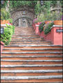
| 10/26/2007 04:38:08 PM |
Worship Him From Afarby RosacalacaComment: Looks like a nice location.
I'm thinking you want my eyes to be drawn to the image at the top of the stairs. Unfortunately due to the flatness of the image up there, it doesn't automatically happen. The stairs in the higher up group seem to have the greater focus which doesn't sit well with the viewer. |
| Photographer found comment helpful. |
| 10/26/2007 04:36:30 PM |
from a distant and grainy dimension: the TROLL TRAPby cutoutComment: Nice adstract. The colours are nice.
I have no idea what the image is, or what you are trying to portray. I think the addition of the words 'Troll Trap' takes away from your image. It's like you're baiting in a 'reverse psychology' way in the hope you get a higher vote. In my opinion each image just needs to 'speak' for itself without 'teasers' in the title to 'work' for it. |
| Photographer found comment helpful. |
| 10/26/2007 04:34:28 PM |
Into the blueby MelethiaComment: Very cool take on 'distance' and I really like the icy blue shades. I'm taking a guess at saying it's been taken 'hand held'. I think a tripod may have assisted with clarity. Also due to the incredibly flat sky I'd have cropped quite a bit of it out. |
| Photographer found comment helpful. |
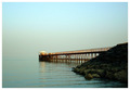
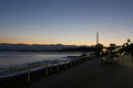
| 10/26/2007 04:33:10 PM |
Promenade des Anglais - Nice, Franceby slo007Comment: I'm sure this is a very beautiful place, but I can't really get a good sense of it due to the time of day this image was taken. It's nice and clear, but I needs for highlights. |
Home -
Challenges -
Community -
League -
Photos -
Cameras -
Lenses -
Learn -
Help -
Terms of Use -
Privacy -
Top ^
DPChallenge, and website content and design, Copyright © 2001-2026 Challenging Technologies, LLC.
All digital photo copyrights belong to the photographers and may not be used without permission.
Current Server Time: 05/08/2026 01:02:34 PM EDT.