| Image |
Comment |
| 10/03/2009 11:00:59 PM |
Cupby ShaylaComment: Nice perspective, though the focus or DOF is too shallow. |
| 10/03/2009 10:58:33 PM |
|
| 10/03/2009 10:58:02 PM |
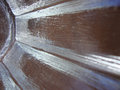
CONFINEMENTby essayComment: Humm, that bowl seems to show off very round lines... Interesting tilt and the negative effect of the split image, though. |
 Photographer found comment helpful. Photographer found comment helpful. |
| 10/03/2009 10:55:20 PM |
|
| Photographer found comment helpful. |
| 10/03/2009 10:40:21 PM |
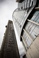
Straight Upby JamesAComment: Nice perspective and the interesting having a Braille tower depicted.
The main building, however, seems to have round facade, which might hurt you with DNMC. |
| Photographer found comment helpful. |
| 10/03/2009 10:37:22 PM |
Bedheadby lccm_82Comment: No doubt it meets the challenge. The patterns and color nuances are OK, but the light is too harsh and the focus is not good. Also, the longer side of the image is only 400 pixels, while you could have used 640, which would give more details to the viewer. |
| 10/03/2009 10:33:04 PM |
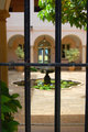
Courtyardby mljComment: Nice view and an story going on here, but there is a big issue of not meeting the challenge: the courtyard has all but straight lines there. As for the bars, the seem skewed. |
| 10/03/2009 10:27:37 PM |
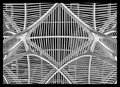
straight Upby kingskingdomComment: Is this the BCE Place? Anyway, as the challenge goes I'm afraid you didn't abide 100% on it as there are several non-straight lines there. I think you'll get many DNMCs.
I like the image per se. The focus is sharp. It provides interesting patterns and I like what appear to be some reflections on the glass. I don`t care for the thicker border though - it competes with the thinner white lines of the structure. |
| Photographer found comment helpful. |
| 10/03/2009 10:22:22 PM |
No Chaserby ChadHComment: I can`t see any relation of this image with the challenge definition. |
| 10/03/2009 10:22:20 PM |
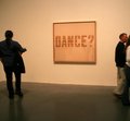
Dance?by SpongetoastComment: Though the subject matter is not not attractive, it does fit the challenge. Having said that I see many down sides with the image. The focus is soft and the lighting is flat. There seems to be no relation between the people on the image with the "Dance" theme. It would be more effective not having nobody in the frame at all (it would be more boring too...). The persons are cropped out - with exceptions, cropping or cutting people/limbs is not a good thing to do. |
Home -
Challenges -
Community -
League -
Photos -
Cameras -
Lenses -
Learn -
Help -
Terms of Use -
Privacy -
Top ^
DPChallenge, and website content and design, Copyright © 2001-2026 Challenging Technologies, LLC.
All digital photo copyrights belong to the photographers and may not be used without permission.
Current Server Time: 06/09/2026 11:29:28 PM EDT.