| Image |
Comment |
| 10/20/2006 10:22:45 AM |
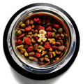
Morning Kibbleby minniedentComment: The shot is nice and clear. I like the white background contrasting with the black rim followed byt he shiny stainless. I don't really like the colors of the food itself. On their own (each color) is fine, but when put together it does not look very appetizing or do much (IMO) to help the photo.
I get the title and it is appropriate and no dog food should not be appealing to man, but the colors do need to appeal to the viewer.
Very nice composition. I'm doing a bump up on the score now for the technical aspects of the photo. |
 Photographer found comment helpful. Photographer found comment helpful. |
| 10/20/2006 10:19:43 AM |
Must Have Coffeeby ElaineComment: The speckles in teh cup first come off as if they were photo noise. Then the blacks in the photo help clarify it a bit. Nice composition regarding a simple setup and the lighting is good. |
| Photographer found comment helpful. |
| 10/20/2006 10:19:27 AM |
Start me off with twoby jaysonmcComment: I like the shot of the glass and egg, but i think the grid pattern (glass) takes away from the shot and leaves me wanting more clarity or sharpness in the photo. |
| Photographer found comment helpful. |
| 10/20/2006 10:17:33 AM |
|
| Photographer found comment helpful. |
| 10/20/2006 10:16:56 AM |
Morning Paperby xianartComment: Ha, Ha (lol). I just did this same type of photo on faceless. It actually generated my highest score to date (not sure if that's anything to brag about, lol).
Good sense of humor. |
| Photographer found comment helpful. |
| 10/20/2006 10:16:44 AM |
Frostedby sibelingComment: While the depth of field is nice, the blur looks more like that of a moving object than of something just out of focus. |
| Photographer found comment helpful. |
| 10/19/2006 02:44:22 PM |
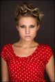
Doing Nothingby littledaComment: Portrait-wise, this is a great photo of the little girl. The title is appropriate as well. But the tree on the left is so blown out or bright that it really distracts the viewer from the subject of the picture, the girl.
Don't know if these help or not, but I hope they do in some way as I want to leave constructive feedback:
Meets Challenge: 2
Lighting: 0
Composition: 2
Overall Image: 1
Wow Factor: 0 (I'm sure the subject is special to you and that is what is important).
Score: 5 |
| Photographer found comment helpful. |
| 10/19/2006 01:41:03 PM |
|
| Photographer found comment helpful. |
| 10/19/2006 01:40:45 PM |
|
| Photographer found comment helpful. |
| 10/19/2006 01:39:33 PM |
Ringlight Eyesby nephotoComment: Not sure if it is body positioning or if the garment moved, but I don't like the way he face is straight on and the neckline is offset to the viewers left. Technical aspects are very strong. |
Home -
Challenges -
Community -
League -
Photos -
Cameras -
Lenses -
Learn -
Help -
Terms of Use -
Privacy -
Top ^
DPChallenge, and website content and design, Copyright © 2001-2026 Challenging Technologies, LLC.
All digital photo copyrights belong to the photographers and may not be used without permission.
Current Server Time: 07/17/2026 11:40:04 AM EDT.