| Image |
Comment |
| 06/11/2004 04:42:24 AM |
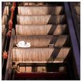
Out Of Order (Color)by Spanish_GreaseComment: as you know I'm a big fan of duotoned images, but this one is way better in colour. dunno why, but it is. the other one leaves me wondering why you're asking me to look at it. this one communicates it well.
the best of your 'new work' as far as i can tell.
Pedro |
 Photographer found comment helpful. Photographer found comment helpful. |
| 06/11/2004 03:57:39 AM |
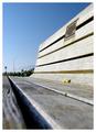
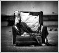
Benchby faidoiComment: i know these benches. there are a thousand of them. nice take on this photo. too many doofs won't get the fact that the lines are, in fact, parallel, but we know. good on ya.
P |
| Photographer found comment helpful. |
| 05/24/2004 11:38:38 AM |
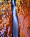
Right through the center...by YomiComment: Nice Jubei. Cool you found time in your busy schedule to get up there. That's definitely print-worthy.
how long was the shutter on this? And I assume you used an ND filter, given that in broad daylight, the d100 can't take more than about 1/3 of a second at ISO 200 and max aperture. details appreciated.
Pedro |
| Photographer found comment helpful. |
| 05/24/2004 11:00:28 AM |
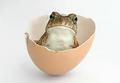
Oh, hello! by JeanComment: I was bothered by this when i first saw it. Of course, that's only because as soon as I saw it I knew for sure I wasn't going to win.
You've now won two of your last three...pretty impressive :)
Just a fabulous shot. A local phone company here uses wildlife in it's ads all the time, and this is an good as anything they've used. It was the first thing i thought of when i saw it - good enough to be published. Great job, Jean.
Pedro |
| Photographer found comment helpful. |
| 05/23/2004 11:07:12 PM |
scrapby jus6681Comment: i think this is my favourite of the challenge. what a wonderful find. most people would move this out of the way to take the photo :) great burning around the perimeter, nice contrast, great use of grain. well done. P |
| Photographer found comment helpful. |
| 05/23/2004 02:36:32 AM |
Pagoda & Laternsby JoviComment: really tough shot to expose. the pagoda looks muted and the lanterns are almost overexposed. a little fill flash could have help depending on the flash and your distance to the carving. good concept and great colours. good luck. P |
| Photographer found comment helpful. |
| 05/23/2004 02:31:30 AM |
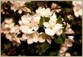
A Center Pieceby TikicharmComment: a little overexposed methinks. the petals of the flower on the right are blown out a bit. a little creative burning would take care of that. nice composition for the challenge, nice depth, and the focus seems pretty sharp too. good job.
P |
| Photographer found comment helpful. |
| 05/23/2004 02:29:44 AM |
Nice Blue Eyes And No Teeth In The Middleby MonaComment: great subject. lighting looks a little flat to me. a little more contrast and/or sharpening might help this. Unless of course you had to crop a lot to get him in the middle. I hope you took lot sof this guy he's worth photographing :)
Pedro |
| Photographer found comment helpful. |
| 05/21/2004 04:57:24 PM |
Squirrelby rj324Comment: a little fill-flash would hav both scared the heck out of this guy, and brightened him up. tough call. A little dodging and burning would help increase the contrast and bring out some features. great focus and sharpness. well done.
Pedro |
| Photographer found comment helpful. |
| 05/21/2004 04:41:20 PM |
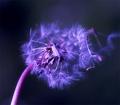
Reproductionby KonadorComment: I like the lighting and focus except for the blown out part of the stem. i'd burn that down a little to even it out. the shallow depth seems to work nicely. The purple glow makes it look like Moodville's shot of a few weeks ago, but that's neither here no there - a compliment, really :)
Pedro |
| Photographer found comment helpful. |
Home -
Challenges -
Community -
League -
Photos -
Cameras -
Lenses -
Learn -
Help -
Terms of Use -
Privacy -
Top ^
DPChallenge, and website content and design, Copyright © 2001-2026 Challenging Technologies, LLC.
All digital photo copyrights belong to the photographers and may not be used without permission.
Current Server Time: 06/23/2026 02:26:01 PM EDT.