| Image |
Comment |
| 12/13/2004 04:12:17 PM |
|
 Photographer found comment helpful. Photographer found comment helpful. |
| 12/12/2004 04:02:52 AM |
|
| Photographer found comment helpful. |
| 12/10/2004 04:13:41 AM |
|
| Photographer found comment helpful. |
| 12/10/2004 12:02:09 AM |
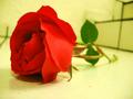
Waitingby Sigur7Comment: sadly, i already know what most of your comments say: "not yellow".
well, I'm not voting, only commenting, so I'll comment on the picture, cuz i don't give a hoot about the rest :)
I like the idea behind it. the shallow depth is nice, and the sharp focus on the rose petals really hammers it home. there's a green cast to the 'yellow' that i don't like much. i looks like the colour of hospital walls or something.the background, while a little chaotic, actually adds to the composition ini my mind. a bunch of right angles to contrat against the soft curves of the rose.
good luck
P |
| 12/09/2004 11:53:49 PM |
Shineby lizzyc3Comment: this is probably one of those ones that's getting the 'orange' comments. sadly DPC can be like that. gotta smack 'em in the face with it sometimes. this is an interesting take o nthe theme. VERY difficult to shoot without hotspots if you want any kind of definition in the subject, particularly in basic editing. it's simple. i like simple. good luck |
| Photographer found comment helpful. |
| 12/09/2004 11:51:52 PM |
Vintage Yellowby CantiqueComment: kind of a random image. not always a bad thing mind you. in my view, a photographers job is to subtly direct the viewer...to convey a message or share a view of something. I'm not really getting that from this. I'm getting the compositional contrast, but not really the point. (I'm not voting by the way, just commenting so don't worry about my opinion affecting your score). I'd be interested to see you work with this theme some more - maybe with different subjects when you're not worried about a challenge.
technically it's pretty solid. focus is good, sharpness and DOF is good. could use a little diffusing of the light to tame some of the hotspots on the metal. even a piece of thin white paperbetween the light source and subject would do the trick.
good luck.
P |
| Photographer found comment helpful. |
| 12/09/2004 11:46:05 PM |
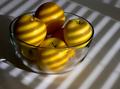
"Apple Bees"by SammieComment: great use of available light. so much more interesting than perfect studio light. i like that they're not perfectly arranged stems-up or anything. i would like to see more of the shadow of the bowl though...just because i think shadows add depth to a photo. for fun i'd try increasing th contrast some, so the shadows are darker and the highlights are lighter (curves or levels). makes a great study of light.
well done.
P |
| Photographer found comment helpful. |
| 12/09/2004 04:53:15 PM |
Solitudeby kosmikkreeperComment: sweet Yanik. love it. oh so familiar canadian scene captured beautifully :)
P |
| Photographer found comment helpful. |
| 12/09/2004 04:42:10 PM |
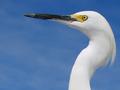
Stoicby Mark of SRQComment: nice contrast. the yellow definitely provides the impact. i hope most people get that.
a little halo-ing around the beak from sharpening, but otherwise perfectly processed.
nice shot. |
| Photographer found comment helpful. |
| 12/09/2004 04:24:21 PM |
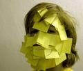
Post-itby MarkComment: the whole thing (skin included) has a green cast to it on my monitor. could either be a white balance issue, or a post processing issue. concept is good for a laugh. a little light from the left side would help balance the shadows out a bit as well.
P |
| Photographer found comment helpful. |
Home -
Challenges -
Community -
League -
Photos -
Cameras -
Lenses -
Learn -
Help -
Terms of Use -
Privacy -
Top ^
DPChallenge, and website content and design, Copyright © 2001-2026 Challenging Technologies, LLC.
All digital photo copyrights belong to the photographers and may not be used without permission.
Current Server Time: 06/24/2026 06:42:54 PM EDT.