|
|
|
Showing 201 - 210 of ~1547 |
| Image |
Comment |
| 01/31/2007 01:55:56 PM | Simple Pleasuresby HawesPhotoKCComment: On a different subject, this processing would kick ass. It's gritty and edgy and I normally love that, but on a soft subject with a soft title, it is a bit conflicting. I like the pose and the crop very much - your model seems very at ease with herself and the camera which is either great acting or very admirable self-esteem. In either case, that comes through in the photo and it's very appealing.
beyond that, the technical aspects are good. the focus is soft and flattering, the lighting is nice (aside from the harsh shadows from the edit) and the crop frames the mood nicely. the fact that your model is adorable doesn't hurt either. ;)
a solid entry.
P |  Photographer found comment helpful. Photographer found comment helpful. |
| 01/31/2007 03:51:54 AM | Pear of Legsby Rae-AnnComment: clever title...decent technicals :) a little halo from the dodging around her hips, but otherwise a nicely executed image.
P
*of course I had to check :) something else I just noticed that I couldn't put my finger on last night - the tilted horizon. i knew it looked a bit off balance and I couldn't figure out why since your legs are vertical. Now i get it. Looks like you know your ass from your elbow.
P | | Photographer found comment helpful. |
| 01/30/2007 05:57:18 PM | Black & White by DrJOnesComment: magnificent models...professionally lit and well executed technically. not sure about the crop of his foot and her knee, but there's enough goodness going on here to make up for it. Top notch entry...very well done.
P | | Photographer found comment helpful. |
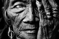
| 01/29/2007 08:50:13 PM | See No Evilby librodoComment: Originally posted by whiterook:
That is not true LARUS. We don't like the picture!!!!
The picture is to dark crop is to much. Is this a Blue ribbon I will stick with Brown ribbon! |
And you'll likely get your wish, Whiterook.
As for you, Manny...well - you already know what I think about the entire series with Rosalinda. Pure Genius. Ballsy and real...the way an A-Class artist should be ;)
All the best, Pare...keep on bein' you.
P | | Photographer found comment helpful. |
| 01/29/2007 06:50:50 PM | deltaby cheleComment: very nice. Gentle lighting and soft expression. won't be surprised to see this in the top ten. The toning is nice too...though I'd like it if it were more consistent.
(as an aside, if the inconsistent toning wasn't intentional, next time try dodging and burning before you convert it to duotone...then once you convert it will be more even.)
Normally i don't like noise reduction tools like neat image, but in this case it adds a silky texture to your skin, which is an asset to the photo.
P | | Photographer found comment helpful. |
| 01/29/2007 06:23:05 PM | Confinedby levyj413Comment: Oh, I liked this one at first pass :)
From a technical perspective i think this one holds it's own in the challenge. the focus is soft, but in the nice way - it doesn't look blurry or 'off', just soft - which is nice. My guess is that you used a fairly small single light source, or it was fairly low and directed across her body. I guess this because the light is fairly harsh on her neck, and drops off fairly quickly as it works its way down her body.
A few ways around the blown highlights on her hair and neck:
-a more diffused or larger light source (either a bigger light, or use a big diffuser; sheer white fabric works as does bouncing the light off of white posterboard or reflector)
-you could raise the light higher and a bit closer to her so it's a bit more even (though this may lose some of the shadows which IMO add to the appeal of the image)
-leave the light where it is, but underexpose it a little (so the hotspots are gone), then use the dodge tool in PS to selectively bring the lower parts up a little to match more evenly.
Compositionally i think you have a great idea, but a few things make it a bit uncomfortable to look at. The almost panoramic crop doesn't work for me so much; it really closes the image in on top, and while I get that you were working within the 'confined' theme I think the pose conveys that message well enough by itself. I think simply adding some negative space at the top would free the image and in some ways enhance the feeling of confinement. I might add a little space at her head and feet for the same reason.
I don't think the blanket at the bottom adds to the image any, and it competes with the the smooth lines that her body creates.
Her pose seems to depict exactly what you were after and creates a really nice flow to that part of the image. the only thing I might try would be to have her relax her head/neck a little...it looks like she's forcing her face into the ground and seems a bit unnatural (might be more the blanket doing that...not sure). Understanding that she may be somewhat shy and really wanted her face hidden, I might suggest moving her arms up a little to hide her face; but really...the shadows will do most of the work anyway with the directional lighting.
All in all i think it's a very nice photo...it was among my higher votes (a 7) If you are so inclined, I'd love to see how it looks without the blanket and with a slightly looser and taller crop.
all of the preceding rambling was of course just my opinion - artistic freedom is entirely yours and feel free to disregard my thoughts at will :)
P | | Photographer found comment helpful. |
| 01/29/2007 02:21:32 PM | Tribute to Sonifo's "Body Art"by timfythetooComment: it's not that easy...being greeeeenn (one of my little guy's favourite songs :))
ok - so from a topical standpoint, you'll get punished for a few reasons: first off, toys, stuffed animals, woodies, etc all tend to get hammered by virtue of their very being. hard to differentiate those from a poor opinion of the photo. Secondly (specific to this challenge) a lot of people went WAY out of their comfort zone to enter themselves or a loved one naked, and will take this as an insult to their serious effort. that should affect their score, but it will. Lastly, a 'tribute' in all senses of the word, should seek to improve upon or show respect to the original, and with an original as good as Soni's - you've got some stiff competition.
Technically speaking it has strength. The setup/composition is good so it has a nice flow. Technically speaking I notice a few little things that could be improved upon (i'm nowhere near perfect, but I have been working hard on improving my studio stuff in the last few months, so these are the things I'd criticize my own work for).
The first thing I notice is that it's a bit overexposed...the whites are a bit blown out near the bottom of the image. when I'm shooting on a white backdrop I tend to light slightly from above, and I try to get more light on the back than the ground (particularly when it's white on white like this one). it gives a sense of surrounding and provides a base for the image; kermit almost looks like he's levitating. Ideally you will have a little contrast on the ground, even if it's just a wee shadow around the base of the object and below the feet. A simple little cheat on a BW image is to use a *slightly* off white pedistal in this case - 5% grey maybe, which will look like shadow.
Second thing i see is either a slight blur that has been sharpened to compensate, or compression artifacts that show up as blur. I'm guessing it may be a bit of both, because i can see some haloing around the edges that usually comes from sharpening. I don't mind softer focus, but it needs to be consistent - in your image some of it is tack sharp, while other parts seem soft (his right leg, for example seems artificially sharp with compression artifacts around it). The solution to all of this of course is simple - add more light, close up the aperture a little for greater DOF (F8-F9 is perfect for an indoor studio), pay close attention to focus, and (if you didn't) use a tripod.
i like the attention to detail - the tattoos, hand positions, etc...shows you paid attention, which shows respect for the original. If you were looking to improve on the composition (no insult to Soni) I'd have cropped it to give more space above him, and less below to open the image up a little. I like to give models room to move through a photo - even borders all the way around give a sense of confinement to me - but that's a personal preference thing.
So there you have it...my thoughts all wrapped into one. Overall it's a well done image, with a few minor details that could have been improved. In a tribute challenge, I'd expect this to score a 6.5ish overall. as it stands, I won't be surprised to see it in the high 4s or low 5s.
hope that helps :)
P | | Photographer found comment helpful. |
| 01/29/2007 02:06:42 AM | Pinchby ShecoyaComment: i wonder how many comments you get that use the word "OW!" | | Photographer found comment helpful. |
| 01/29/2007 01:58:57 AM | Still Life With Lemonsby De SousaComment: beautiful. soft light, excellent sharpness and lots of depth. the lemons add a nice touch of texture colour. The nipple ring would have been far more amusing if she had one too, but i like it anyway :)
P | | Photographer found comment helpful. |
| 01/29/2007 01:52:30 AM | Ms Leeby rossbillyComment: i have yet to find a way to shoot someone in the bathtub and have it NOT be somewhat disorienting. That said, the technicals in this image are excellent, and the concept and model make it a very appealing image. nicely done :)
P | | Photographer found comment helpful. |
|
Showing 201 - 210 of ~1547 |
Home -
Challenges -
Community -
League -
Photos -
Cameras -
Lenses -
Learn -
Help -
Terms of Use -
Privacy -
Top ^
DPChallenge, and website content and design, Copyright © 2001-2026 Challenging Technologies, LLC.
All digital photo copyrights belong to the photographers and may not be used without permission.
Current Server Time: 06/22/2026 02:54:07 AM EDT.
|